Review: Motorola ROKR E8
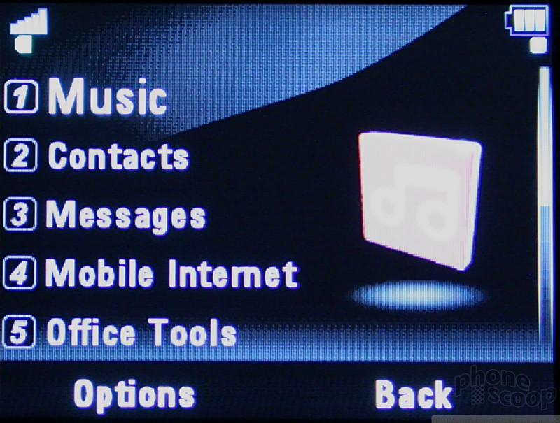
On the E8 home screen are two options, Menu and Shortcuts, above two corresponding soft keys. The choices under Shortcuts change slightly depending on the application, but at the start include Create Message, Create Contact, Take Picture, View Pictures, Find Bluetooth Device, Set Alarm, and Turn On/Off Bluetooth.
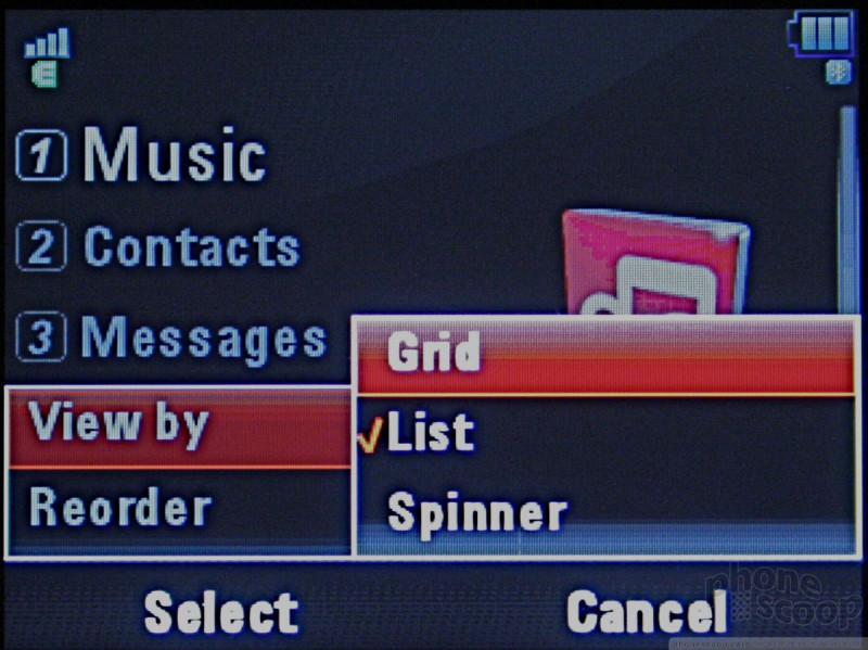
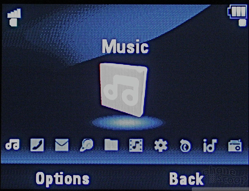
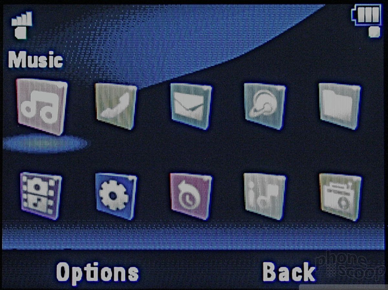
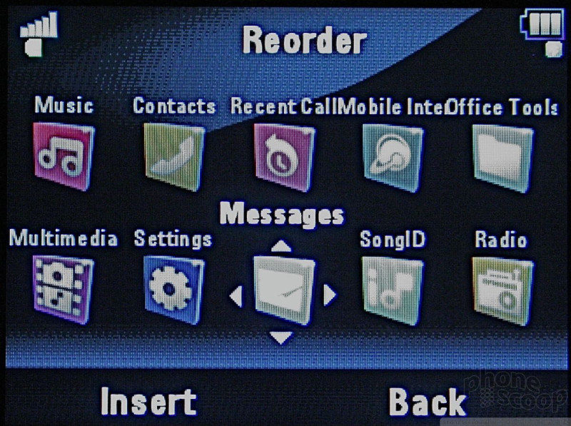
The Main Menu consists a row of tiny function icons arrayed in row along the bottom of the screen, with a larger version of the icon in the middle of the screen along with the item's name. You could try to move across them with the scroll wheel, but using the one-by-one left-right toggle was far easier and infinitely more precise. You can change this default arrangement into more traditional icon grid or list views, which I suggest.
Since the primary function of the E8 is music, the Music icon is the first icon on the left, followed by Contacts, Messages, Mobile Internet, Office Tools, Multimedia, Settings, Recent Calls, SongID, Radio.
Sub menus are the usual numbered lists, boring but thankfully simple. The selected choice is highlighted in bolder and larger text.
The D-pad navigation button also provides programmable direct application access.
All menus are old-school white on black with red highlights, which makes everything super easy to read regardless of the ambient light. I hope this is a trend.

 CES 2008
 Hands On with the Motorola edge (2022)
 Snapdragon 8 Gen 2 Redefines AI in Flagship Phones
 Android Gains Smarter Auto-Rotate and Long Screenshots
 Motorola Brings moto g100 to US With Incomplete Network Support
 Motorola ROKR E8