Review: LG Glimmer
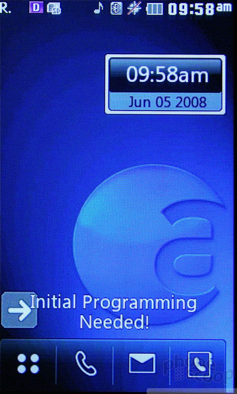
The menu system on the LG Glimmer is not all that different from the one seen on the LG Voyager. The main screen holds four icons along the bottom, for the main menu, phone, messaging menu and contacts.
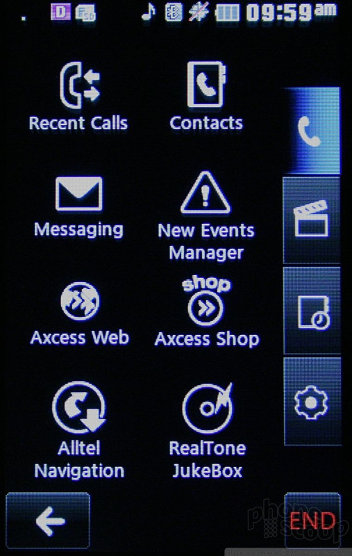
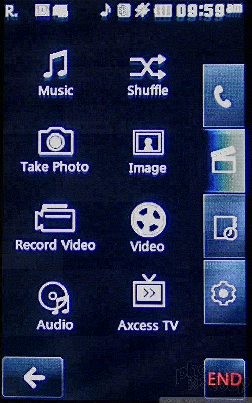
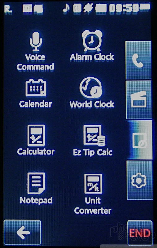
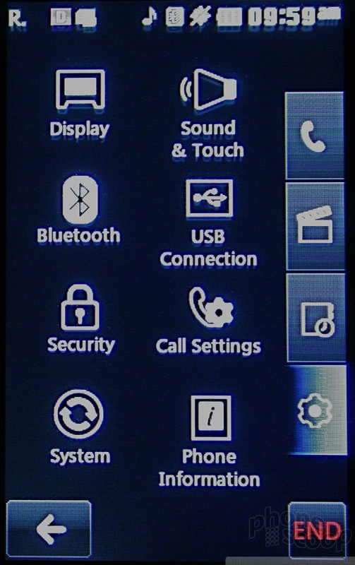
Pressing the main menu button, which falls all the way to the left, brings up the vertical tabbed menu that is almost identical the Voyager. There are four tabs that run along the right side of the screen. The first is for phone, messaging and browsing applications. The second is all your media, music and and content. The third stores all the phone's tools, such as the clock and calculator, and the tab at the bottom accesses the Glimmer's settings menu. There are eight menu items found in each of these tabs.
Because the lack of a D-pad forces you to touch what you want, I found navigating the Glimmer's menus to be a breeze. The icons are large enough--and separated enough--that it is unlikely you will fat-finger the wrong icon.
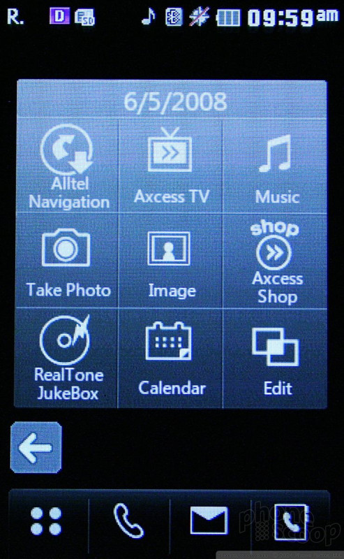
There's also a Quick Menu that is accessible from the home screen by tapping a little arrow above the phone icon. This pulls up a nine-item grid with things such as "take a picture," etc. This menu is customizable and can shorten the number of steps to reach certain actions.
Because the Glimmer sticks to LG's menu system, it isn't complicated by adding too much of Alltel's proprietary menu stuff. This means it is less schizophrenic than other LG models, such as the Voyager, that combine both manufacturer and carrier menu styles. Everything is easily accessed with no futzing about.
 CTIA 2008
 iPhone 14 Plus Offers a Big Screen For Less
 Qualcomm Taps Iridium for Satellite Connectivity
 New Asus Phone for Snapdragon Fans Showcases Qualcomm Tech
 Samsung Updates Foldables with Water Resistance, S Pen
 LG Glimmer / UX-830 / Vantage / Spyder