MWC 2008
Feb 11, 2008, 1:03 AM by Eric M. Zeman and Rich Brome
updated Feb 13, 2008, 9:48 AM
On the scene at Mobile World Congress. Hands-On with new Samsung finger-touch phones, Modu, Google Android, S60 3.2, S60 Touch, plus new phones from Sony Ericsson, Nokia, LG, and more.
Part 1
SE: smartphones
Sony Ericsson pulled out all the stops at this year's show. Most of their new phones were major announcements, and there were a lot of them.
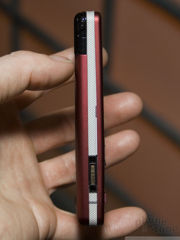
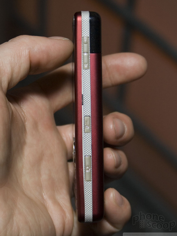
The G-series is all-new for Sony Ericsson. It represents an interesting direction for Sony Ericsson and the UIQ platform these phones use.
First, these phones mark the long-promised move of UIQ into Sony Ericsson's mainstream consumer phones. These phones look and work like normal bar-style phones with normal keypads, unlike SE's past UIQ smartphones, which were more specialty devices.
Second, SE has added support for finger-touch navigation in a few key areas. It's not quite on the level of the iPhone or LG's Prada and Viewty, but it's a decent first step for UIQ, a platform that has sometimes been slow to evolve.
The UI has a top layer that can be operated completely with your fingers. Much like the easy-to-use UI that sits on top of Windows Mobile on T-Mobile's Shadow, this new finger-touch UI on the Sony Ericsson's G-series only goes one or two levels deep. If you want to do anything beyond the basics, you're knee-deep in the traditonal UIQ interface.
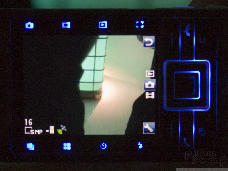
There are some exceptions: the camera and gallery applications have been tuned for finger use, for example. There's also a new "notes" application that emulates sticky notes, essentially. You'd typically use the stylus to create them and you can toggle between drawing and handwriting recognition modes. It's a neat app, although having to break out the stylus feels like a step backward, since smartphone technology in general seems to be moving decidedly away from stylus input.
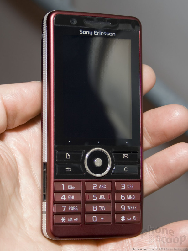
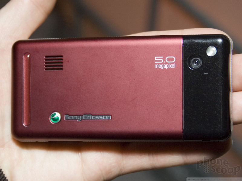
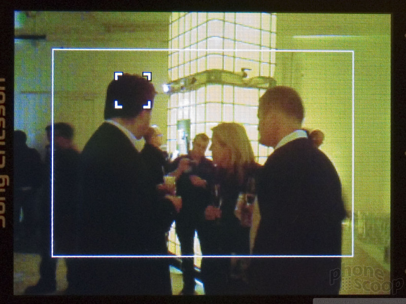
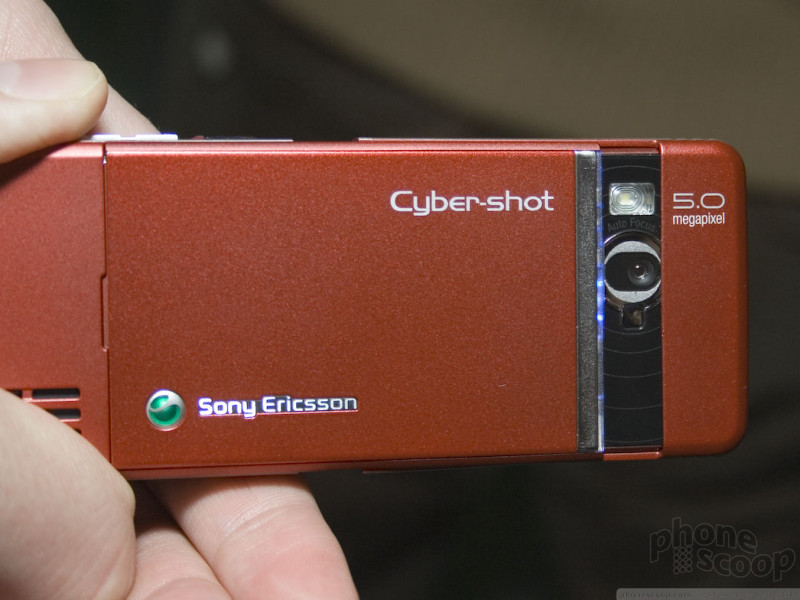
The G900 is just like the G700, but steps up from a 3.2 megapixel camera to an auto-focus 5 megapixel unit. The G900 also has a really neat feature that lets you touch the part of the scene you want the auto-focus lens to focus on.
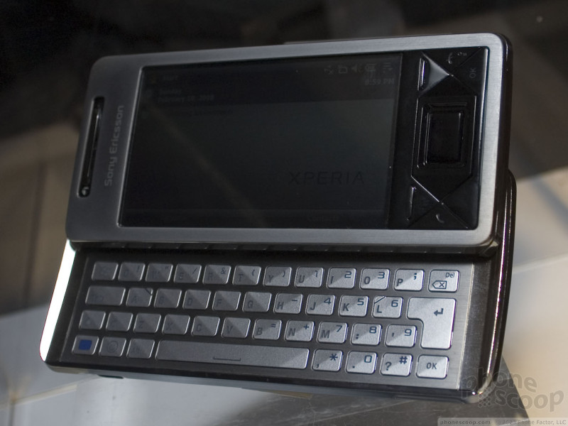
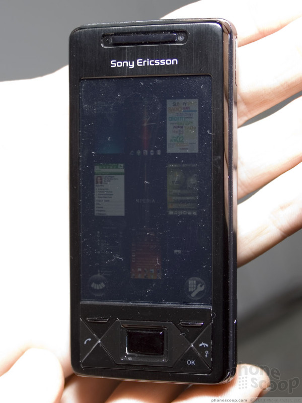
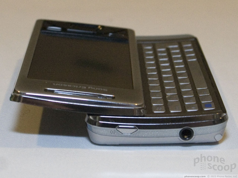
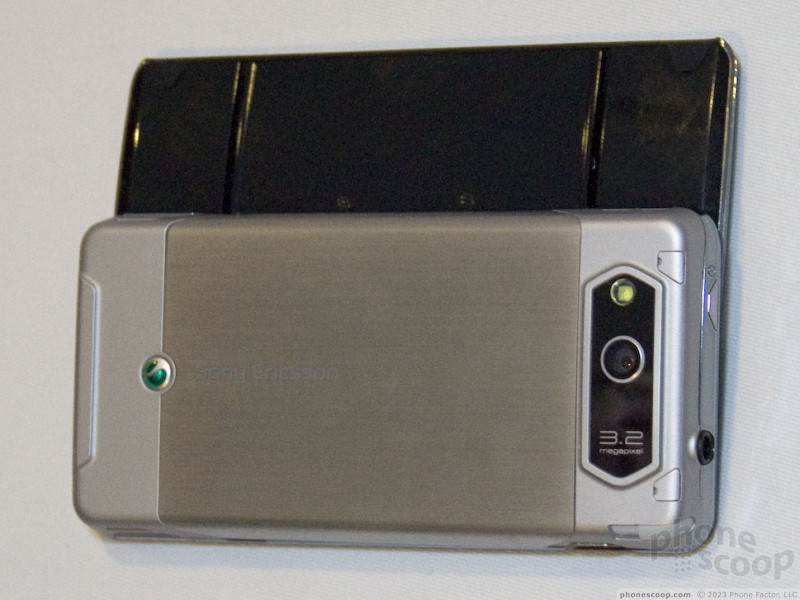
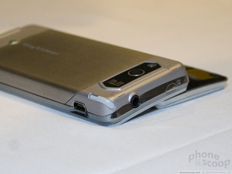
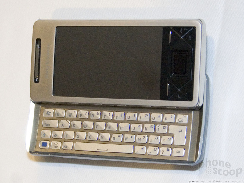
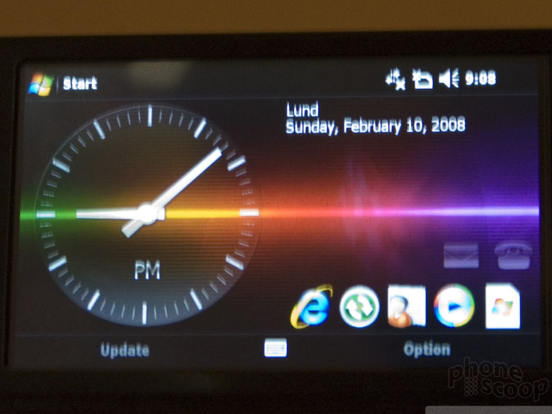
Last but certainly not least is the Xperia X1, Sony Ericsson's first Windows Mobile phone. The X1 is the first in a series of Xperia devices from the company.
There have been rumors of a Windows Mobile phone from Sony Ericsson in recent weeks, but most of us in the industry took them with a grain of salt, since Sony Ericsson has always been so closely tied the competing UIQ platform that the idea of a Windows Mobile phone from SE seemed almost... blasphemous.
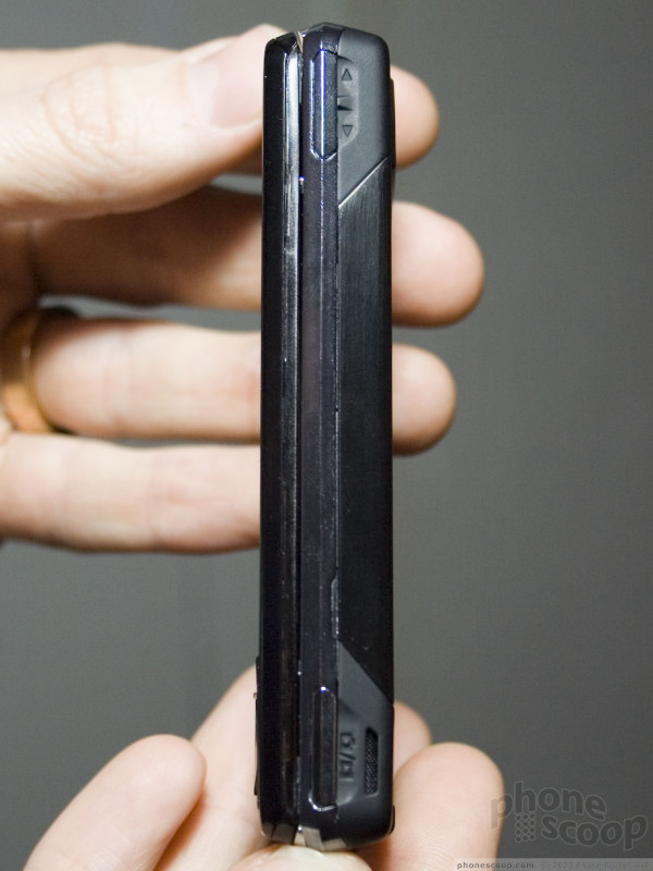
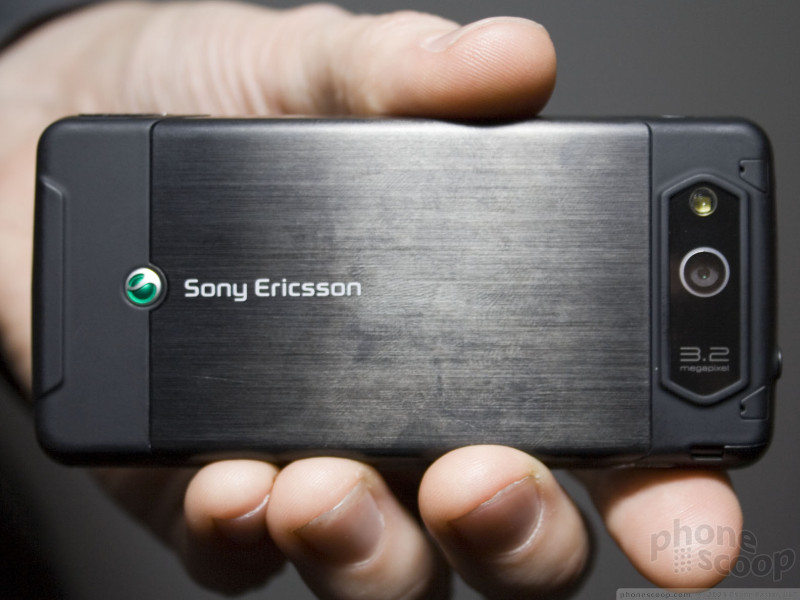
The X1 is no "toe in the water", either. Sony Ericsson is diving right in and making their first Windows Mobile device a powerhouse that puts even most everything-but-the-kitchen-sink HTC devices to shame. The impressive list of features includes quad-band GSM, quad-band 3G with HSDPA (850/1700/1900/2100 MHz), 3-inch WVGA touch screen (800 x 480 pixels), GPS, Wi-Fi, and all of the standard features you'd expect like stereo Bluetooth, microSD memory card slot, etc. The camera is 3.2 megapixel with auto-focus, and it can record VGA video at 30 fps. An optical joystick also provides an alternative to the stylus for web browsing.
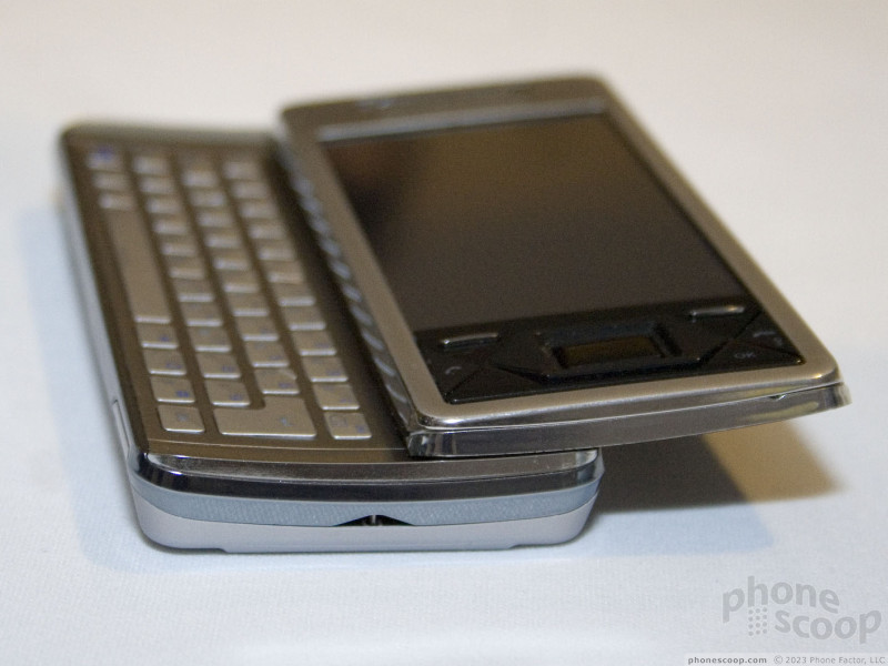
The design is slick, with metal components and a QWERTY keyboard that slides out in an "arc" motion, so the display is tilted up slightly when using the keyboard. It's not tiny, but it's actually surprisingly small for what's on board. In terms of size, it will compete very well against phones like the Nokia E90 and Tilt from HTC.
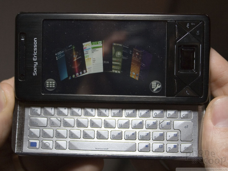
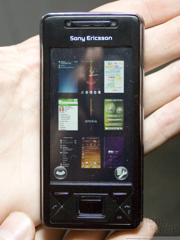
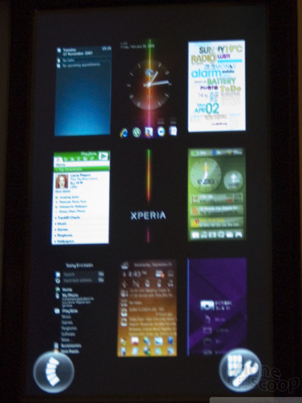
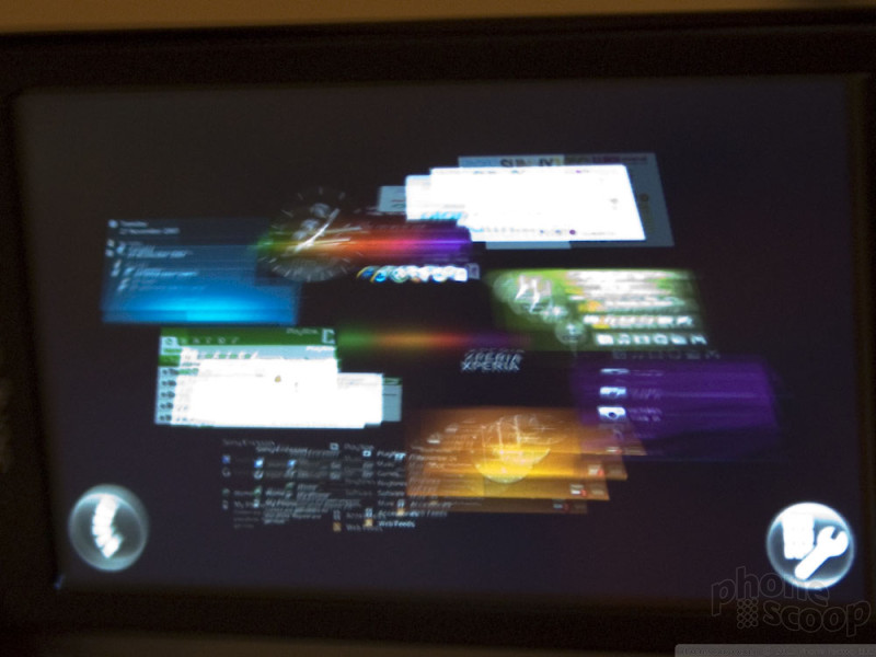
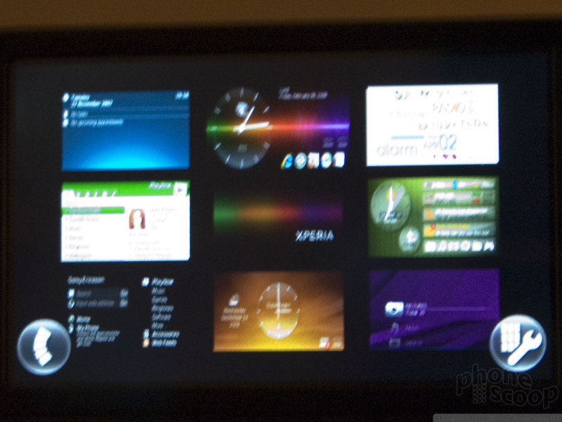
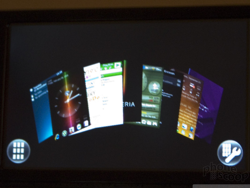
Sony Ericsson tried very hard to tout the "Xperia Panels" feature. In fact, it's the only part of the interface they would let anyone look at on the demo units.
The Xperia Panels feature looks neat enough, although it's not really clear what it does, exactly. Every time we asked a rep about specifics, we got different answers. They were decidedly shady about it.
The basic concept is that you can have up to 100 different custom "panels" - with nine active at any one time - that are each a shortcut to a different "experience", such as email or music.
What those "experiences" actually are is less clear, however.
One rep explained it as a switcher for Today screens (interactive home screen themes). As the T-Mobile Shadow shows, home screens on top of Windows Mobile can be very powerful, so this is an interesting concept.
A different rep explained Xperia Panels as a "virtual desktop" feature, like "Spaces" in the new Mac OS X. Each panel would therefore be a separate instance of the Windows Mobile UI.
Yet a third rep described it more like simple shortcuts to your favorite applications and bookmarks.
I'm still not entirely sure what Xepria Panels are, and perhaps Sony Ericsson isn't sure yet, either.
It is pretty, though. It switches between vertical and landscape mode when you open or close the keyboard. A neat animation goes with that, and the orientation of the content in each little panel changes, too. There are both grid and fan options for viewing the panels.
Be sure to check out the video to see the sliding design and animated Xperia Panels graphics. You can also hear the SE rep say at the end that Windows Mobile is just "one of" the Xperia Panels. I don't think that's right, but then again I heard a lot of conflicting things about Xperia Panels that night.
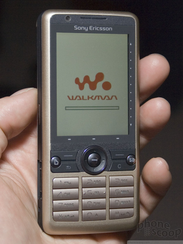
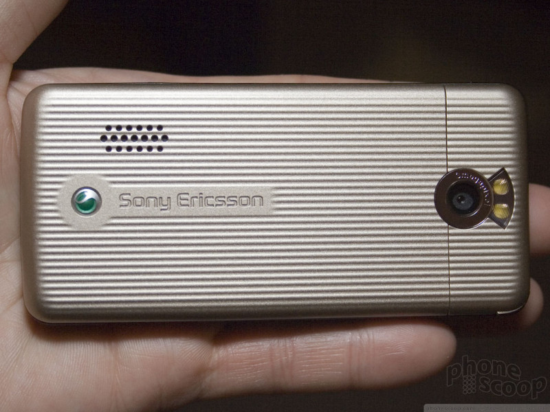
SE: Cyber-Shot & Walkman
Sony Ericsson is known for its Walkman and Cyber-Shot phones. Sony had new high-end models of each type. Starting with the Walkman series, we have the W980:
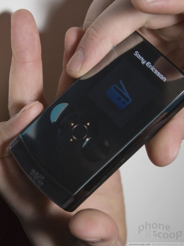
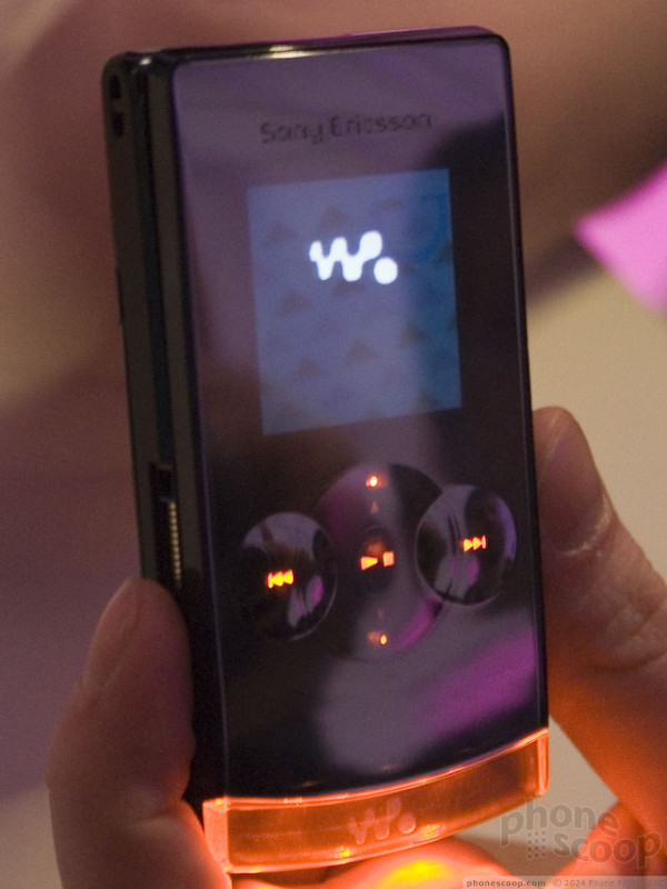
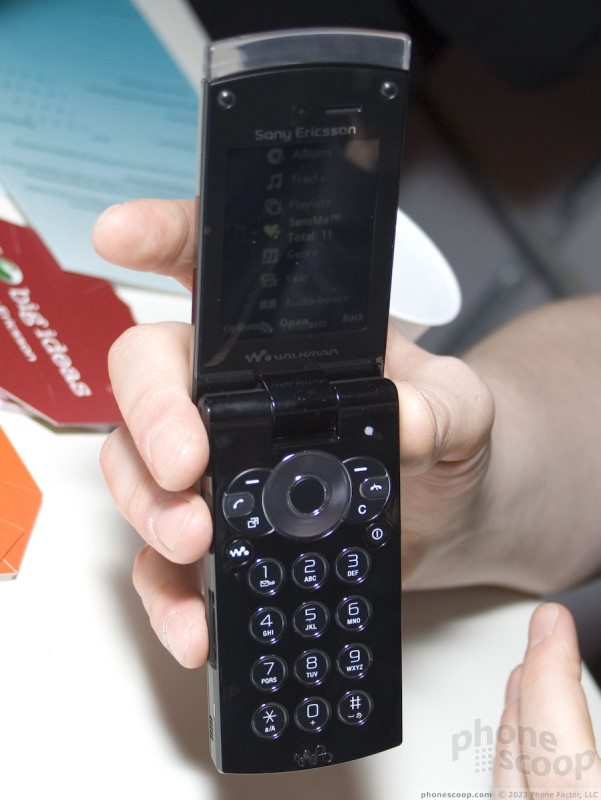
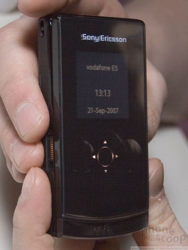
The W980 has a clamshell design with a few nifty twists. When closed, it has a mode designed to look like a standalone music player. This is definitely a trend in music phones for 2008. A large external display is part of that, and of course external music controls.
The external keys change between a d-pad and music keys when appropriate. Changing lit icons behind a glossy black touch surface - so that they disappear when not in use - is a major trend these days. Sony Ericsson joins Samsung, Nokia and Motorola in presenting music controls this way.
The W980 also has a unique glass edge along the bottom (or top, when open.) The glass lights up white at times, but orange for music. It can be set to pulse in sync with the music if you'd like a personal light show.
Continuing with music features, the W980 has a whopping 8 GB of internal memory.
It also rocks two-way FM radio. What I mean is it can receive FM radio and also transmit FM, so you can wirelessly listen to your MP3s through your car stereo, for example. What's more, unlike most phones that can tune into FM radio, the W980 doesn't require a wired headset to be connected (as an antenna) thanks to its built-in FM antenna. It can also receive RDS - meaning it will show song info sent out by local radio stations - plus it can even transmit RDS info, so you can see the name of the MP3 you're playing displayed on your car radio display.
The W980 also has QVGA display and 3 megapixel camera (fixed focus.) It has 3G for Europe, but it's also quad-band GSM/EDGE, so it will work fine in the States.
Check out the video to see the external controls and FM features in action:
Moving on to the Cyber-Shots:
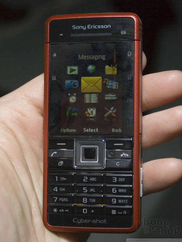
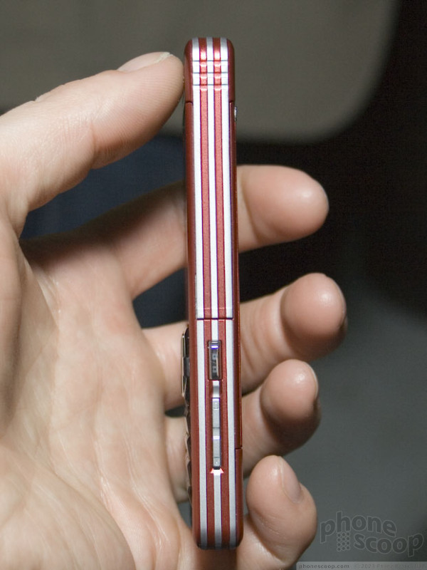
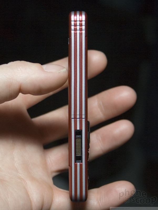
The C702 is a typical Sony Ericsson Cyber-Shot camera phone (meaning it has a darn good camera) but it does have a major twist, and that's the splash- and dust-resistant casing. You can use the C702 in the rain to your heart's content, or on the beach, for example.
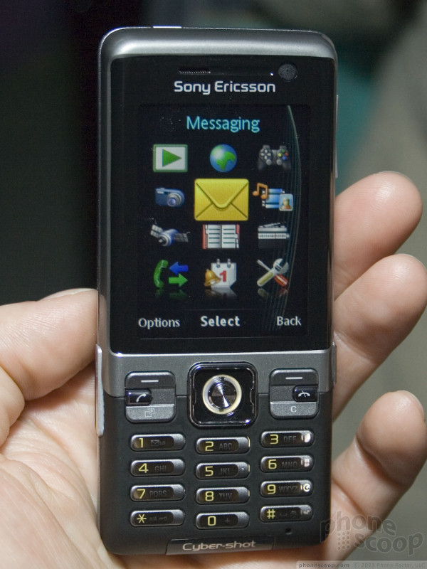
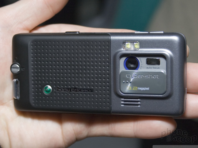
The C702's camera resolution is only 3.2 megapixel, but it is auto-focus, which makes a huge difference, and Sony Ericsson has a great reputation for camera quality, so only pixel-counters should be concerned that's it's not 5 megapixel.
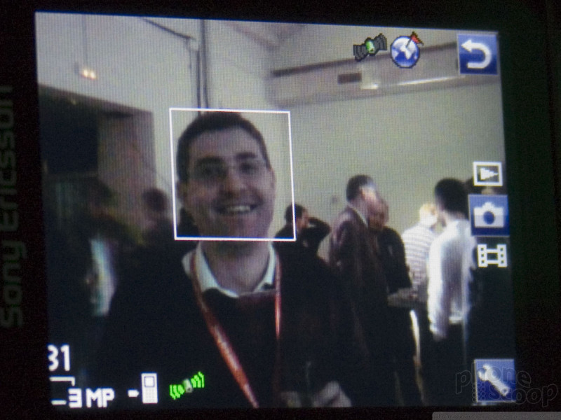
The C702 also has GPS, for geo-tagging your photos (as well as navigation, of course.) That means if you upload photos to a service that supports geo-tagging like Flickr, you can automatically see exactly where you took the photo on a map.
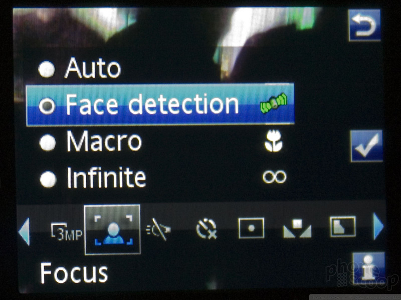
Another neat feature of the C702 is automatic face detection, which will find human faces in real time as you frame the shot, and make sure they are focused and well-exposed when you take the photo. Standalone cameras have had this for a while, but Sony Ericsson is among the first to bring this technology to phones.
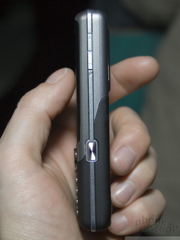
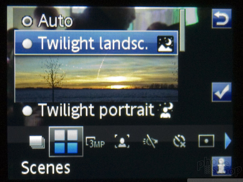
You'll see other familiar Cyber-Shot features on the C702, like a row of blue camera shortcut keys along the top edge in camera (normally the right column on the numeric keypad) just like the K850. There's also scene modes, like "twilight landscape" for getting a good shot quickly without adjusting a bunch of manual settings.
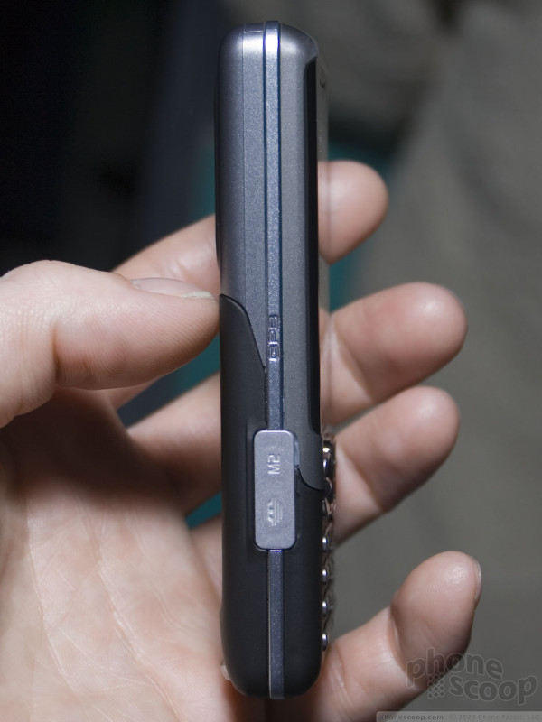
Like the W980, the C702 and C902 are 3G for Europe, but they have quad-band GSM/EDGE for use in the States as well. The C702 and C902 only have 160 MB of built-in memory, so there's an M2 (Memory Stick Micro) slot for adding more memory. Speaking of the C902...
The C902 might seem like an upgraded version of the C702, stepping up to a 5 megapixel camera, however there are some trade-offs. They're really just two different phones aimed at different kinds of people.
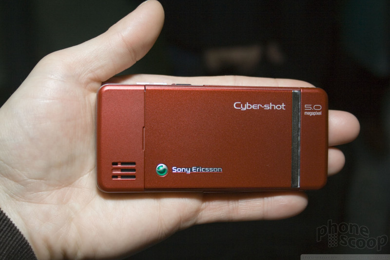
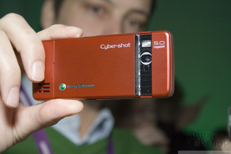
The C902 lacks GPS and the rugged casing, but steps up on camera resolution and ease of use for the camera. What makes it easier to use are two rows of touch keys just for camera modes - one above the display, and another below it.

Furthermore, the whole top half of the case acts like a giant lens cover. Camera mode is activated simply by holding it at the corners like you would any thin camera and tugging on the ends to slide it open. A second later a spiffy row of blue lights flash next to the lens, and you're ready to take a photo.
That neat sliding body is also very, very thin. It's one of the - if not THE - thinnest auto-focus 5 megapixel camera phones in the world. If you always wanted something like the K800 or K850 but couldn't stomach the thickness, the C902 may be your next phone. This is one of the first 5 megapixel camera phones we've seen that simply does not have a size penalty.
Check out the video to see the slide action, touch controls, and real-time face detection in action:
Samsung
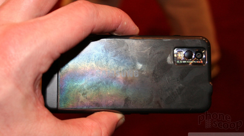
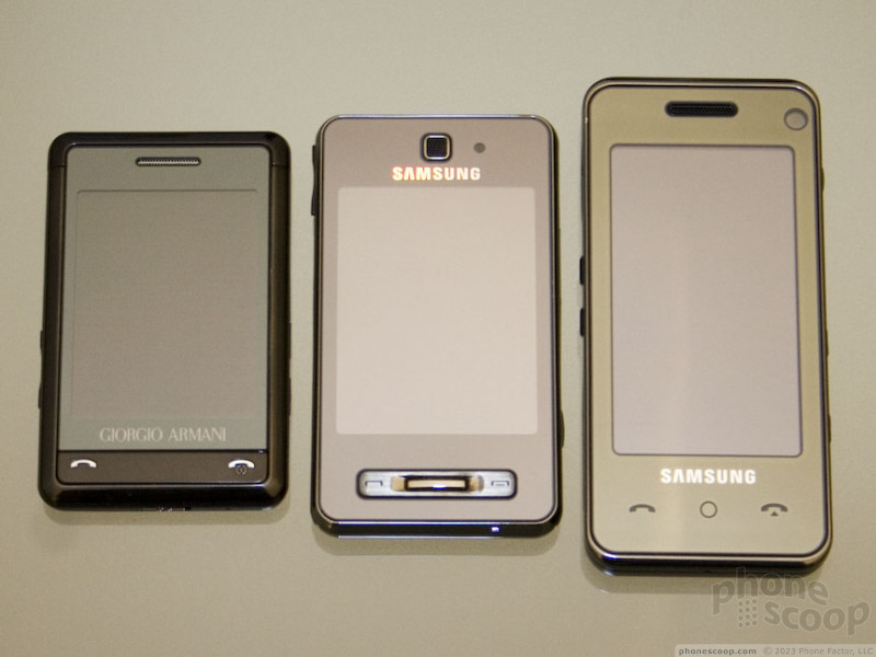
Samsung showed off two new phones before Mobile World Congress officially launched. The Soul, which was announced last week, and the F490, which was announced previously. We had a chance to spend some time with both.
Soul
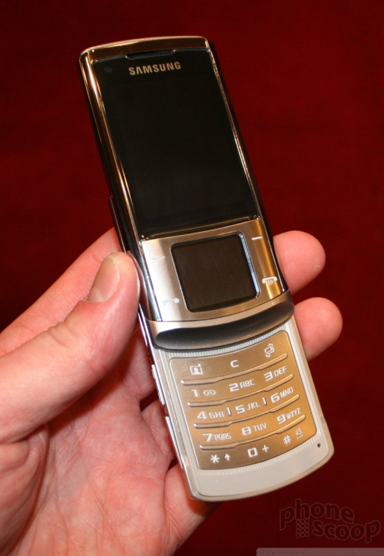
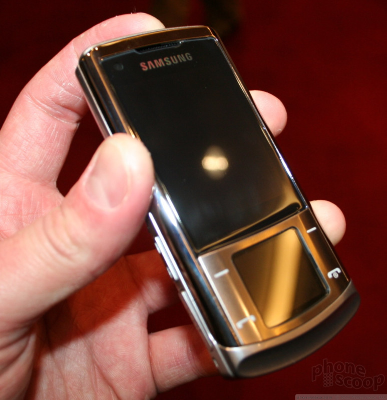
The Soul is one sleek phone. It has a gorgeous metal skin that covers the phone and feels great in your hand. It is smooth and comfortable to hold. It has a generous screen, and below the screen are four softkeys surrounding the morphing touchpad.
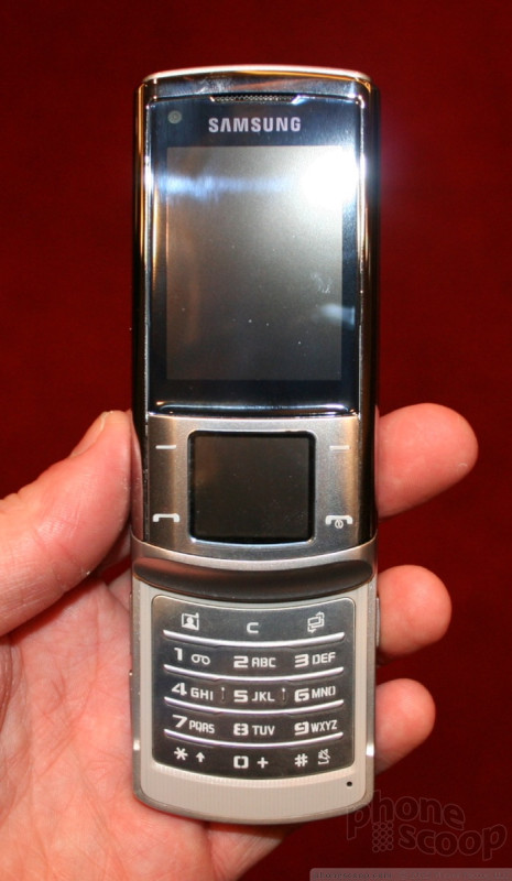
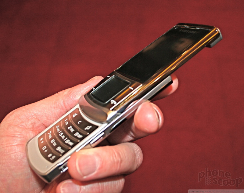
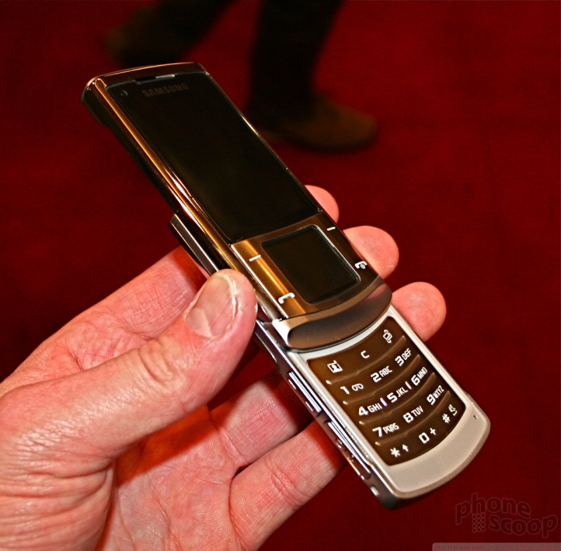
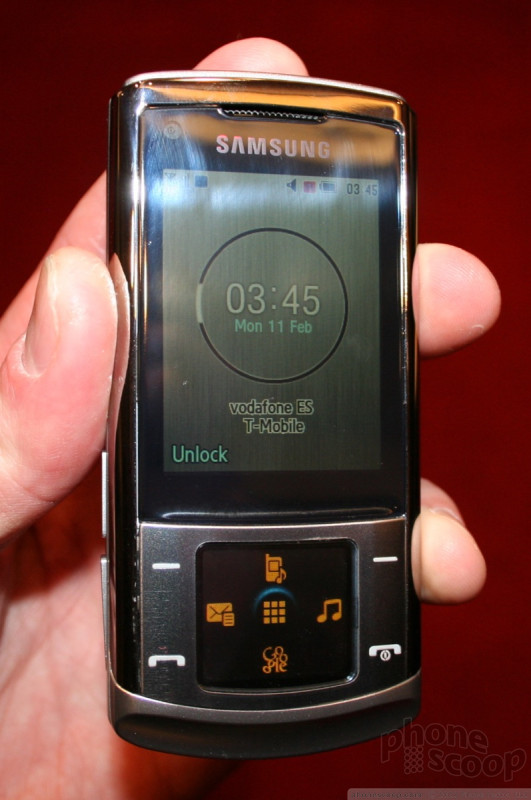
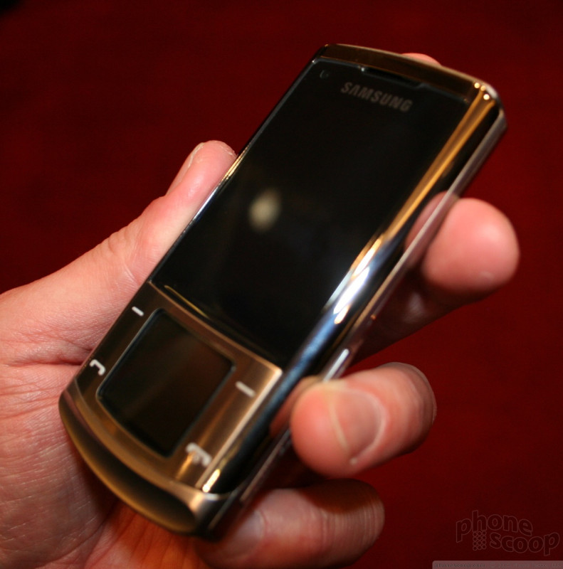
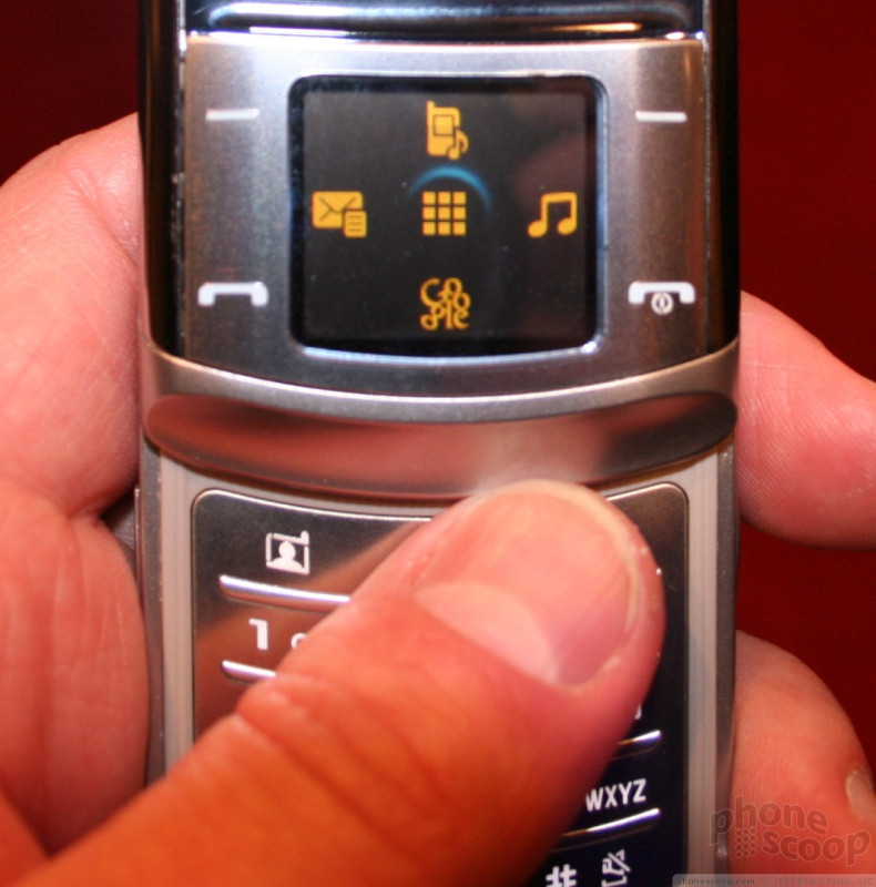

The four softkeys have good feedback and solid travel to let you know you've pressed them. They are spaced well apart from one another, so there's no mistaking which button you are using. In the center of these four keys is the touch capacitance control pad with haptic feedback. The navigation pad is about one inch by one inch square, so it is a bit small. Using it was natural enough, though, and the four directional arrows let you navigate the menus easily. When you switch from application to application, the icons on the navigation pad change accordingly. When you're in the camera application, the icons shift to camera-centric control buttons, and same goes for when you are in the music player and other applications. We found it intuitive and easy to use. The feedback from the haptics was good, and you definitely knew when you were interacting with the touch pad.
The slider mechanism felt solid and polished. Popping the phone open or closing it was natural and was very smooth. Samsung didn't say whether or not the phone we used was preproduction, but it was very well made. The spring assisted opening wasn't too powerful, nor was it too weak. It was just right.
With the phone open, you have access to the numeric keypad. The keypad on the Soul does not break any new ground for Samsung. It is very similar to the keypads on other Samsung models. It is essentially flat, with three horizontal ridges separating the rows of keys. These, plus the pimple of the 5 key, gave you more than enough physical cues to let you know where your fingers are on the keypad. All of the buttons had good travel and feedback. There was plenty of room on the keypad and your thumb never felt cramped when using it.
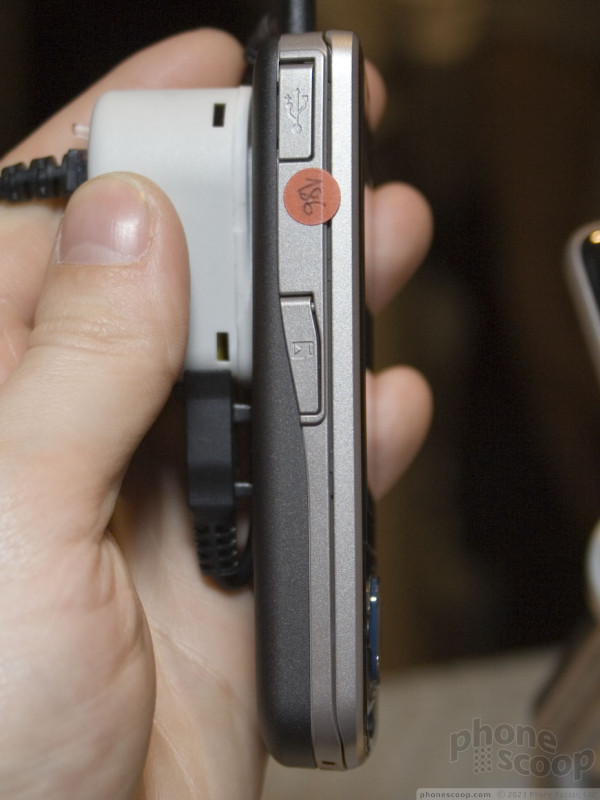
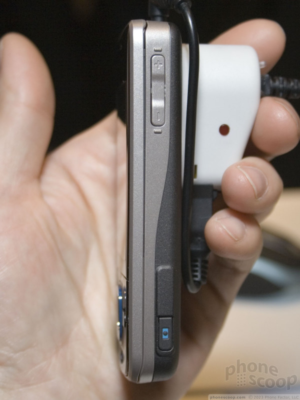
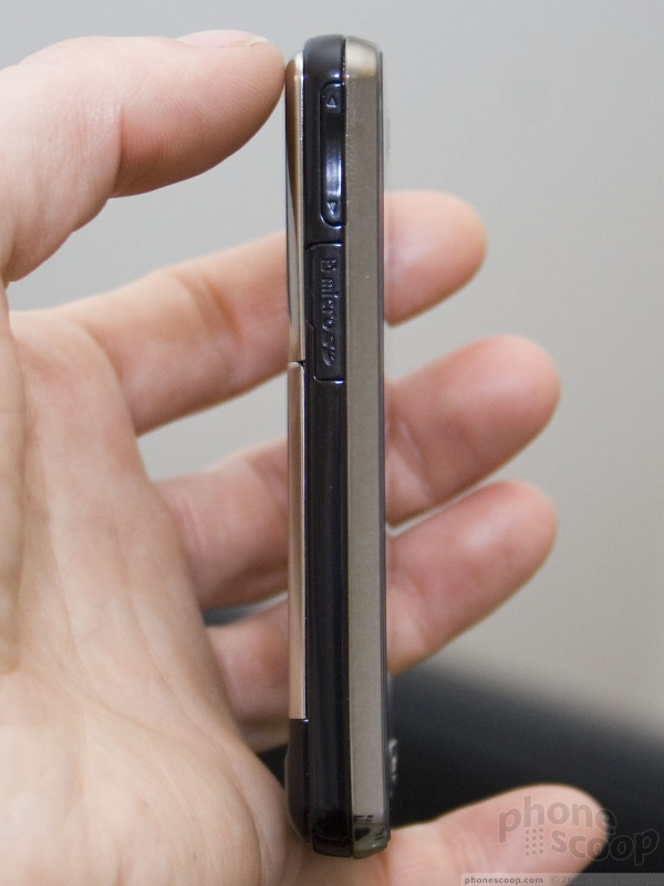
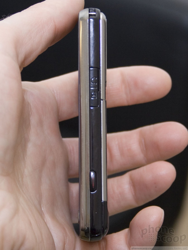
There were also some keys along both sides of the phone. The volume toggle on the left was a little on the small side, and we often raised the volume when we intended to lower it and vice versa. The hatch covering the power/accessory port was also on the left side. It was easy enough to dig open with your nail.
On the right side of the phone were two different keys. The bottom most key was the camera shutter release. It was small, but offered good feedback. Above it was an application key that was also small, and also offered good feedback. There was also a hatch for the microSD slot. It was not cumbersome to open it to access the slot.
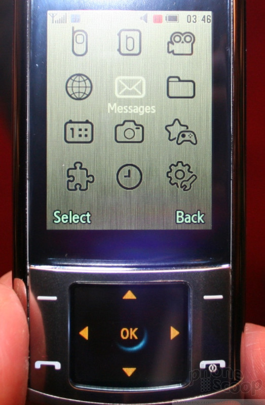
Using the interface of the phone was simple enough. The softkeys bring up the main menu, which is intuitive to use. We did find that moving the selector around sometimes took several presses of the touchpad, though. The execution of the touch functionality of the D-pad was not flawless and didn't automatically just work all the time. Multiple key presses were somewhat common.
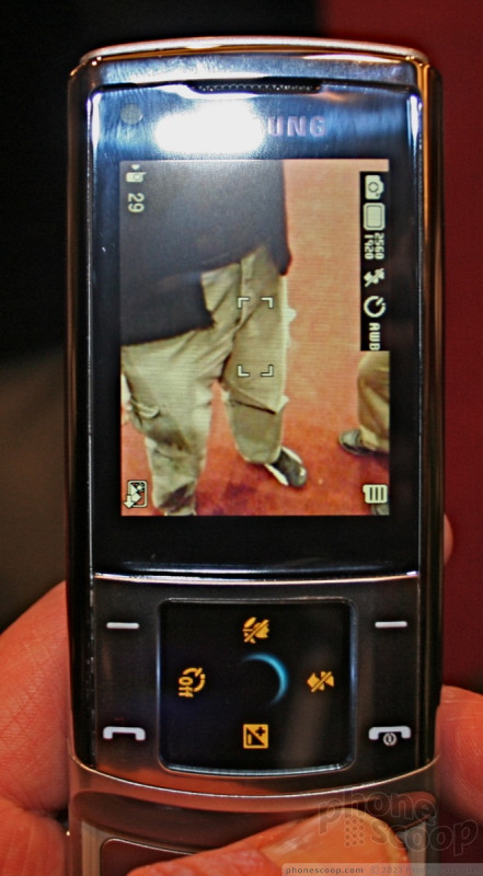
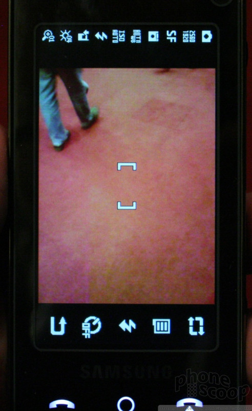
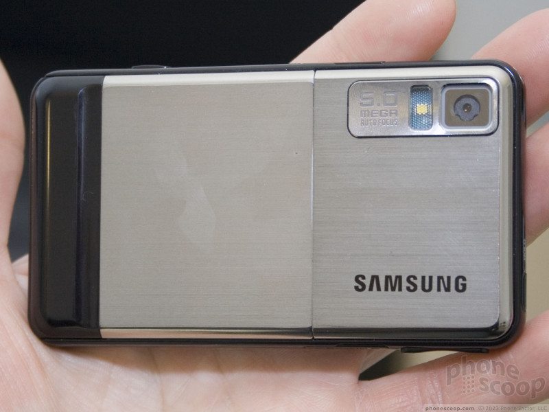
In all, the Soul is a solid contender. It offers many of the latest technologies, including stereo Bluetooth and a 5 megapixel camera with autofocus and face recognition. The camera launched quickly, had lots of customizable features, and took pictures almost immediately. We didn't get to listen to the Bang & Olufson-powered sound system.
Here is a short video preview of the Soul.
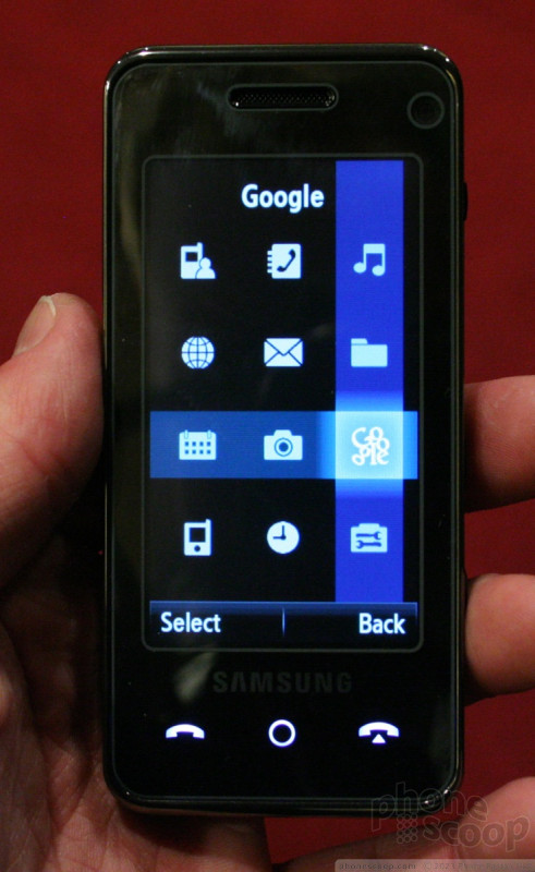
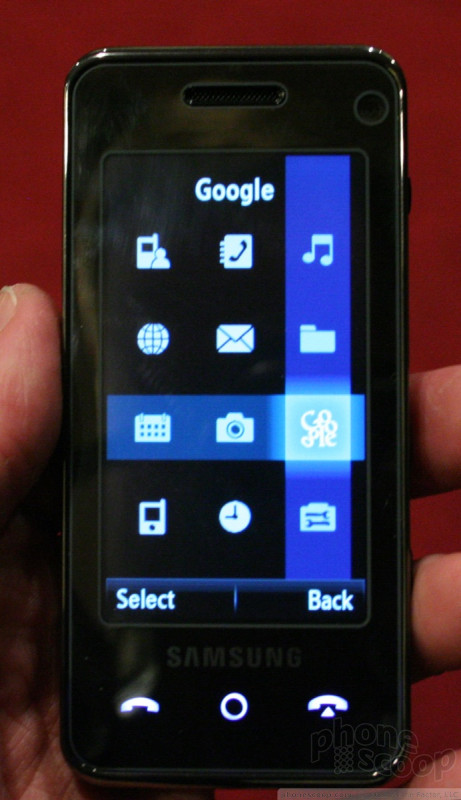
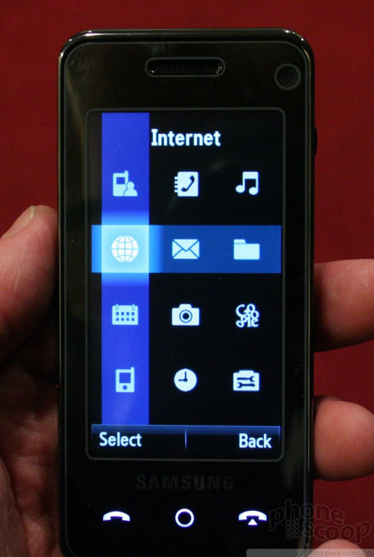
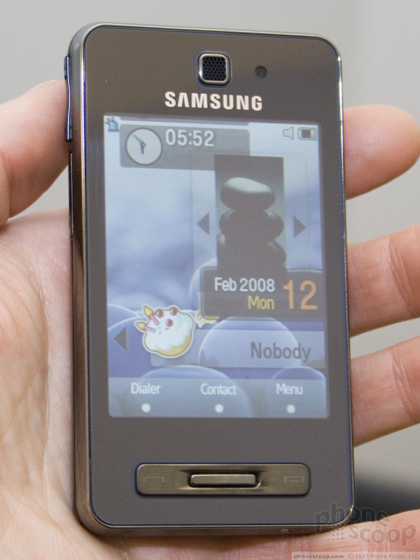
F490
Th F490 is a full touchscreen phone that uses Samsung's Croix user interface. It is a hair shorter and narrower than the iPhone, but is a bit thicker from front to back. It is very slim and slipping it into you hand or pocket is easy. It is fairly light weight and feels good in your hand.
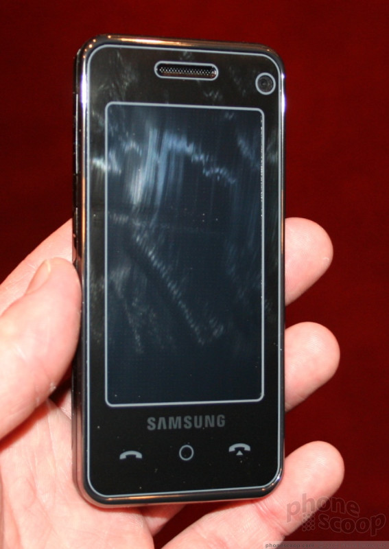
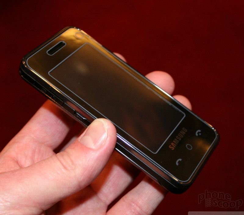
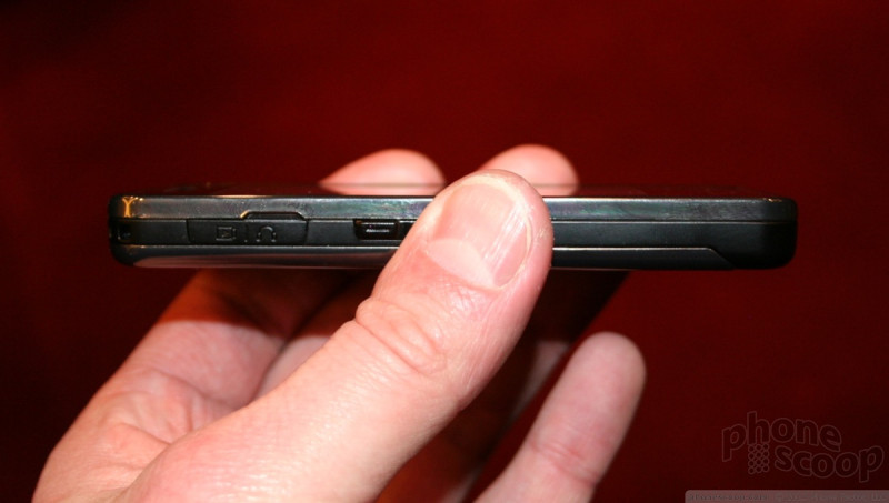
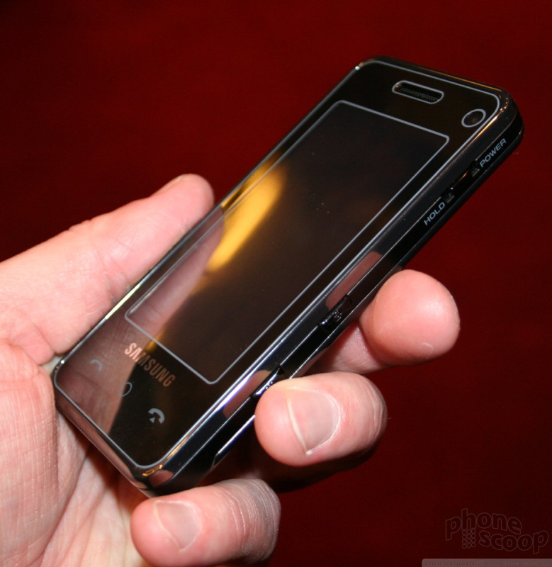
The only buttons on this phone are located on the sides, and are the volume toggle, application key, and lock switch. All of them were simple enough to find and use. The lock switch is spring-loaded, so you slide it and hold it for a second to lock or unlock the phone.
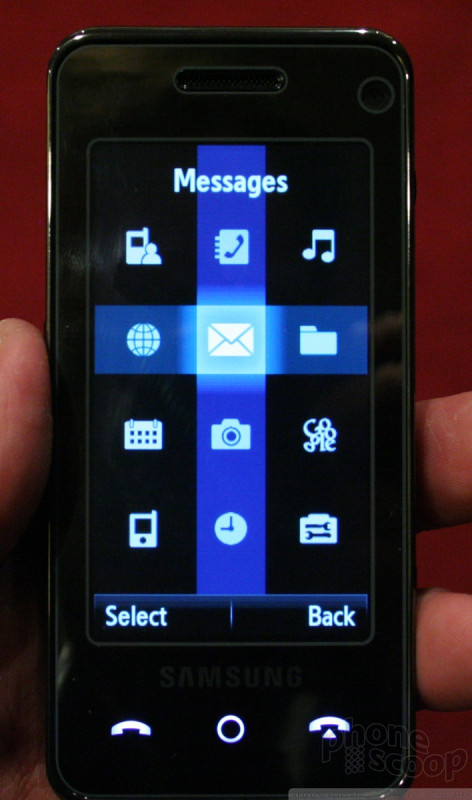
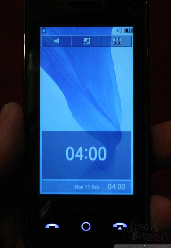
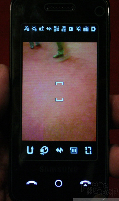
The main way you interact with this phone is the touchscreen interface. Croix is a black and white interface that is similar to, but not nearly as good as, the iPhone. You can slide your finger around the screen to the different selections, or simply press them firmly to open an application.
The speed of the UI was decent, and applications opened nearly immediately, though some were faster than others. The camera, for example, was a bit slow to open. Rather than displaying the graphical richness that the screen is capable of, the Croix UI is a simple affair. Opening most applications or folders brings up simple black and white lists. These menus get old after a while. Even though they are easy to figure out and help you find what you are looking for quickly, there's no pizzazz or fun in using the UI. It does get the job done, though, and most features of the phone are accessible with just one or two presses on the screen.
At the very bottom of the screen are three keys that remain constant no matter what. They are the send/end keys and the main menu key. Like the rest of the phone, these are software keys, and not physical keys. They stay the same even if you change applications. There is limited haptic feedback when you use the screen. It is there, but not as pronounced as on the Soul.
The F490 is a good alternative to the iPhone, and while it has some features that surpass the iPhone (such as the 5 megapixel camera) it is not as fun to use.
Here is a short video preview of the F490.
Part 2
Nokia Nseries
Nokia's new Nseries phones continue the Nseries tradition of throwing everything but the kitchen sink into really high-end phones and pushing the boundaries of phone technology. The competition in this segment of the market is much stronger this year, but Nokia is still holding its own for the most part.
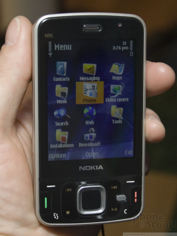
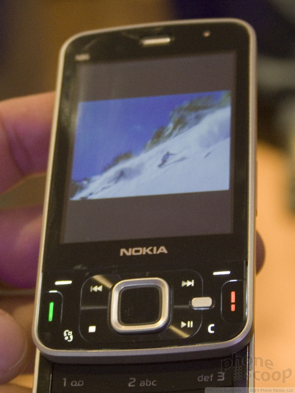
The N96 is the new flagship successor to the wildly popular N95.
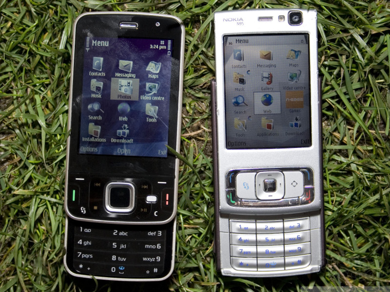
The N96 is a tad wider and taller, but also thinner, which makes it feel like a wash for the most part. The feel is generally nice.
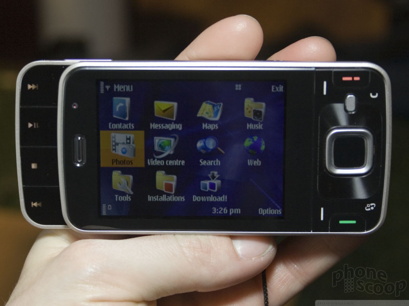
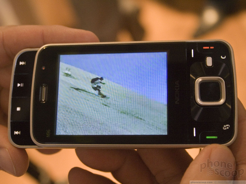
The display is massive. It rivals many personal media players. If you're the kind of person that carries a PSP for video plus a phone, but would rather carry one device, the N96 might be for you. The video experience is impressive.
The glossy black design with disappearing media keys might lead you to think these are touch keys, but they're not. All of the keys on both the N96 and N78 are physical keys. The black plastic has just enough flex to allow the keys to be pressed easily. You might expect the keys to be difficult to feel out and tell apart on the smooth surface, and to an extent you'd be right, but the keys are carefully arranged and spaced so that it's not nearly as tricky as it looks.
The media keys around the d-pad disappear when they're not needed, and also when you slide the top part down to put the phone in landscape mode and the four dedicated landscape media keys are revealed. That way you have dedicated media keys for each orientation, so they're always available when you need them, and always right-side-up.
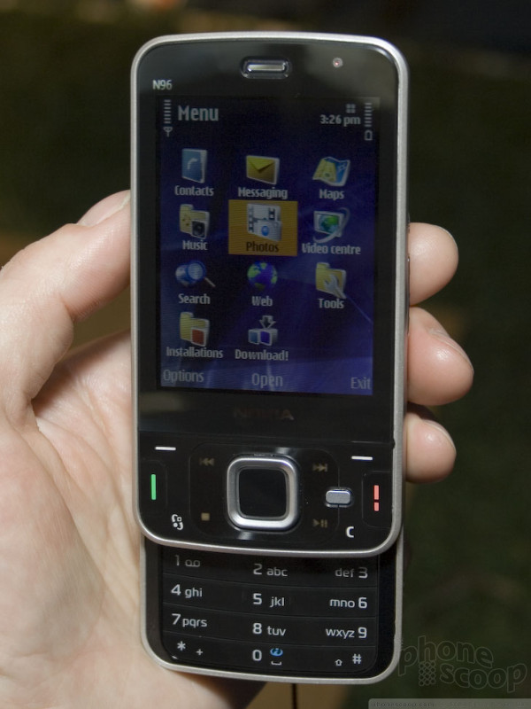
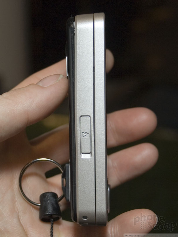
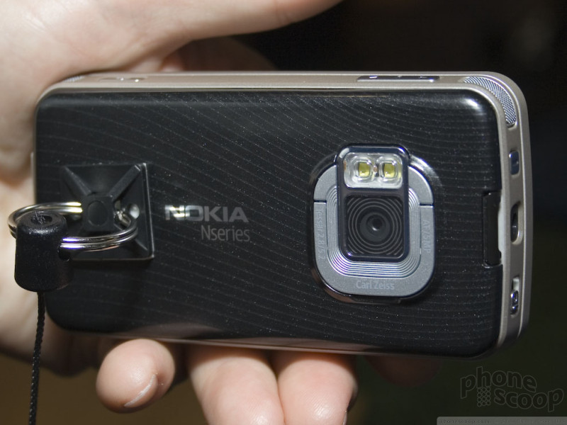
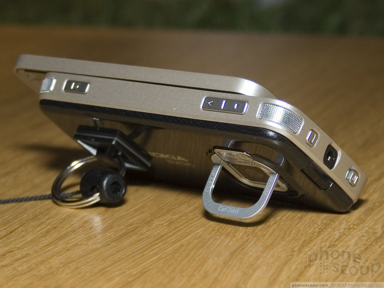
One clever innovation is the kick-stand that swings out from around the camera lens on the back, allowing you to set the phone on a table tilted for watching video.
The N96 is a great video machine. Eurpeans will be delighted with built-in DVB-H live TV support. That doesn't mean much in the States, and we were told not to hold our breath for a MediaFLO edition, but 16 GB of built-in memory means plenty of room to store high-quality video. Unlike the various N95 variants, you aren't forced to sacrifice a memory card slot, either. You can expand the 16 GB up to 24 GB with a microSD card at any time. Rounding out the improved media experience are stereo speakers intelligently placed at the top two corners in landscape orientation. That makes a lot more sense than the N95, where the speakers were designed for the video-unfriendly vertical orientation.
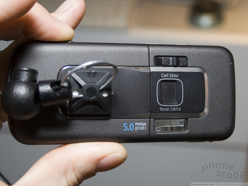
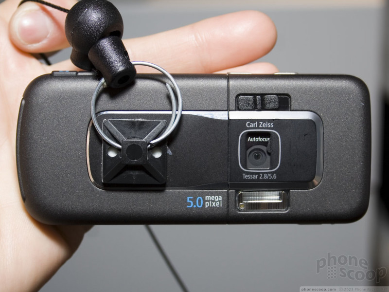
Other features carry over from the N95 (8GB edition) with few changes, such as the 5 megapixel camera with Carl Zeiss lens, 2.8 inch QVGA display, GPS, and 3.5 mm headphone jack.
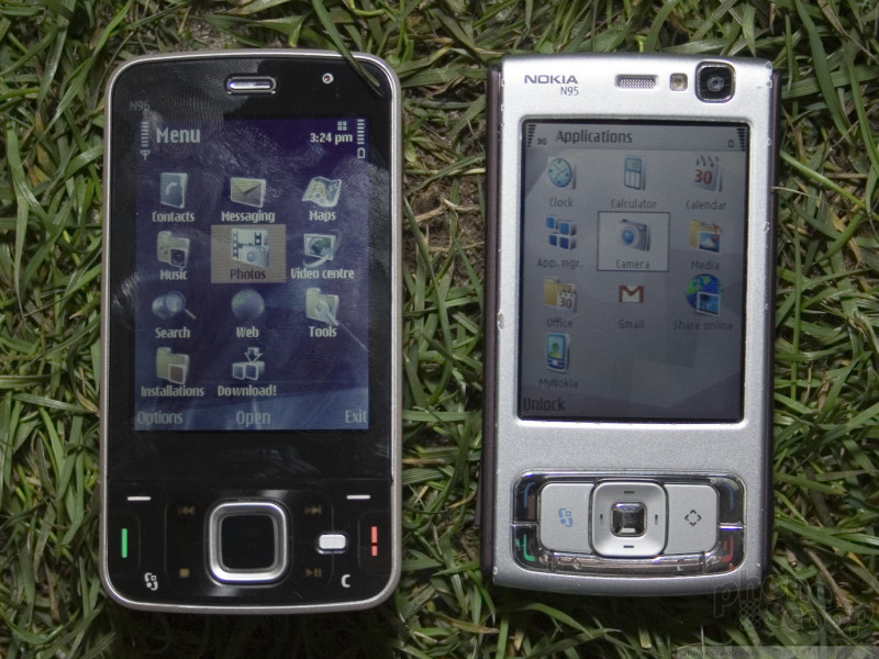
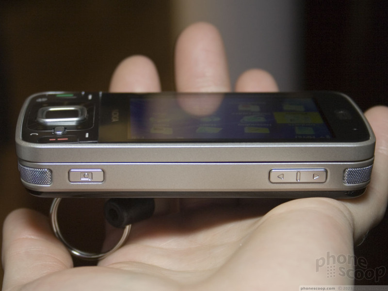
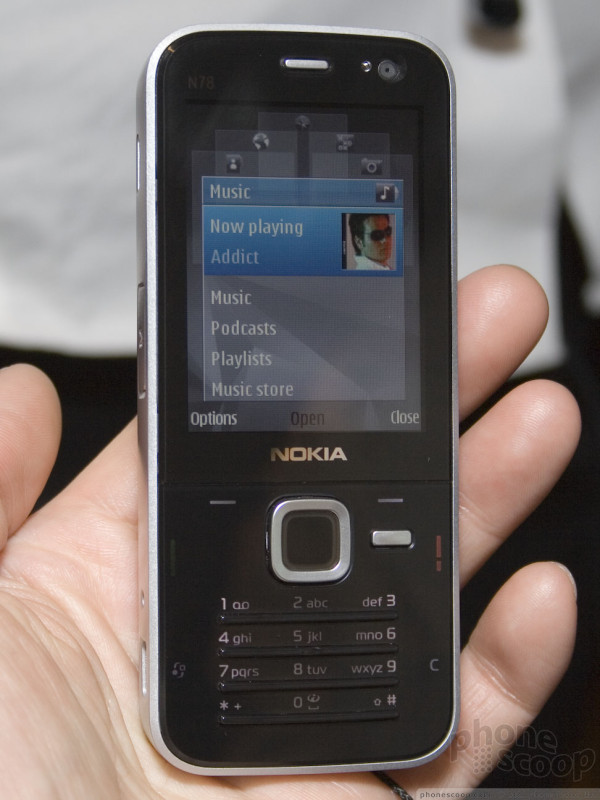
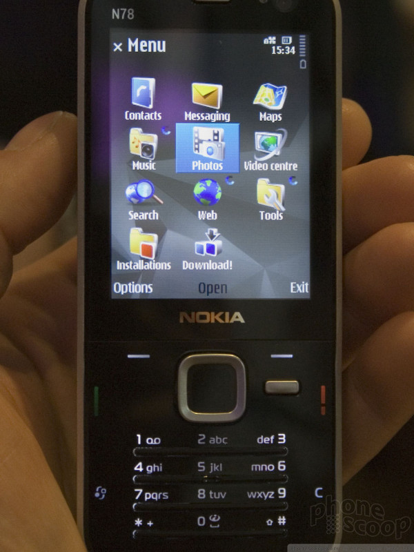
The N78 is the logical successor to the N73. It's wrapped in the same slick styling as the N96, and the two phones also share S60 3rd Edition Feature Pack 2 (let's just call it S60 3.2 - more about this new version on the next page) and the latest version of Nokia's multimedia applications for Nseries phones. Pressing the little silver key next to the d-pad on either new Nseries phone takes you to the nifty animated "carousel" application with quick access to key functions of music, photos, maps, web, contacts, and more.
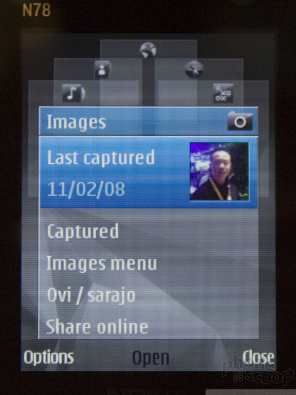
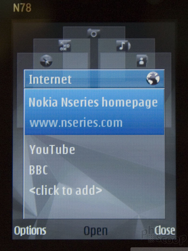
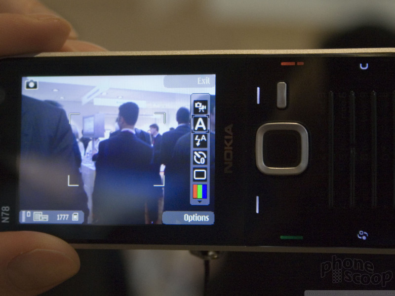
The N78 only has a 3 megapixel camera like the N73, but it is auto-focus and has a Carl Zeiss lens, so it's still at the high end of camera phone quality. You'll also find HSDPA and Wi-Fi data, plus GPS and a 3.5 mm headphone jack, in keeping with the "kitchen sink" philosophy of the Nseries. The GPS function includes geo-tagging of photos, and it's integrated with Nokia Maps 2.0, so you can simply select a photo you've taken, choose "Show on map" and see exactly where you took that photo. It's all automatic.
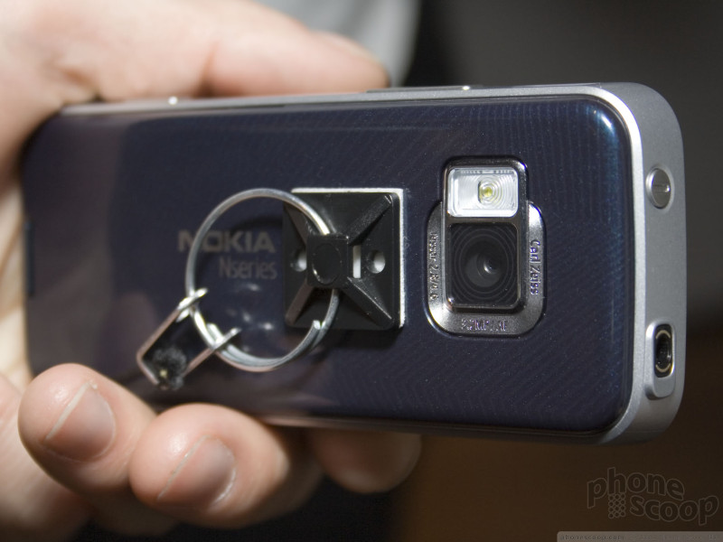
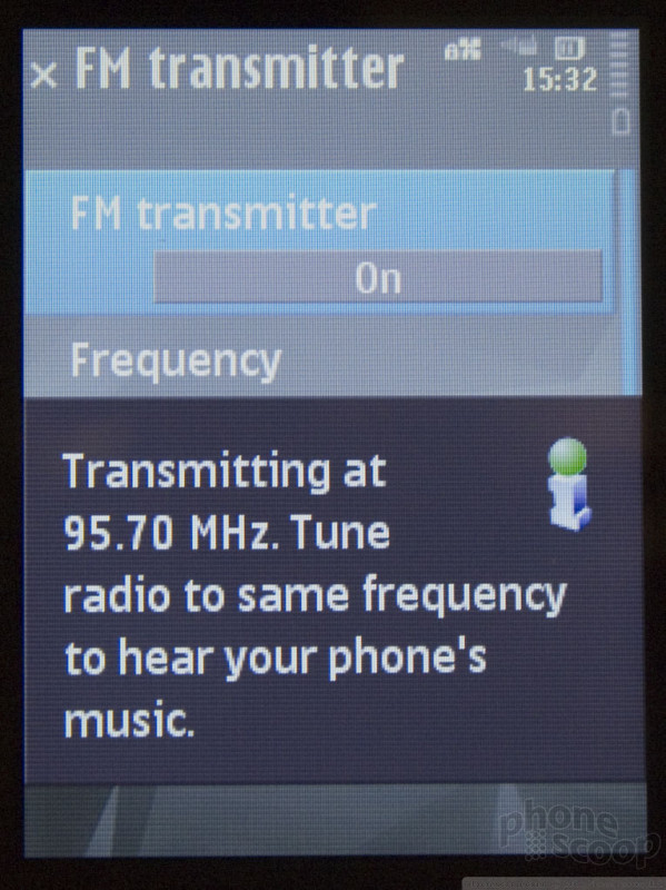
Some really unique features of the N78 (for a Nokia) include an FM transmitter and a touch scroll wheel integrated into the d-pad. You'd never know from looking at it, but you can glide your finger around the silver d-pad ring to scroll through any list. It's especially useful for large lists like photos, music, and even simple things like contacts. The gallery application, in particular, is optimized for this, and will switch between standard mode and a special high-speed arc mode depending on how fast you scroll. Be sure to check out the video to see it in action.
Here is a quick video preview of the N78:
The N78 also has keys that disappear, either when the phone is in standby or those particular keys are not needed. Note how in the photos, in camera mode the numbers keys almost disappear, and in standby mode the whole phone has a smooth, sleek look.
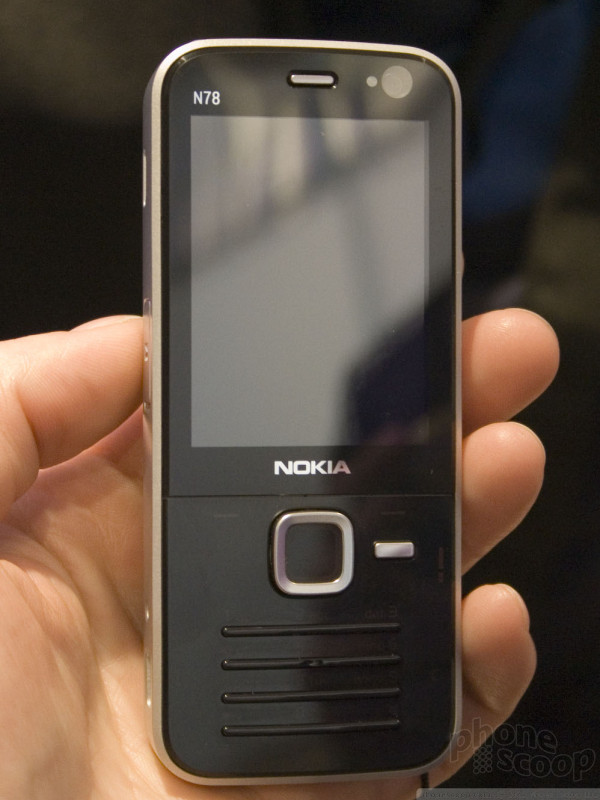
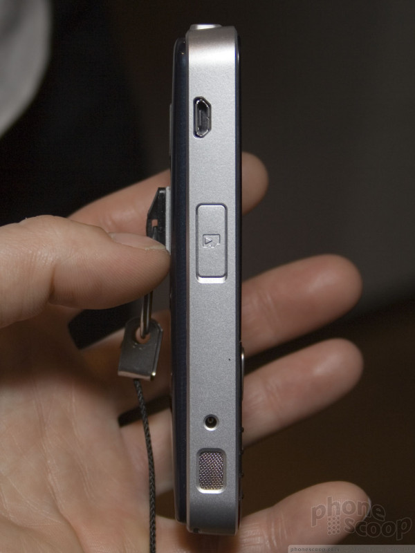
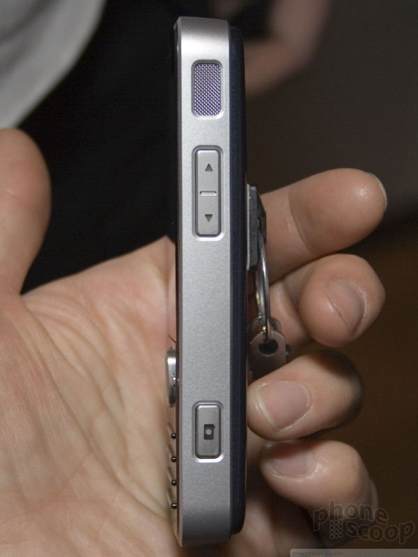
The N78 is fairly thin and surprisingly lightweight.
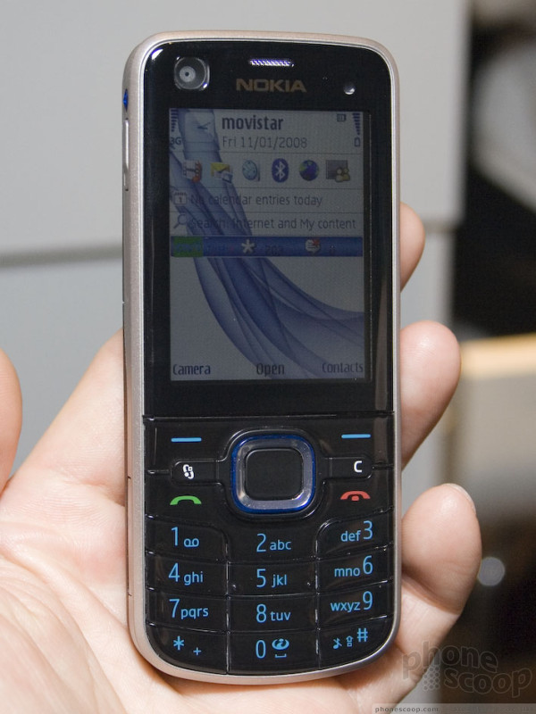
Nokia 6210 & 6220
All of Nokia's new phones announced this week feature the latest version of the S60 smartphone platform: "3rd Edition Feature Pack 2", or some in the industry would call it "S60 3.2" for short. In fact, a Nokia marketing executive admitted to us that the naming is cumbersome and they may switch to something simpler with the next major version.
Version 3.2 adds animated visual cues throughout the OS, such as a subtle zoom-in as an application opens - much like Vindows Vista - or a diagonal fade/wipe effect, depending on the phone and theme selected. Check out our 6220 (and N78) videos to see these in action.
Other improvements include unified SMS and MMS messaging. The center-select key can also function as a kind of third soft key in some areas now (much like Nokia's Series 40 phones) and the platform now has fully integrated support for widgets (web applications that can run locally on your phone and act like Java applications, etc.)
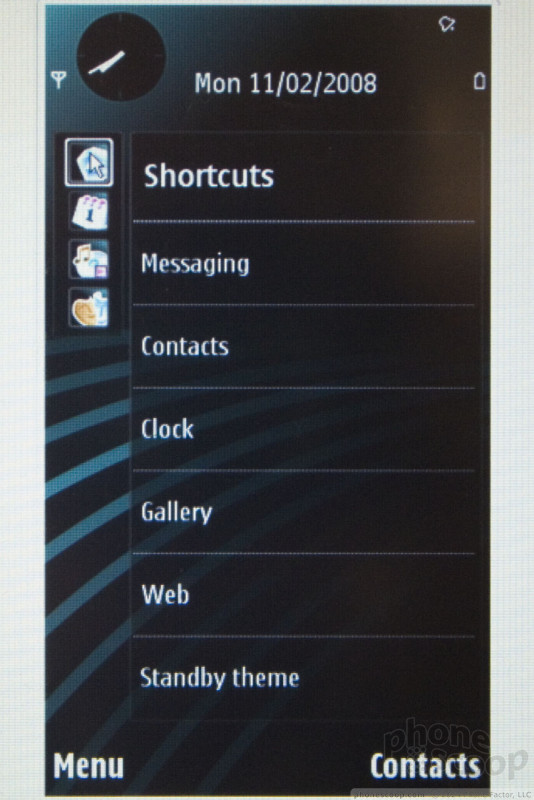
Switching between applications and multi-tasking has also been improved. Since that's a major feature that sets S60 apart from non-smartphones, they've made the app switcher much more prominent.
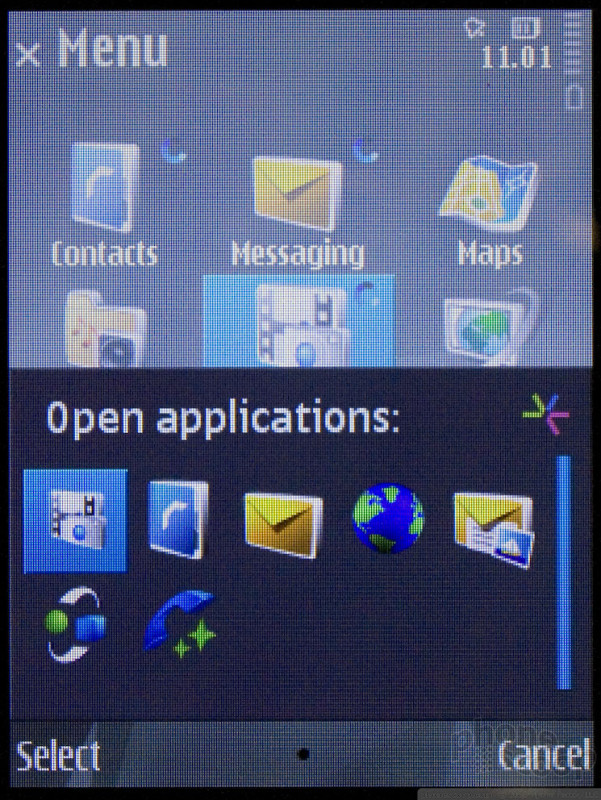
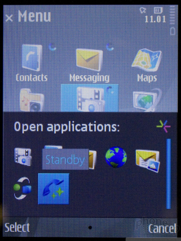
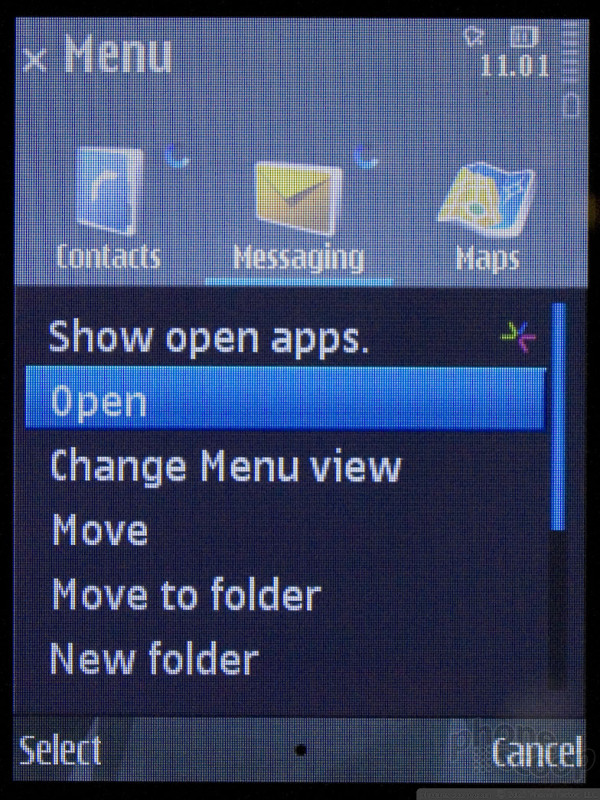
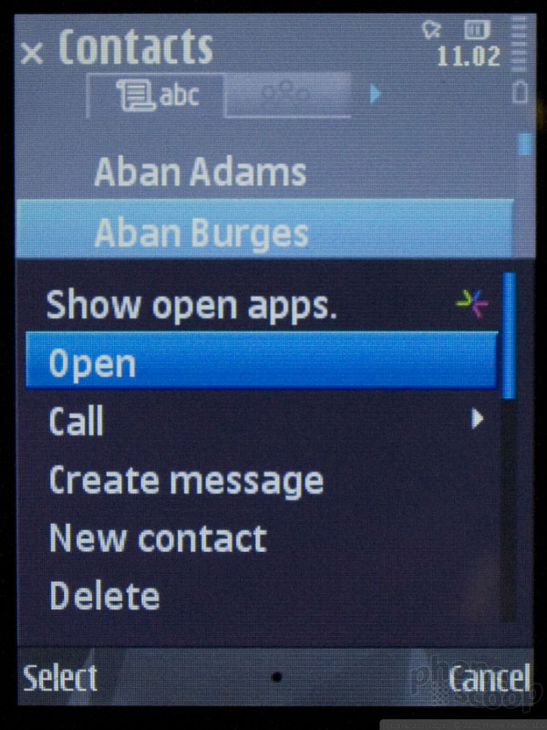
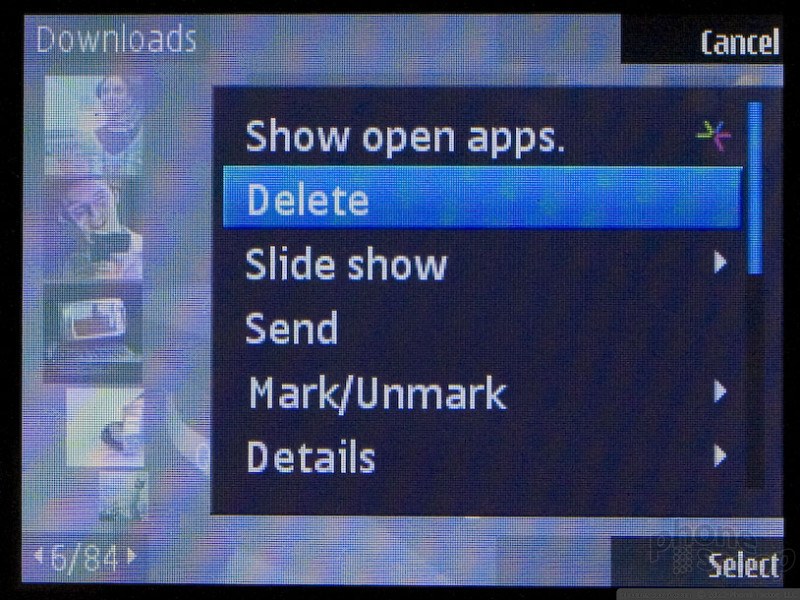
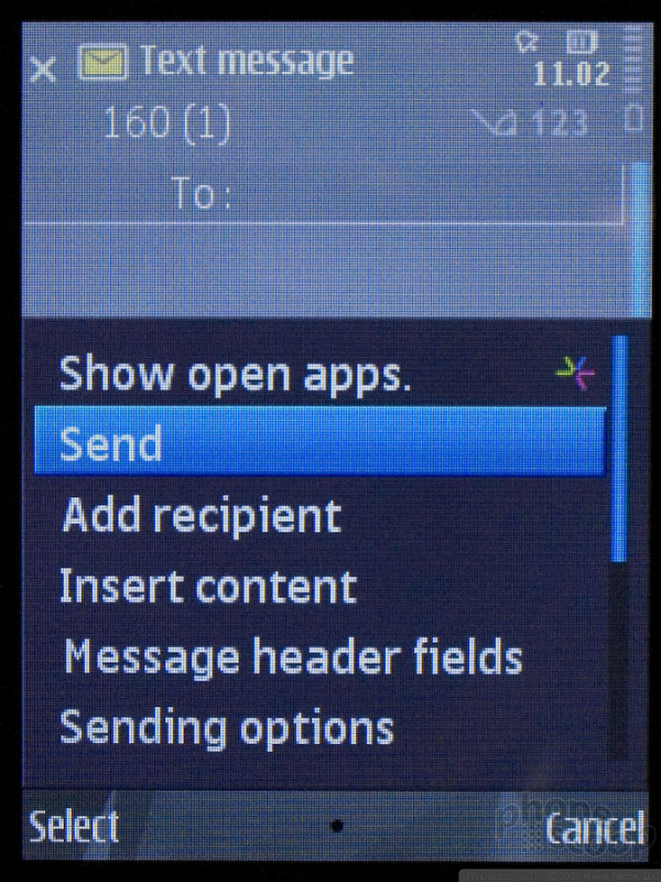
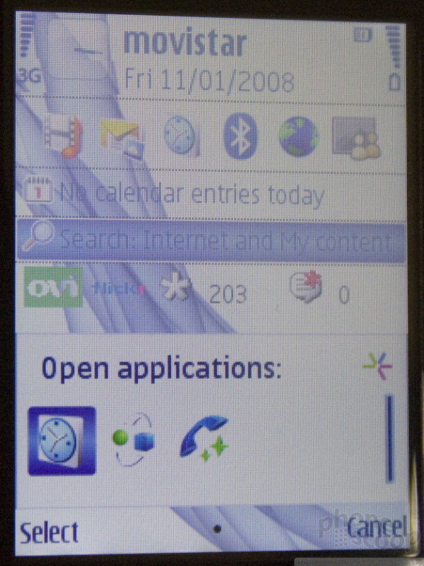
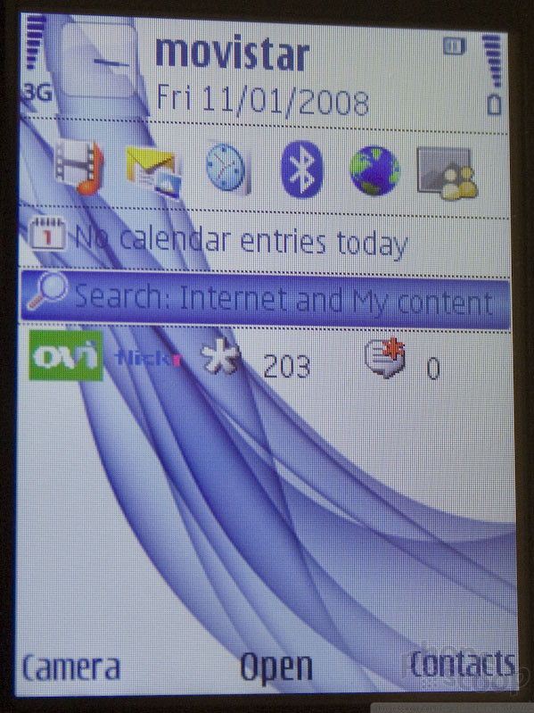
As you can see from the screen shots above, there's now a "Show open apps" option at the top of the "Options" menu in all applications. The default option (like "Send" when writing a message) is still the default selection, but now you can press the "up" key to access the app switcher, making it much more discoverable. Previously, you had to know the secret shortcut of holding down the menu key (or home key on the E series) to access this menu.
They've also added a little S60 icon to both the menu shortcut and the app switcher itself. This is a little bit of branding similar to the Windows logo next to "Start" on Windows Mobile. It's a very smart move for S60 if they want to be known as something other than "that Nokia smartphone software", which they do.
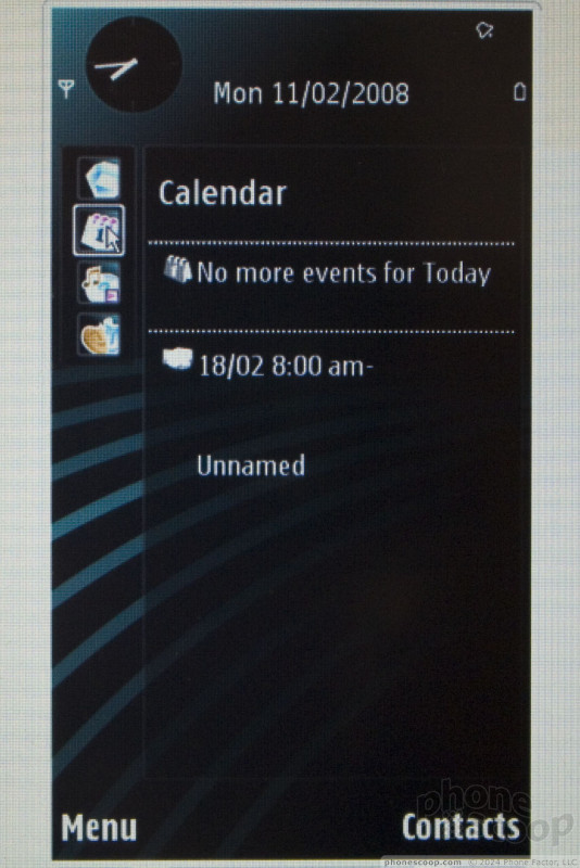
Nokia has also developed some new home-screen plug-ins for its Ovi content portal service. In the example pictured, you can see a tally of how many photos you've uploaded directly from the phone to Flickr, and how many comments you've received on those photos.
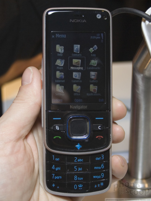
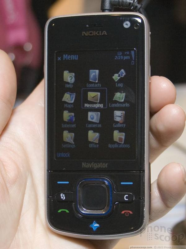
The 6210 and 6220 both look very similar in terms of styling. In fact, they look a bit like twins, with one being a slider and the other simply being a bar-style version. However, they actually differ in a few major ways under the hood. The 6210 has a navigation focus, while the 620 is more camera-oriented.
Let's start with the 6220 Classic:
The 6220 has a serious 5 megapixel auto-focus camera built into it. In fact, it has all of the advanced camera capabilities of the N82, which was Nokia's absolute flagship camera phone until this week. Just a few months after rolling out the N82, the same camera capabilities are available now in a "mainstream" phone. The similarity to the N82 runs deeper, though; the 6220 matches the N82 pretty much feature-for-feature except for Wi-Fi. If you liked the N82 but don't need Wi-Fi and/or didn't care for the odd narrow keys on the N82, then the 6220 is worth a look.
Here is a short video of the 6220:
Even though the 6210 is a "Navigator" phone and the 6220 is not, the 6220 still has GPS and a large shortcut key (on the left side) with a large blue plastic "navigator" icon, just like the 6210.
Moving on to the 6210 Navigator, the emphasis is obviously on navigation and maps.
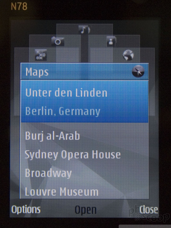
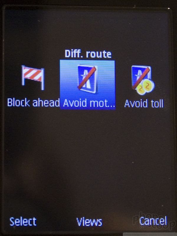
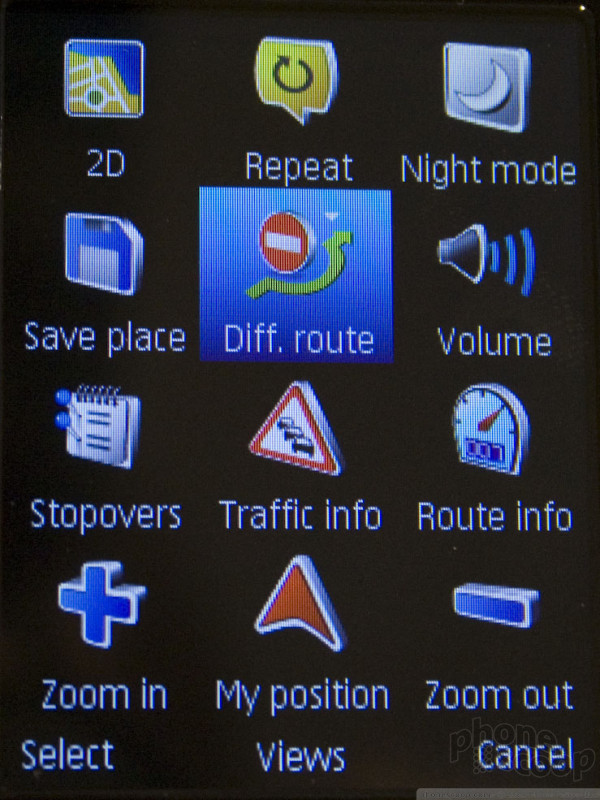
The 6210 runs Nokia Maps 2.0, which you'll find on of the new phones this week. Maps 2.0 supports improved graphics, with 3D and satellite view options, plus options to re-route around traffic and tolls.
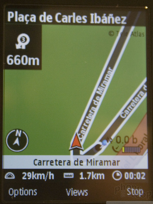
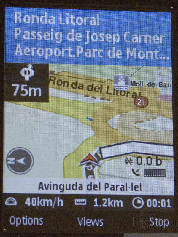
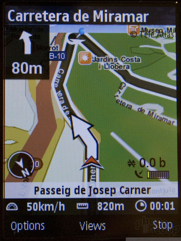
It also has an all-new pedestrian mode. This is something common on phones in Japan, but brand new for the Western world. It's a very different kind of navigation, and the implementation in Nokia Maps seems like decent one.
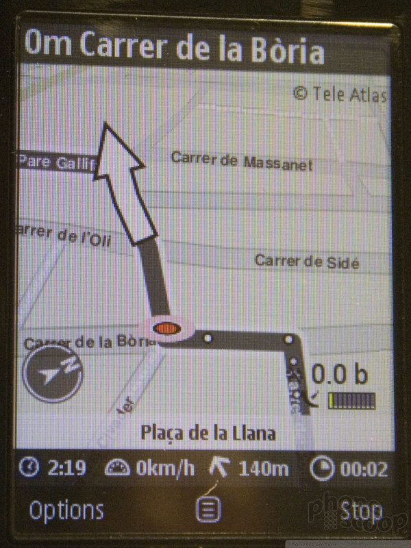
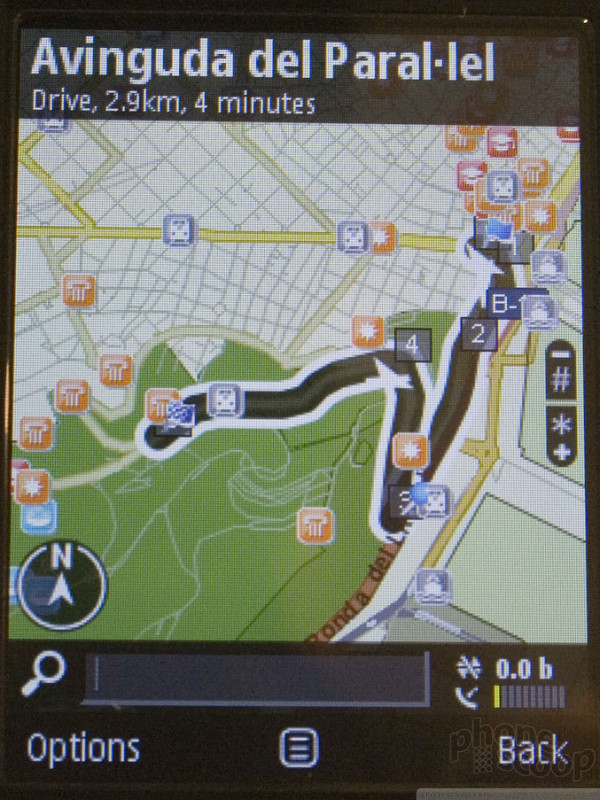
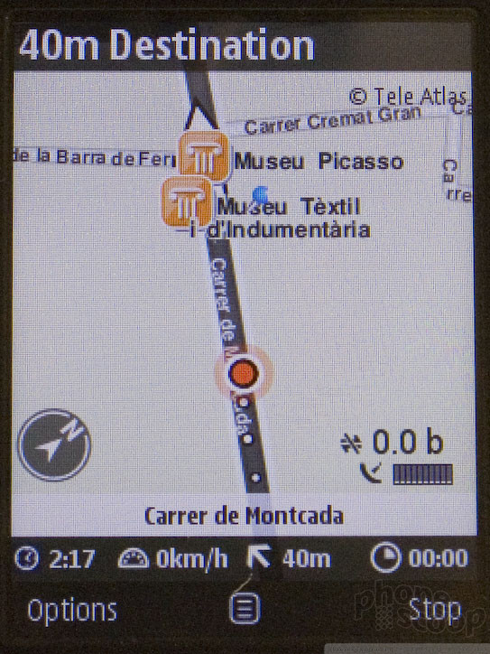
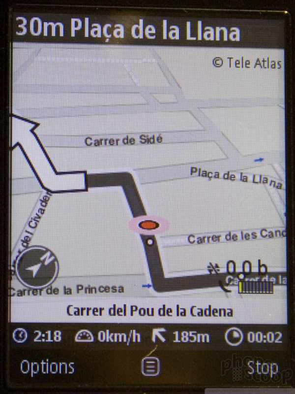
What sets the 6210 apart is the inclusion of a digital compass linked to the Maps software so that the maps automatically rotate to match the direction you are facing at that moment. Combine that with 3D and/or satellite mode, and you can really get a clear picture of where you're going - literally! It's impressive stuff. It even shows landmarks on the map, so you can see what kind of things you should be looking for as you walk down the street. Little white dots on the path show where you've been, like virtual bread crumbs. You'd have to try really, really hard to get lost with a phone like this.
S60 Touch
The next major version of S60 - after "3rd Edition" - will support finger-touch input much like the iPhone. This much has been announced before. I had a chance to sit down with Matti Vanska, Vice President of Mobile Software Sales & Technology for Mobile Platforms. He shared some info about the future of S60 that is not as widely known.
According to Mr. Vanska, we should expect the full platform to be formally announced by mid-year. That means it will get an official name (it definitely won't be "4th Edition") more details will be announced, and developers will get access to the SDKs they need to start developing software for it. Then later - by the end of 2008 - we should actually see a Nokia phone that will run this new platform.
Besides touch, the new S60 will also support stylus input, including handwriting recognition. It will also substantially improve APIs for web applications and widgets, so that "Web 2.0" apps can really integrate with the phone in ways that only Java and S60 applications can now. Other details are still being kept secret, though.
In other S60 news, Matti noted that Nokia has made progress in its relationship with AT&T in the US, and specifically we can look forward to more S60 phones for AT&T in the coming year.
Nokia was also showing off a live demo of an early build of the new S60 software, complete with finger-touch capability. It wasn't running on a prototype phone of any kind - just a generic touch screen - so gestures like swiping didn't work very well. (That kind of thing requires hardware tuning.) It wasn't finished, so much of the cooler interactive features Nokia has shown off in video previews weren't working, but for a basic idea of what the screens look like, check out the screen shots and video below:

Here is a video tour of the S60 touch UI:
Part 3
Google Android
We got to spend some time with the new Android platform from the Open Handset Alliance. The hardware was a reference design and ARM said it was not a final build at all. They were simply showing off the platform on their chipsets.
One thing we can say about Android is that it is blazing fast. It is probably the fastest phone user interface we have ever used, and that's on ARM's 220MHz processor. The same processor that powers a lot of Windows Mobile phones. The different is speed is palpable, as is evidenced on the video (below).
The basic UI is simple and intuitive. There is a dock, resembling the dock in Apple's OSX, that runs along the bottom of the screen. In it you see the phone's basic applications. Using the d-pad, you can zoom left and right through the items in the dock. The response in instant, and you can speed from one end of the dock to the other by pressing and holding the d-pad.

The applications were all in a basic form, and not yet fully realized. But everything was very speedy. The contacts database, the music player, Gmail and other applications all opened immediately when selected. Unfortunately nothing was set up or populated with content.
The applications themselves were fairly simple looking. The spokesperson at ARM told us that they will probably be dressed up by the OEMs when the final release is available.
In all, it is a very capable user interface, and we look forward to seeing the final build some time later this year.
Here is a video preview of how Android works:
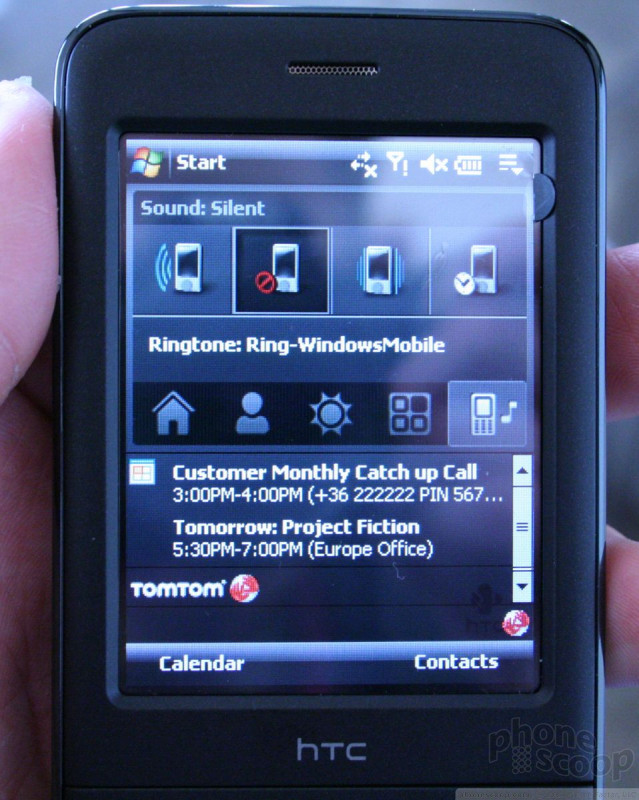
HTC P3470
This is a new smartphone from HTC that is meant for the European market. We have to say, it is one of the better builds we've seen from HTC. It feels a lot like the Touch when you hold it in your hand. It is very solid, compact, and feels great. It was a little bit weighty, but no in any egregious way.
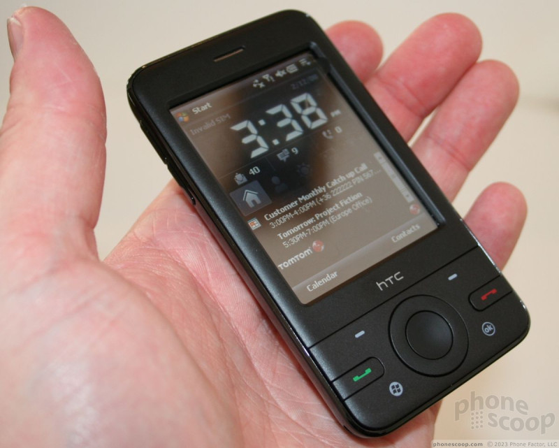
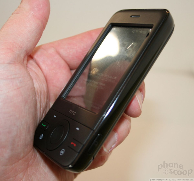
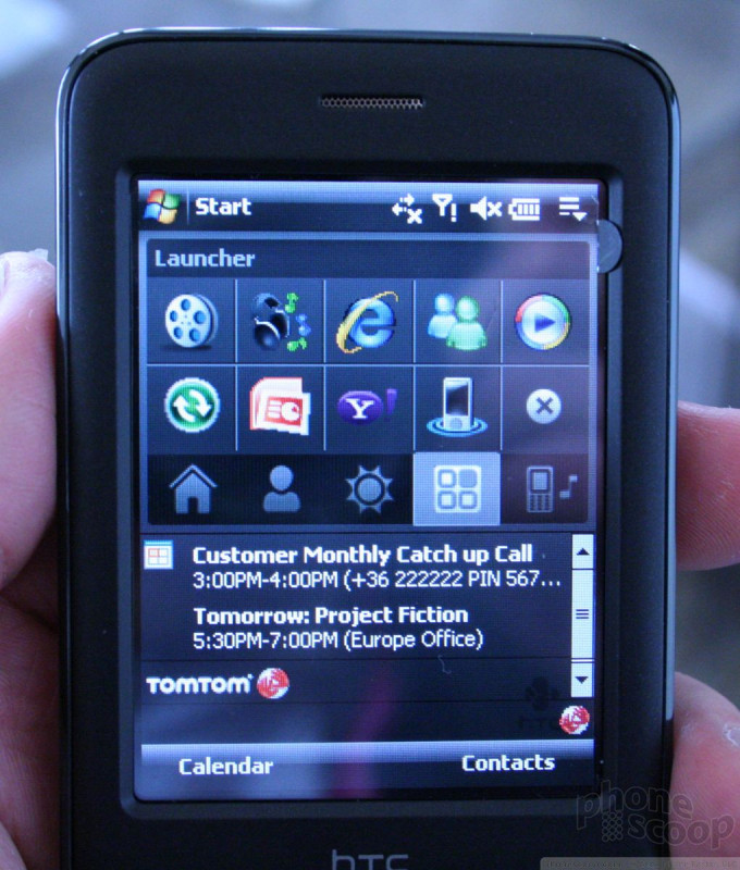
One the front is a generous screen that was nice and bright. Below it are four softkeys, the send/end keys and the trackwheel d-pad. All of the physical keys offered good travel and feedback and were comfortable to reach with your thumb.
The trackwheel is the one misstep of the P3470. As on other phones, such as the HTC Shadow, the movement of the selector doesn't necessarily correspond well with how you move the trackwheel. Often there was a delay, and this caused us to mis-navigate from time to time. You can also use the trackwheel as a standard 4-way d-pad and the center button is large and easy to push.
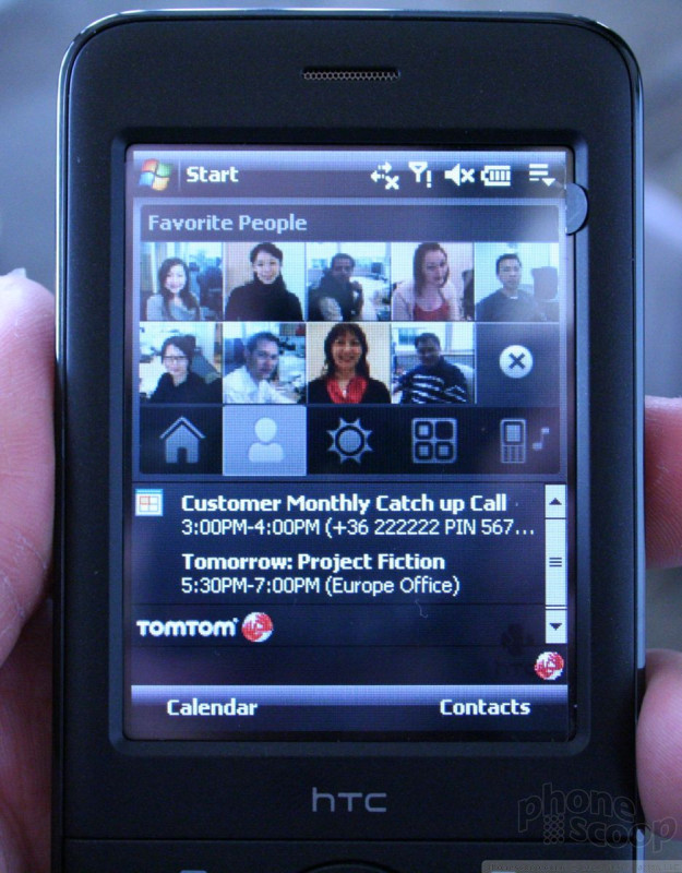
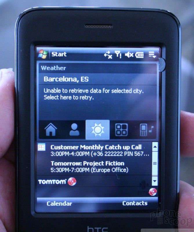
The HTC home screen is very well thought-out. It has five tabs that let you jump across the phones features quickly, using the trackwheel or your finger. Having such easy access to things such as your contacts, a weather widget, and other settings is great. The contact tab opens up a grid layout of your favorite contacts and you can populate the fields with pictures of your contacts. Pressing the picture initiates a call. Very cool. You can also choose to open the contact and send them an email, SMS, etc.
HTC did a good job of organizing the applications and makes them as easy to use with your finger as possible with the large buttons. The camera application, in particular, was well laid out and let you get at the settings quickly so you can alter them and get back to picture taking.
The rest of the user interface is Microsoft Windows Mobile 6, with which you are already familiar.
Here is a walk through of some of the phone's features:
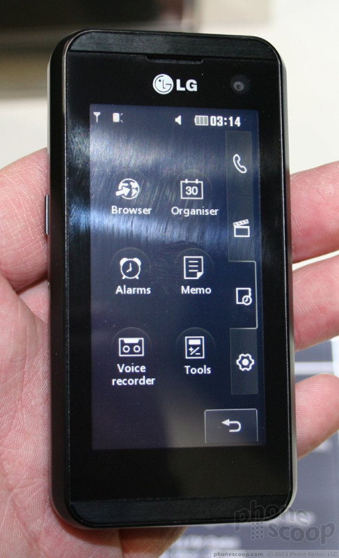
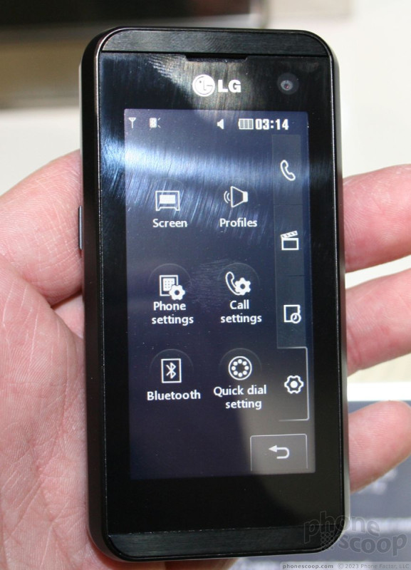
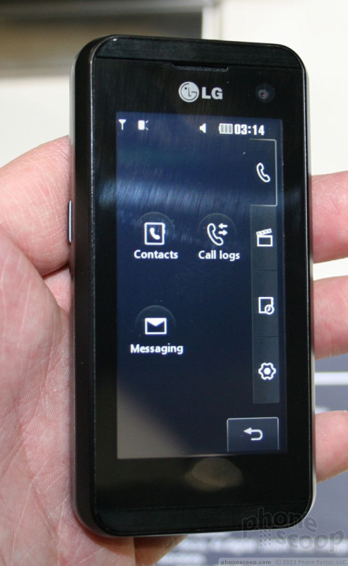
LG
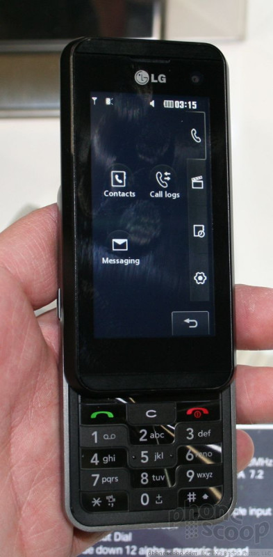
LG showed off three new phones in Barcelona. One of them was announced last week, but the KF600 and KF700 were new at the show. Both are slider phones that use touch for interacting with the phone's menus and applications.
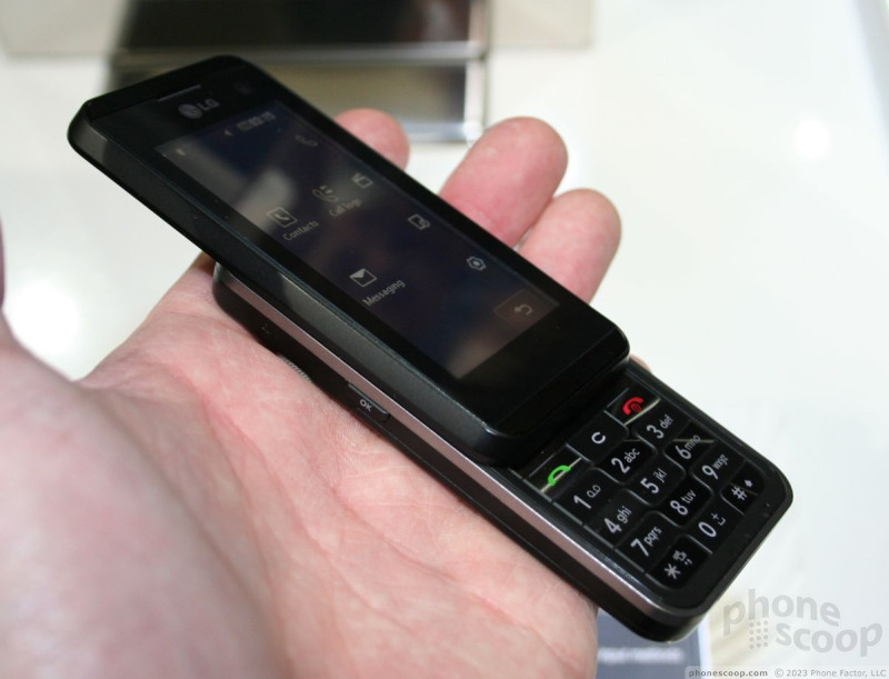
KF700
The KF700 is a slider that is akin to the Prada phone. It has a large screen on the front that looks sharp is ready for video playback. LG is getting pretty good at making touchscreen phones that offer decent user interfaces and and other shortcuts to applications and content.
The KF700 is about the same size as the iPhone, but is a bit thicker. It has a slide-out numeric keypad for entering numbers and text information. Sliding the phone open requires just a gentle push of the thumb. The slide mechanism was solid and smooth. The numeric keys felt similar to those of the Venus. They offered good travel and feedback, and the keypad wasn't too cramped. The keys were nicely spaced out. The phone feels good in your hand and isn't too heavy. All the buttons along the side were easy to find and use. We had no issues with the microSD slot hatch.
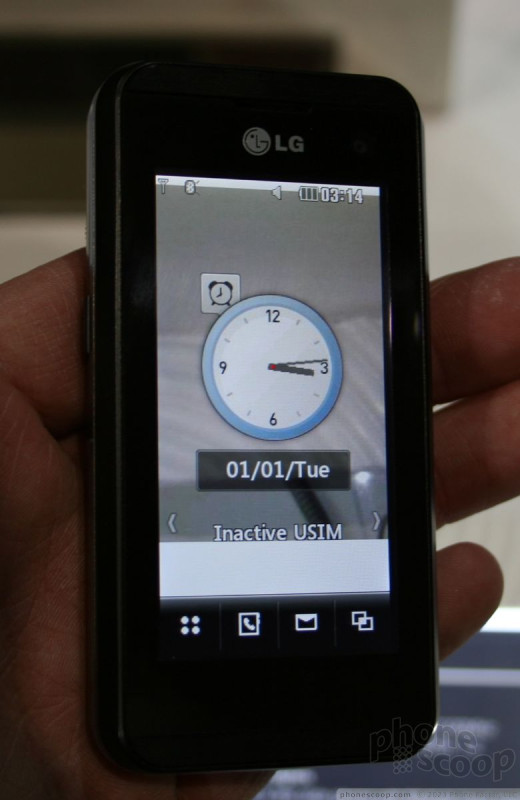
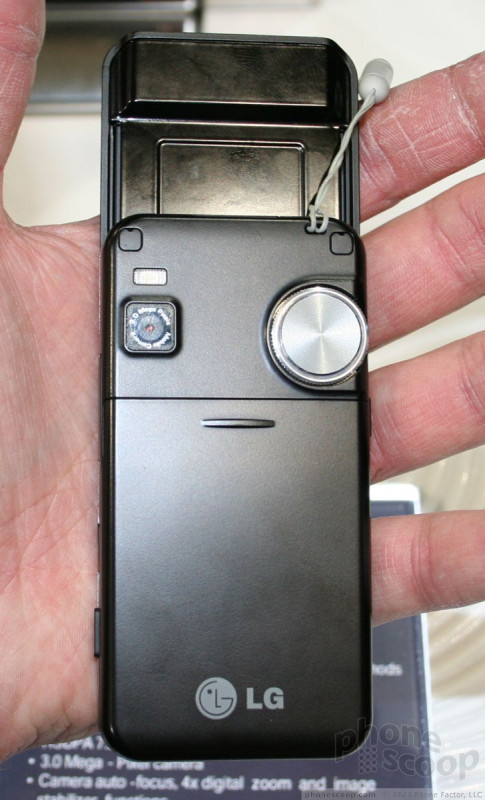
On the left side/back of the phone is a jog dial that is used with a customizable shortcut menu. The dial sort of resembles what might have appeared on a transistor radio from the 60s. It is silver, and definitely stands out on the back of the phone. This was probably the cheapest aspect of the phone. The materials of this dial felt a little brittle. Otherwise, moving it with your thumb was easy, and it moves around the circular selector on the screen.
The user interface is one of the better ones we've seen on an LG phone. Since it hasn't been specified for any one carrier, it was devoid of operator decks, applications and so on. It is simple, clean and uses black and white icons on the screen. It was relatively responsive, though we did often have to perform multiple presses on the screen to open certain applications. This could be either a hardware of software issue.
Because the entire phone face is a touchscreen, LG brings a lot of the action items to the screen when using applications. The camera, for instance, has a lot of flexibility in what it can do to alter images as they are taken. All of the settings are intuitive to figure out and use.
The main menu uses tabs that are along the right side of the screen. Touching each of the tabs brings up a separate bunch of applications or tools on the phone.
In all, the KF700 is one of the better phones we've seen from LG. Unfortunately is is not meant for the North American market.
Here is a video tour of how it works:
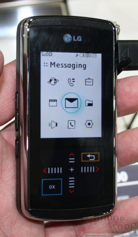
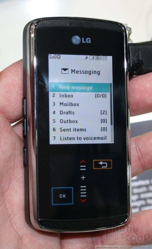
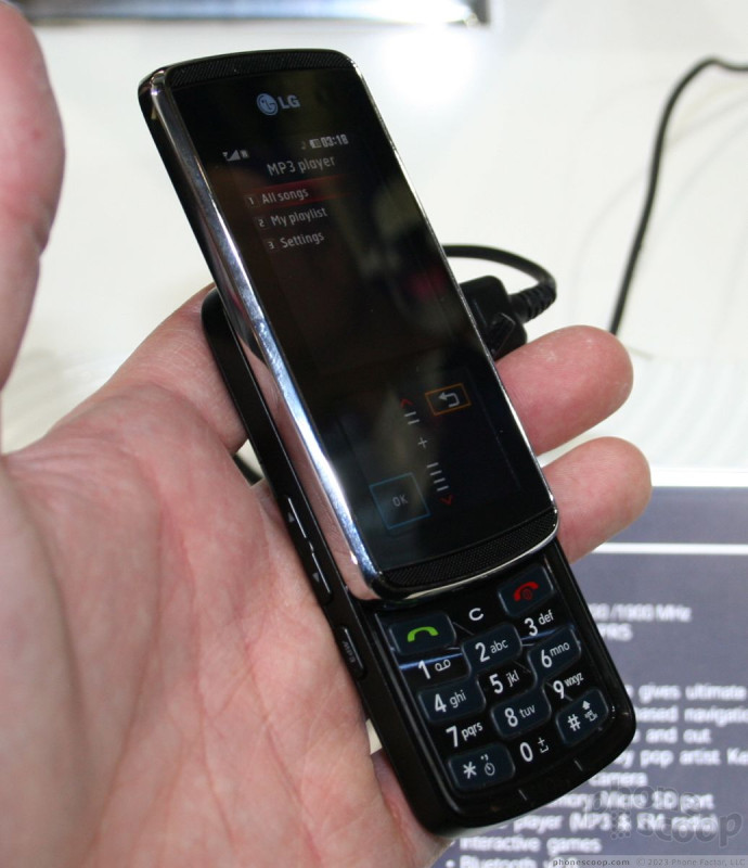
KF600
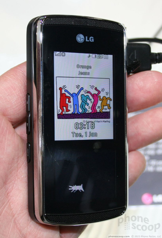
Like the KF700, the KF600 is stylish, elegant and classy. It is essentially a GSM variation of the Venus. It features good materials, a silver and black appearance, and a nice alligator-textured back panel for easier gripping. Rather than sporting a full touch screen, the KF600 only goes halfway. The upper portion of the screen is a regular display with no touch capabilities. The lower portion of the screen replaces what would be the navigation cluster with a touch sensitive navigation system instead.
The KF600's touch screen navigation uses haptics to provide microvibration feedback to let you know you've made a selection. It is very prone to smudges, but works fairly well for navigating the phone's menus. The problem here is that even the haptics can't replace the feedback we're used to getting on a regular D-pad. This means navigating without looking at the phone is more difficult.
Sliding the phone open is easy, though with no ledge or anything else to catch your thumb on, you're definitely going to be touching the screen (and smudging it) a lot to get the phone open. The mechanism felt solid and the spring action helped to get it open and shut.
Once open, there is a regular 12-key keypad underneath with three extra buttons, the send, clear and power/end keys. It has a checkerboard-style appearance, and we found using the keys was easy. They felt good as you passed your thumb over them and with their slightly convex shape finding each key was a snap.
There are a number of buttons along the side of the phone. On the left is the volume/zoom toggle and a microphone key. On the right is the unlock key and camera key. The data port and microSD slot are also located along the sides of the phone.
With the phone closed, the navigation touch screen lets you jump to a few different applications, including contacts, messaging, the phone and a short cut menu. The shortcut menu brings up six little options in the navigation pane to let you jump to an application or task without having to access the main menu. Depending on which application or menu you are using, the entire make-up of this navigation panel will change and show different options.
With the main menu open, the navigation pane simply becomes a D-pad, with four arrows and a select key in the center and back key in the bottom right corner. Hitting any of the arrows will move the cursor/selector around, and provide haptic and visual feedback to let you know you've made a selection.
The KF600 has eight different themes to it. They are artistic in nature, and change not only the main display, but also the appearance of the control panel as well. Several of the themes feature animations complete with active screen savers. These themes let you customers the KF600 to a certain degree.
Here is a video tour of the phone:
Part 4
Samsung TouchWiz & F480
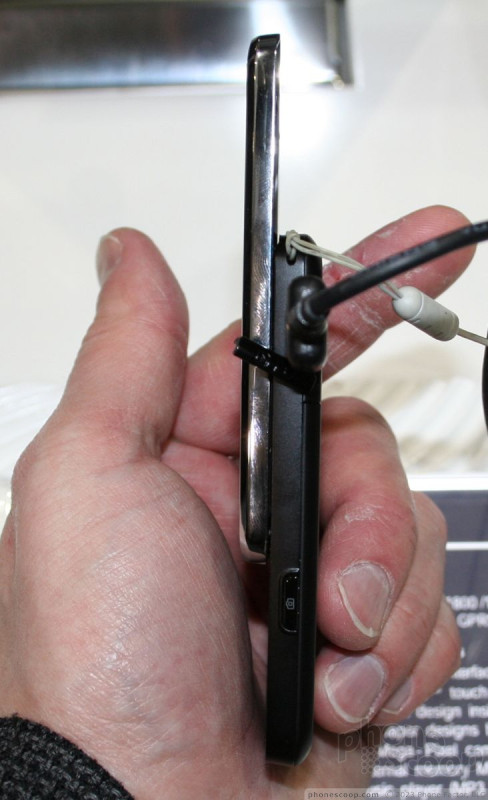
Samsung was showing off two new finger-touch phones at MWC this year: the F480 and F490. Unfortunately, both are tri-band GSM for Europe and Asia, so they won't be offered directly in the States, and we wouldn't really recommend them for use the US. However, the two phones represent Samsung's second generation of finger-touch phones, and run a new version of Samsung's finger-touch UI. We hope to see similar phones for the US announced at CTIA in a few weeks.
Samsung's first generation of finger-touch phones included the F700 "Ultra Smart" that debuted at last year's 3GSM, which was then followed by the diminutive Armani phone. Both implemented "Croix", Samsung's first stab at a finger-touch phone interface. Croix was okay, but did seem a bit rushed (to compete with the iPhone) and wasn't nearly as refined as LG's competing UI on phones like the Prada and Viewty.
The new F480 and F490 run "TouchWiz", which you could think of as Croix 2.0. Samsung told us that TouchWiz will replace Croix on all new Samsung finger-touch phones. In fact, the F490 was originally slated to run Croix - and that's what was on display in the booth - but it was recently decided to upgrade the UI to TouchWiz instead of Croix on the final shipping version.
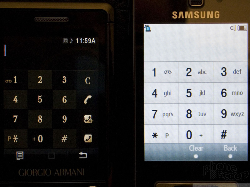
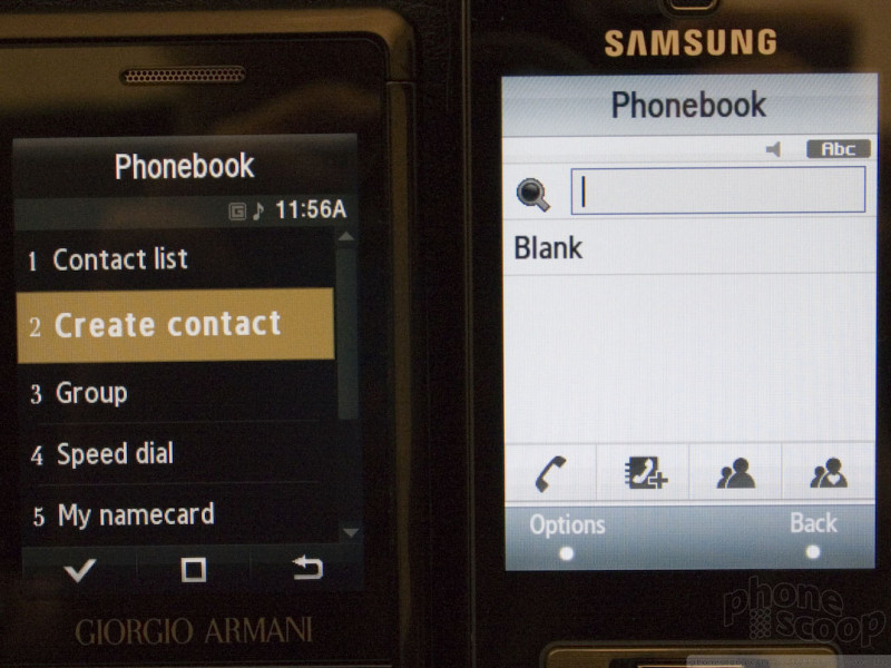
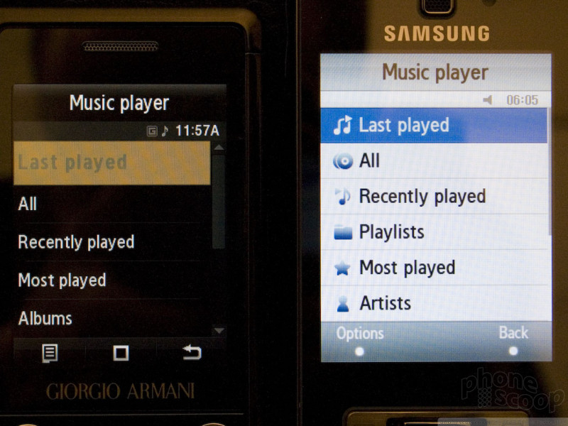
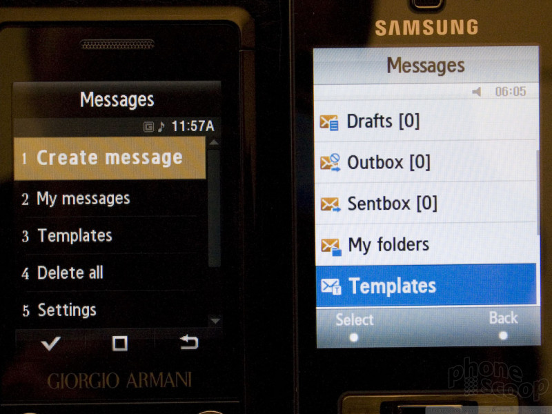
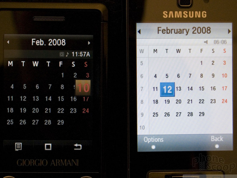
As you can see from the photos above, TouchWiz is very similar to Croix in most places. The basic layout and menu structure remains unchanged. TouchWiz upgrades the look to be more appealing and user-friendly, including text labels on the main menu icons and new icons added to the sub-menus.
There are some very key changes in several places, though. The cryptic icon bar at the bottom has been replaced with much more intuitive virtual soft keys that are clearly labeled. The system-wide shortcut menu also has a dedicated hardware button now, instead of the square icon taking up valuable screen space all of the time. The dialer also has larger number buttons now, and the phone book starts with a more powerful interactive screen now, instead of a plain menu, saving a click or two for anything contact-related.
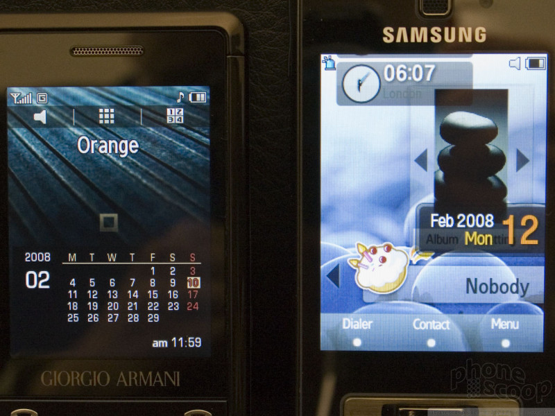
By far the most "fun" improvement, though, is definitely the new home screen. The new home screen has a completely customizable set of widgets that can be dragged and dropped anywhere on the "desktop", and added and removed via a handy pop-up dock. The setup is highly customizable, fun, and very easy to use. Be sure to check out the video above to see this in action - it's really neat.
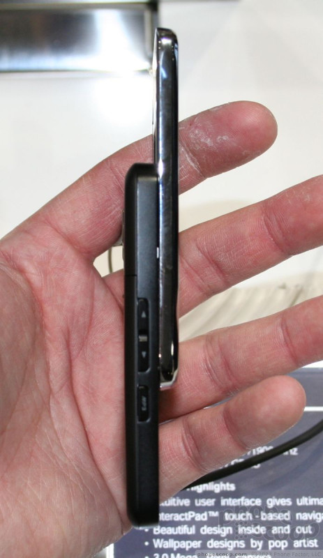
TouchWiz will be available on both the F480 and F490. The F480 is like a slightly larger Armani phone. The Armani phone is so tiny, though, that the F480 is still quite small. The little bit of extra size allows for a vastly improved camera (5 megapixel auto-focus) plus HSDPA for Europe and a larger, 2.8-inch display.
The F490 is a big brother to the F480. They're very similar, but the F490 steps up to an even larger 3.2-inch display. With a 16:9 aspect ratio and 240 x 432 pixels, it's optimized for video in landscape mode. The F490 is just about as thin as the F480. It's a bit taller, but the big surprise is weight: it's incredibly light.
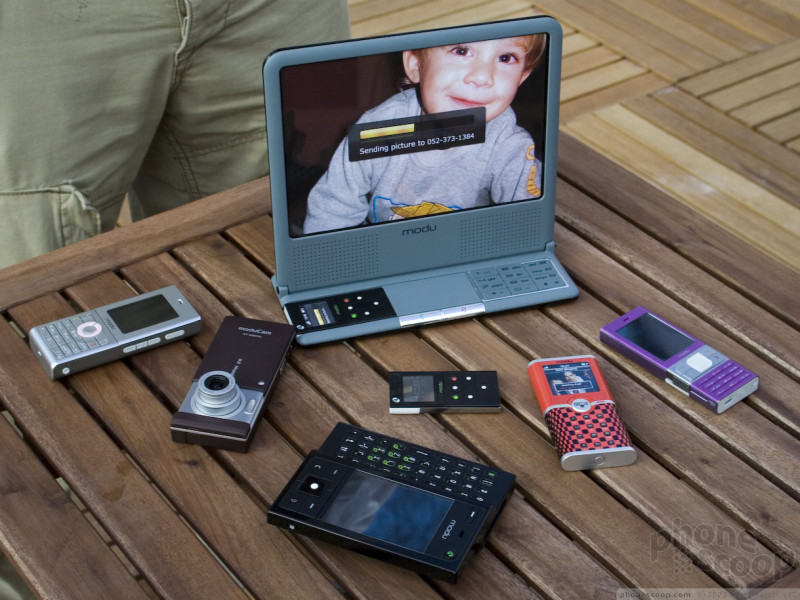
Modu
Phone technology has advanced to the point these days where it's possible to make phone that's entirely TOO small to actually be usable to most people. Several companies now make what is essentially an entire phone on a single chip. Add a battery, antenna, and speaker, and you've got a phone.
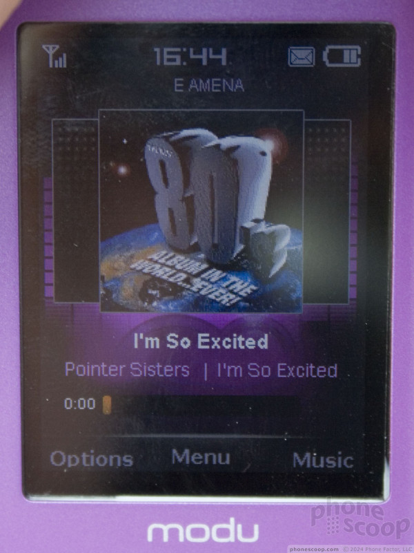
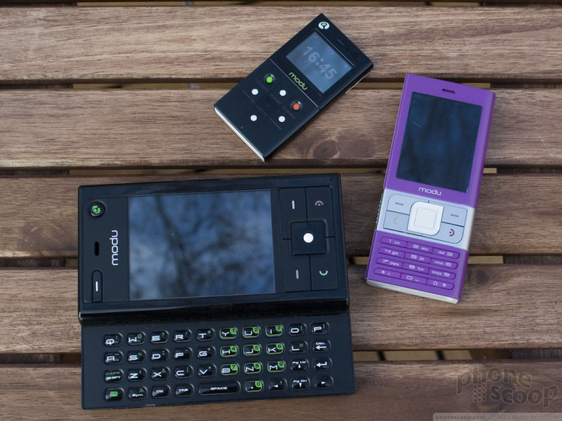
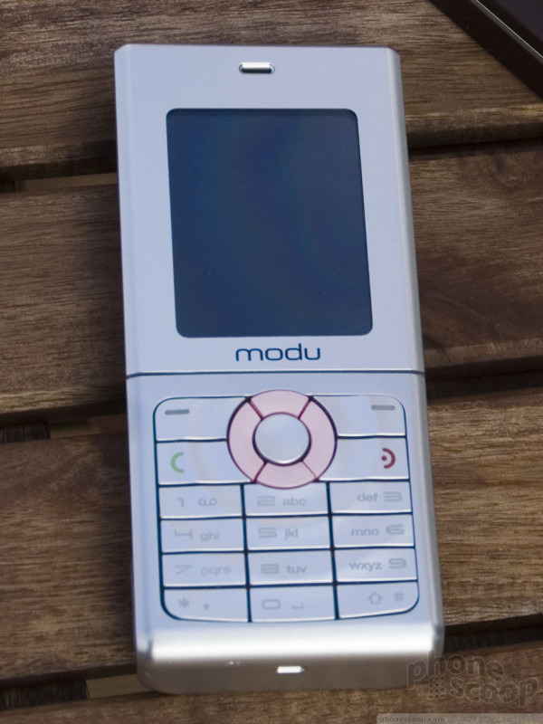
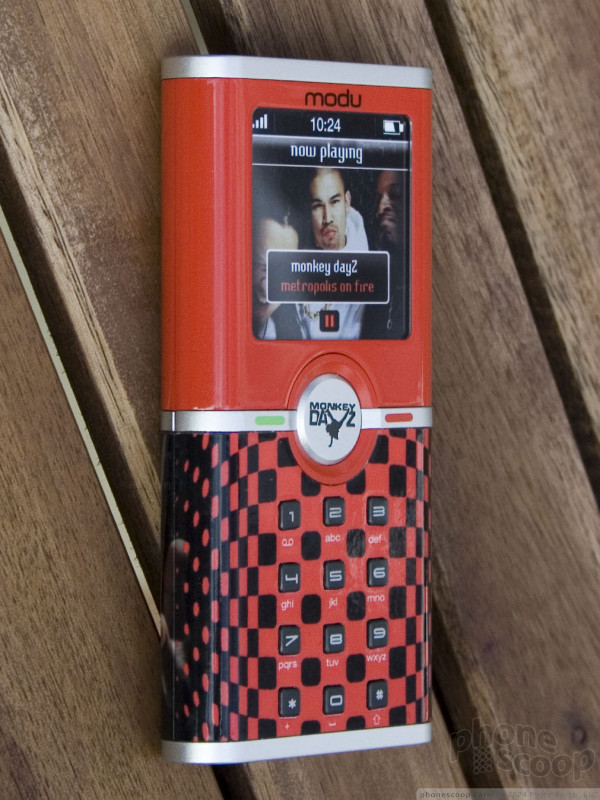
Modu is concept that takes advantage of this new paradigm to create a modular system that literally puts a "phone inside a phone". There's a core module that contains all of the main phone components and stores your data and content. This tiny core module can then be inserted into a variety of "jackets" that can be changed at any time.
Different jackets offer different features and form factors, so you can have a QWERTY keyboard and large screen for work, then a small, slim phone for going out in the evening, and a high-quality camera phone on vacation. The whole time, all of your messages, content and info stays with you - even call logs - because you're still using the same phone core module. All jackets at least offer their own display and keypad, so don't let the term "jacket" lead you think it's just a fancy faceplate - it's much than that.
The core module itself is incredibly tiny. It's powered by Texas Instruments "LoCosto" phone-on-a-chip, and it's manufactured by FoxConn, famous for making iPods and iPhones for Apple, among many other advanced high-tech devices these days.
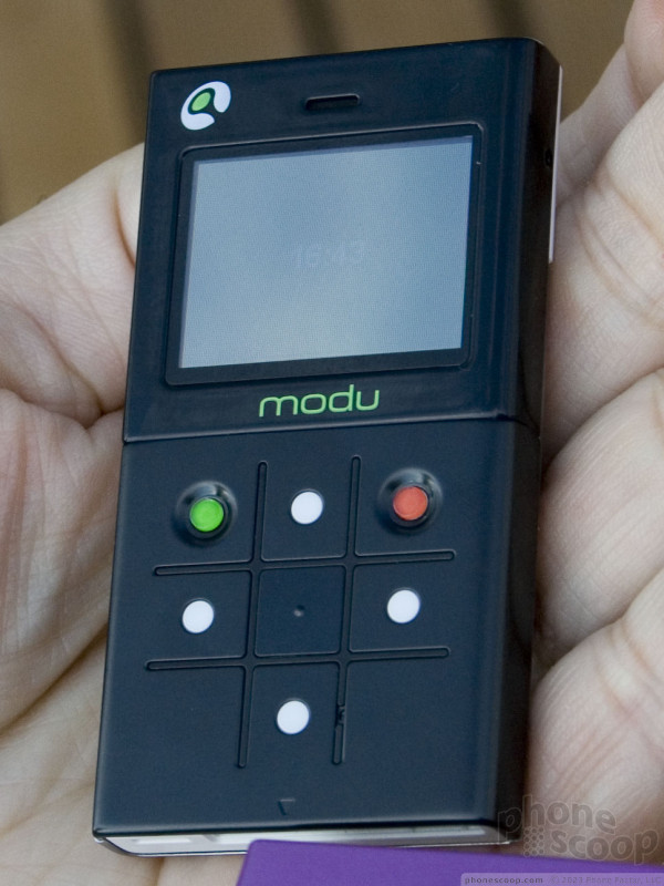
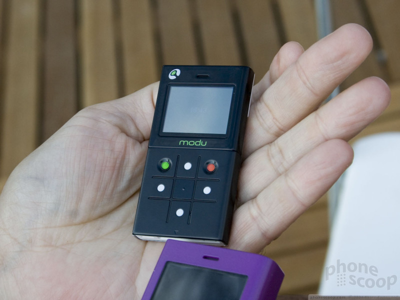
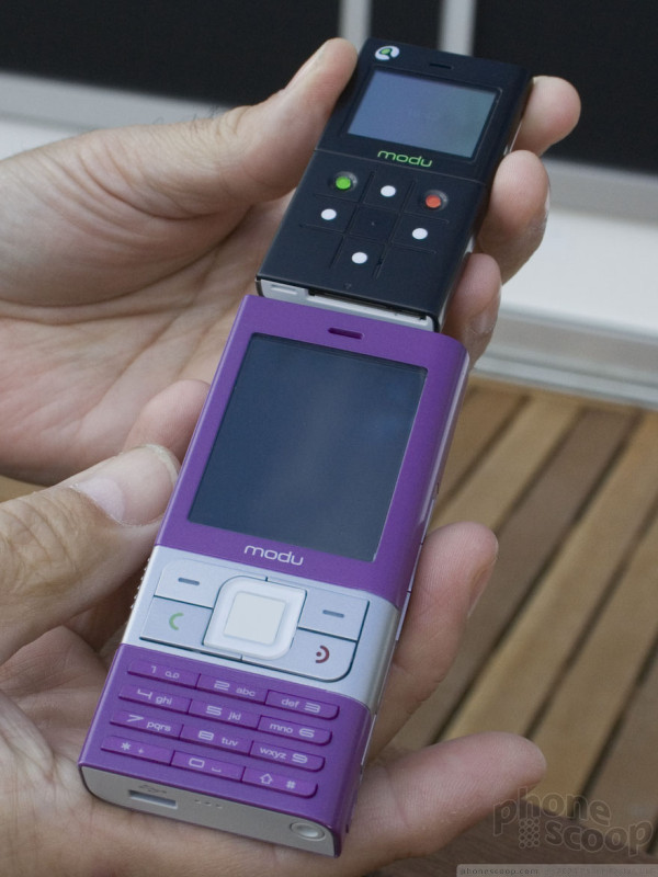
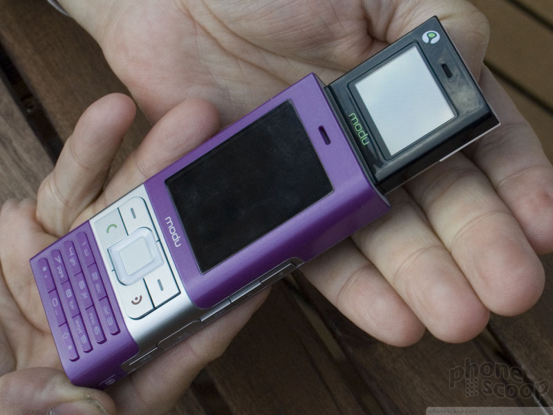
The core module is actually a complete phone you can use by itself. It has everything you need: a speaker, microphone, antenna, battery, display, and buttons. It's so tiny that people will think you're mimicking Zoolander or a certain SNL skit, but it does work.
The core module is quad-band GSM and comes with at least 1 GB of memory (or up to 16 GB at a carrier's request.) The bottom has a long, skinny jack for interfacing with jackets. One end of the jack is actually standard microUSB, so you can connect the core module directly to a PC with any microUSB cable, for example.
The fun starts, though, when you dress it up in a jacket (and tie, if you use a wrist strap.) Modu was showing off several possible "jackets", including one for gaming, one with a QWERTY keyboard, and one with a serious camera on back.

As mentioned earlier, part of the advantage is that the user can switch "phones" whenever they want by switching jackets. Another advantage is that users can get a "new phone" (new jacket) every few months if they want, and jackets should be cheap enough that carriers can even build this into their subsidy-supported cost models. So for example, instead of "new every two" (a new phone every two years,) you might be able to get a new "jacket" for free every six months.
Jackets should be cheap because they don't contain any of cellular radio components that are so expensive and time-consuming to develop, engineer, and test. A jacket is only a mix of very standard electronics, so carriers can have many different jackets custom made just for their unique customer base, and they should be able to bring them to market very quickly and cheaply.
In addition to "jackets", there are "mates", which are generally larger devices like photo frames. Plugging the module into a photo frame mate lets you browse or transfer your photos and videos.
If this all smells like a vapor-ware concept, it's not. The units on hand at MWC were prototypes, but they were functional, not dummy units. More importantly, three major carriers have already committed to offering Modu in 2008, including TIM in Italy and VimpelCom in Russia.
The GSM Modu will ship in October. It will cost about Euro 200, which includes the core module and two jackets. A 3G version is planned for May 2009. Modu is in talks with US carriers and hopes to bring Modu to the US in mid-2009.
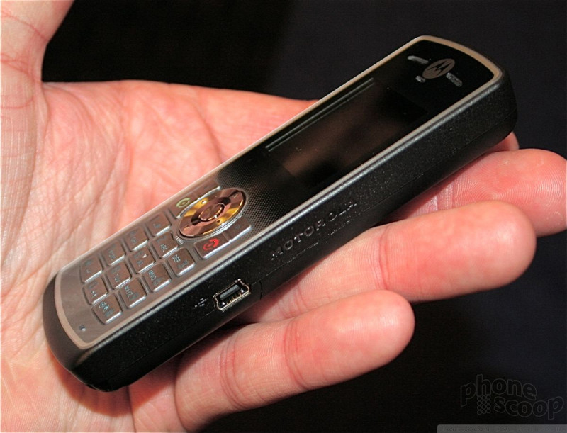
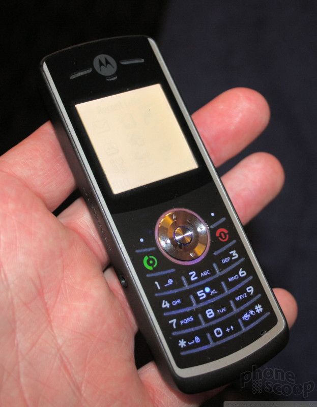
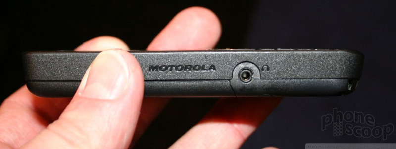
Motorola
We were a bit surprised to see that Motorola only announced some low-end phones for emerging markets at Mobile World Congress. No high-end phones at all, and one of the phones announced was just an upgrade of an existing model. Motorola must really be having issues for it to make so poor a showing at one of the biggest mobile events of the year. Here's what it showed.
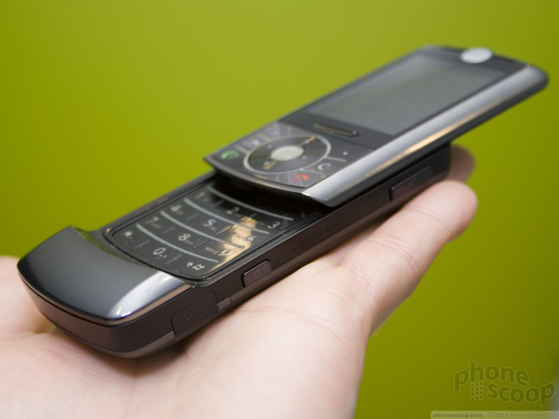
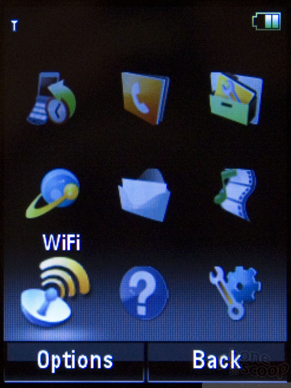
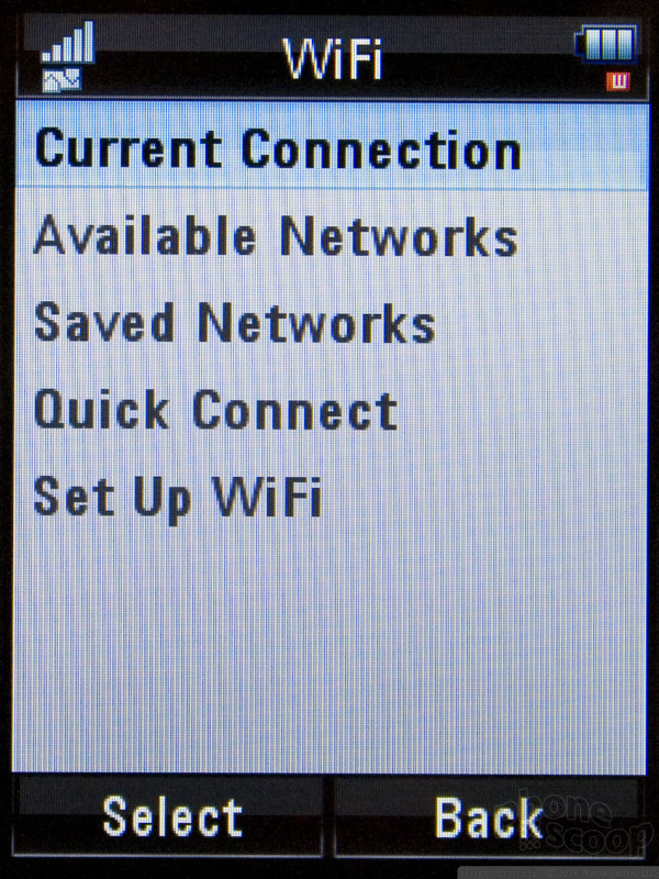
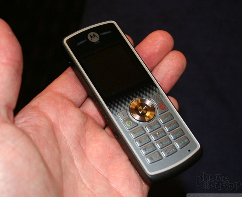
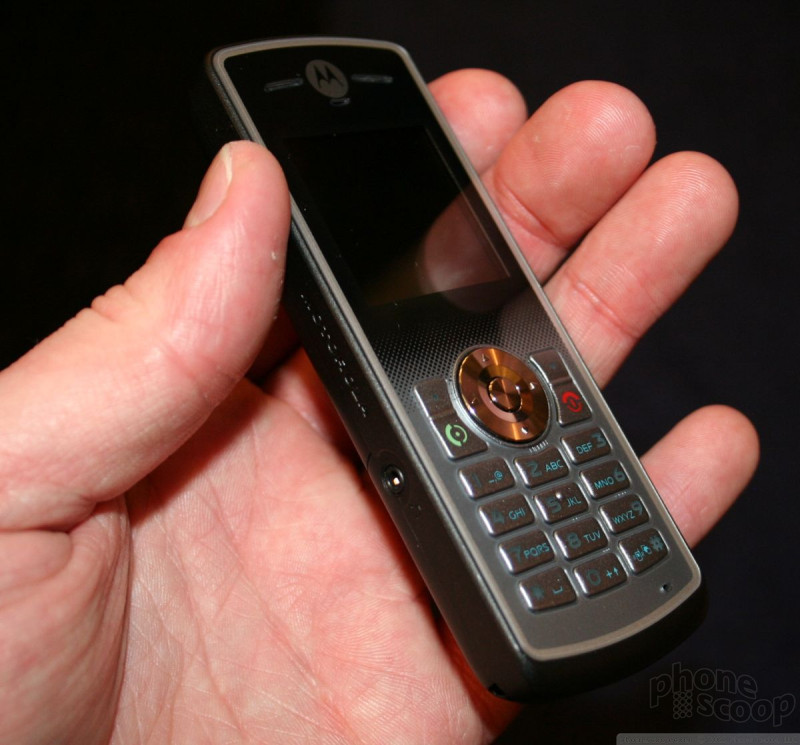
Z6w
The Z6w is an update to the Z6 slider series and adds Wi-Fi. Aside from that, it is the same in most other respects.
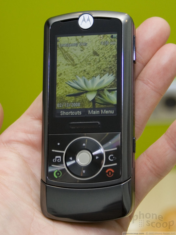
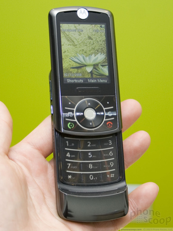
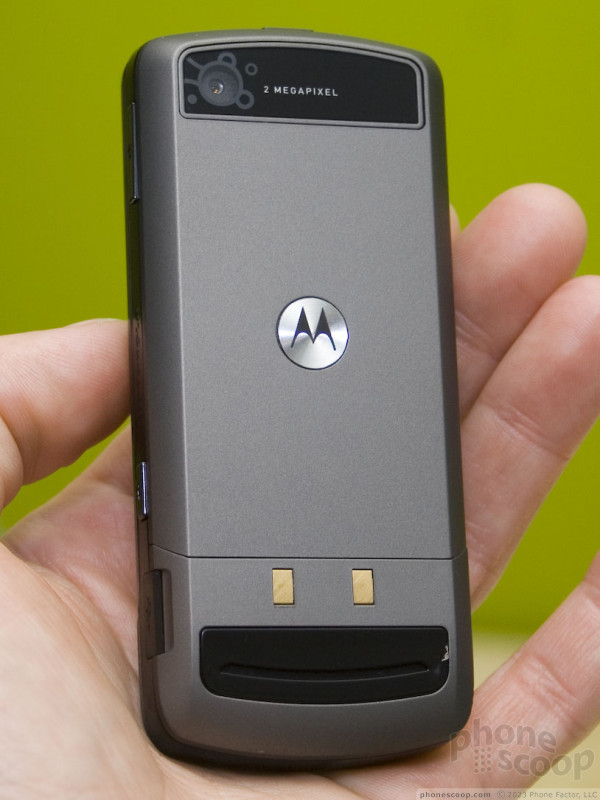
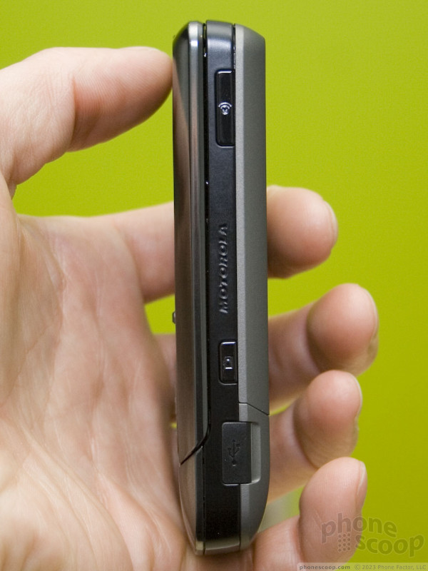
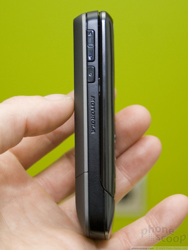
The phone Motorola had on hand was a prototype, and not a final build. There were two contacts on the back as if the phone was meant to be slid into a charging dock rather than plugged in. When we asked about the contacts, Motorola did not have an answer for what their function was. Also, the Wi-Fi turned on and off, but we were not shown any demos of it connecting to a network.
Like the other Z6 models, it is comfortable to hold, and the slide mechanism worked well.
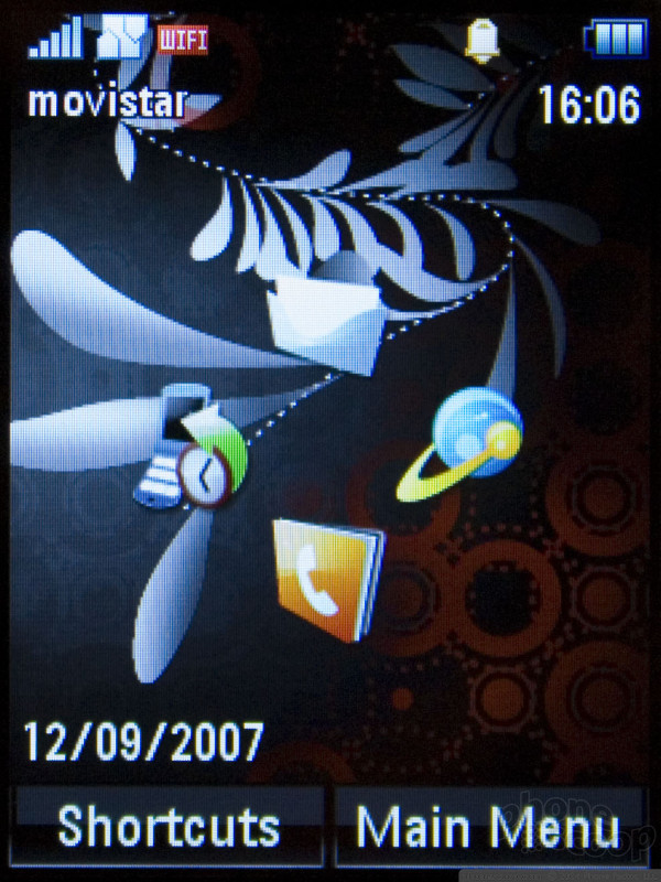
W161 / W181
These two bar-style phones are meant for emerging markets. They are simple and offer almost no features at all. They are thin, small, and very pocketable. Holding them in your hand, they have almost no weight to them at all. Each has a 2.5mm headset jack on the left side, and an on-board FM radio. The back of the phones has a cross-hatched pattern to them, giving them a little bit of grip.
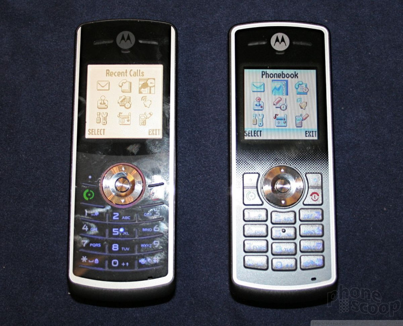
The W161 has real buttons for the keypad and navigational controls. They are small, but easy to find and have good feedback. I found the d-pad and softkeys to be a little to small, but they worked without issue.
The W181 has a RAZR-esque keypad that is flat and has ridges separating the rows of keys. All the buttons had good travel and feedback, though they did feel a little bit on the cheap side.
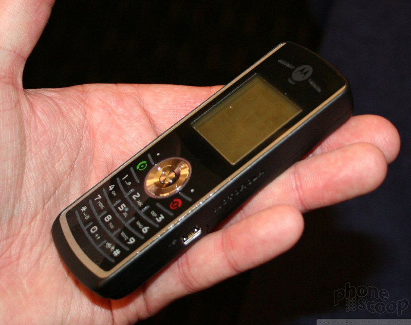
Each had the most basic of user interfaces, consisting of a simple grid with 9 icons for the phones' applications and settings. The W161 has a color screen, but the W181 has a black and white screen. Both of them have extended battery life, with standby time stretching to three weeks.
Part 5
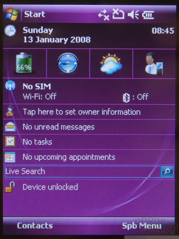
Toshiba
Toshiba had some interesting but odd devices at last year's 3GSM show. This year's devices look a bit more refined, but unfortunately only one is quad-band GSM for use the US: the Portege G810.
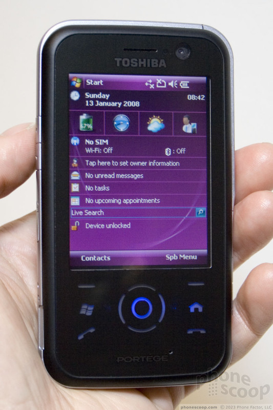
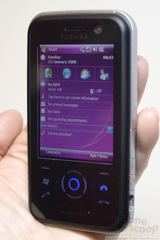
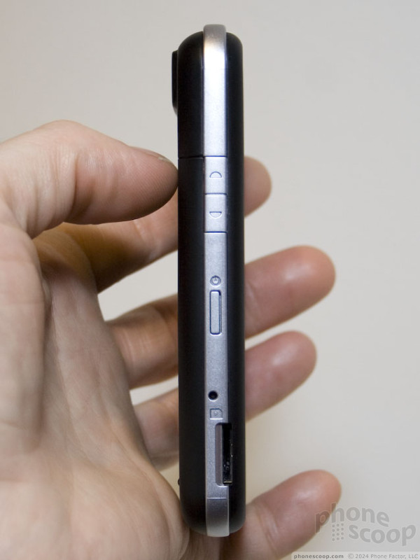
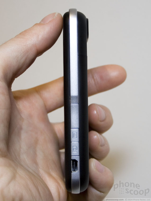
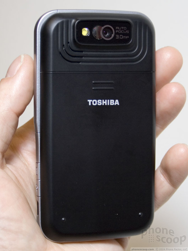
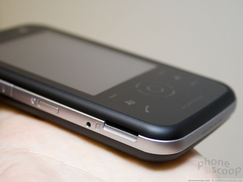
The G810 looks like a fairly typical PDA phone at a fairly typical size, and for the most part, it is. It does pack some nice specs, though, such as the next (still-unannounced) minor version update of Windows Mobile, HSPA 850/1900/2100 (HSDPA and HSUPA) data, full GPS, Wi-Fi, and a 3 megapixel auto-focus camera. The fact is that features like this are becoming standard for a PDA-phone, but still, this device surely isn't missing much.
One oddity is the touch nav keys. It's rather unfortunate that Toshiba went for form over function here. They're just as annoying to use as you'd imagine, especially since there's no haptic feedback. Physical keys would have been much, much easier to use.
On the software side, Toshiba has done a bit of differentiation by bundling menu-replacement software by Spb.
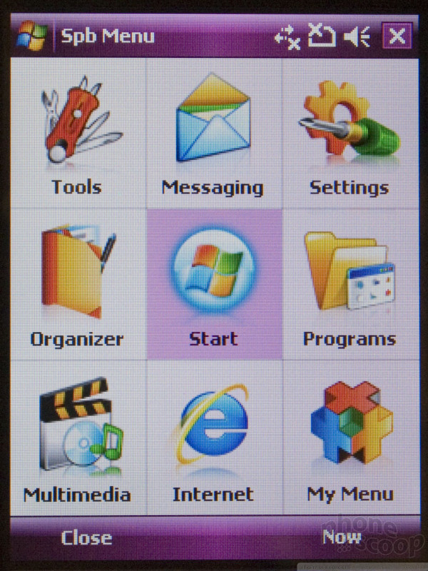
This menu system presents large buttons for navigating to common applications, making at least that part of it finger-friendly. If you happen to load finger-friendly software apps on it as well (something we expect to see more of this year) then you might have a device you can use without a stylus most of the time (and without using the troublesome touch d-pad.)
Overall, the G810 seems well-built and solid. It's not remarkably small or thin, but it's not unusually large, either. If you can deal with the touch nav keys, the speedy HSPA data - compatible with US 3G networks - certainly makes it worth a look. Being able to snap a decent 3 megapixel photo, geo-tag it, and upload it quickly with HSUPA is a tempting prospect.
E-Ten
E-Ten isn't exactly a household name, but they're becoming a little better known these days, as they continue to crank out Windows Mobile devices with attractive specs.
The E-Ten Glofiish M800 is one phone that really got a lot of people's attention recently. With a QWERTY keyboard, HSDPA 850/1900/2100, Wi-Fi, GPS, 500 MHz processor, and a VGA display, the M800 seems like a dream device to hard-core Windows Mobile folks.
It's not without its quirks, though, such as a terrible little joystick, and a generally big, blocky design. That's why we were excited to see the M810 announced at this year's MWC, which trims down the size a bit and switches from a joystick to a d-pad.
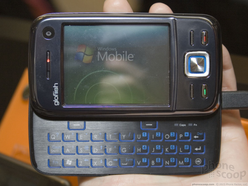
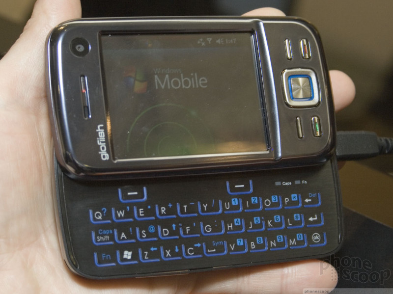
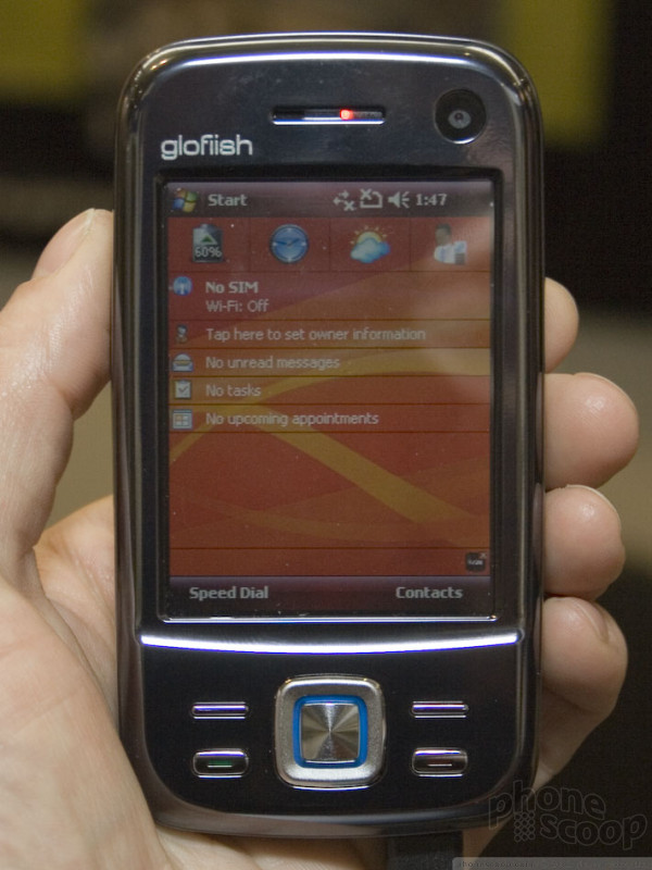
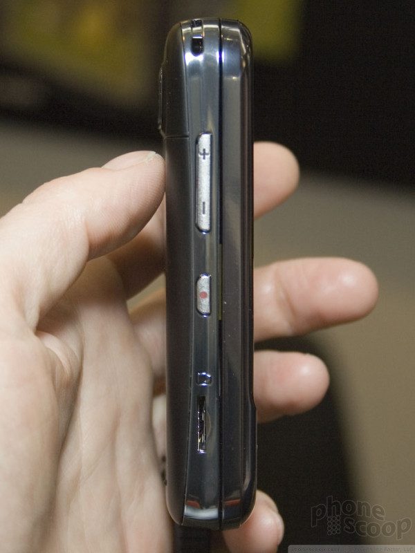
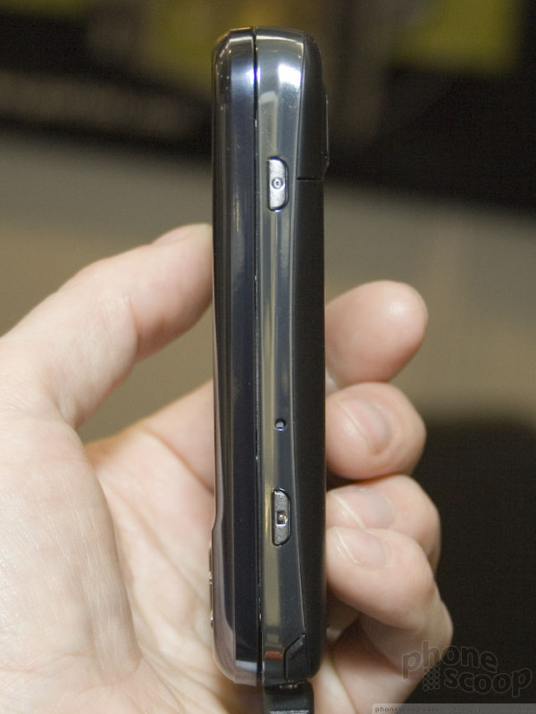
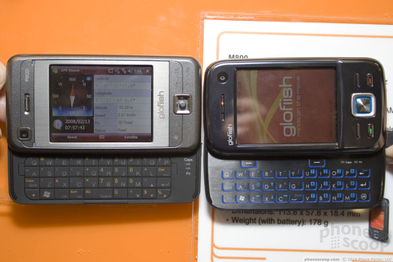
The new smaller size is indeed nice, and the d-pad isn't perfect, but is perfectly decent.
Unfortunately, E-Ten mare some trade-offs in the design of the M810 that make it quite flawed. The worst is definitely the QWERTY keyboard. We've subjected ourselves to a lot of crappy QWERTY here at Phone Scoop, but the keyboard on the M810 may be the worst we've tried yet. It's that bad. The keyboard is just one flimsy sheet of metal with a few slits cut for the rubber that divides the keys, much like a RAZR keypad. That design works for numeric keypads, but not so much for the more-demanding QWERTY layout, and regardless, E-Ten's implementation simply feels crummy, and is hard to type on.
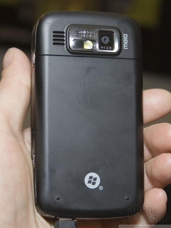
The M810 also downgrades to a QVGA display, although the other specs remain similar to the M800, including tri-band HSDPA data, quad-band GSM, GPS, Wi-Fi, 500 MHz processor, and 2 megapixel auto-focus camera.
After trying the M800 and M810 side-by-side, we'd like the M810 much better if we never opened it to use the QWERTY keyboard. But for anyone who needs to compose email on the go, the M800 is the better choice, provided you can deal with the crap-tastic joystick and bit of extra bulk. The M800's keyboard is actually quite nice, in fact. It's better than most QWERTY keyboards from first-tier manufacturers.
Eric has been covering the mobile telecommunications industry for 17 years at various print and online publications. He studied at Rutgers Newark and University of Kentucky, and has a degree in writing. He likes playing guitar, attending concerts, listening to music, and driving sports cars.
 CTIA 2008
 Samsung Refreshes Galaxy S Series with S Pen, New Cameras
 iPhone 14 Plus Offers a Big Screen For Less
 Samsung S24 Series Adds More AI, Updates the Hardware
 Nokia Brings New G Series to US
 Nokia 6210 Navigator
 Nokia 6220 Classic
 Nokia N96
Comments

fm transmitter?

Where's the Garmin Nuvifone??
Why hasn't Phonescoop reported on the Garmin Nuvifone? Get on it. 🙂
NK
https://www.phonescoop.com/news/item.php?n=2712 »
We did make sure to check it out at MWC, but "it" was just a plastic dummy phone in a glass jar. Seriously.
We'll let you know when they have a real phone to show off, that ...
(continues)


why can't we......
http://www.zzzphone.com/ »
MM

Toshiba Portege G450???

lately at&t's smartphone line has been full qwerty devices.
no love for us oldschool s60 fans.


Modu.. where have you been all my life?
Does anyone else think this has the possibility to revolutionize the phone market?
the moment i saw this modu, i thought what a wasteful fad.
a year or two from now, people are going to have jackets all over their junk drawers.
not for me.
i'd get an iphone b4 th...
(continues)

Motorola

Nokia N96


X1
f490 coming to Sprint (m800)
Kinda nice, but doesn't have slide out keyboard of u940 for verizon. There's also an ultra slim 3mp flip coming, seems more interesting than this.