Review: Apple iOS 8
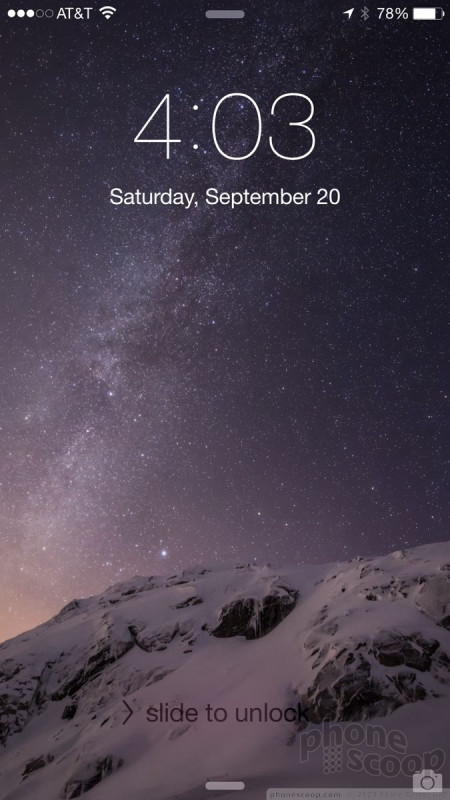
Lock Screen
The iOS lock screen has become a useful space over the years. It can deliver a wide range of content if you want it to, or remain a stark and barren landscape if that's what you prefer. A press of the power button or home button wakes the screen, which shows the clock and notifications. From here, there are several avenues to explore.
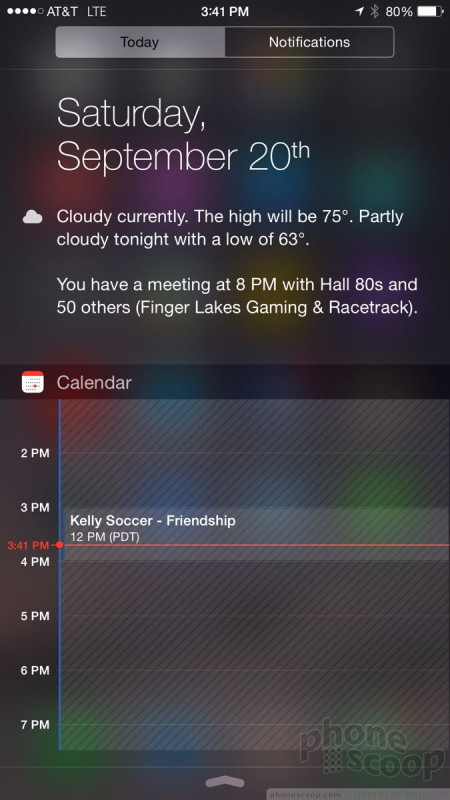
First, you can pull down the notification tray to dismiss your notifications or view your daily agenda. Selecting the Today tab shows the calendar and appointments for the day. It's handy for viewing your schedule without requiring you to fully unlock the phone first. It also shows the weather, stocks, and other widgets.
Second, you can use the camera shortcut to open the camera. The camera shortcut is often hard to see. It is tucked into the lower-right corner of the screen and is semi-transparent. It should be more obvious. It's also a shame that the camera is the only shortcut available. You can't, for example, jump right into your messaging app or the phone straight from the lock screen.
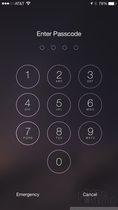
Third, you can swipe up from the bottom to open the “control center” to access basic settings. And fourth, you can fully wake the phone by swiping to the right. If you've elected to use a passcode (highly recommended), you'll have to enter it before going to the home screen. Passcodes can be simple four-digit PINs, multi-character passwords, or a press of the TouchID fingerprint sensor (if your iPhone has one.)
I wish the clock could be customized. It is a white, digital clock. Sometimes I prefer analog, sometimes I prefer bigger fonts, sometimes I wish I could see two time zones at once. The iOS 8 lock screen clock is locked into a single format.
Android and - believe it or not - Windows Phone both have slightly more customizable lock screens. For example, Android phone often offer multiple shortcuts from the lock screen, while Windows Phone has completely customizable clocks.
Home Screens
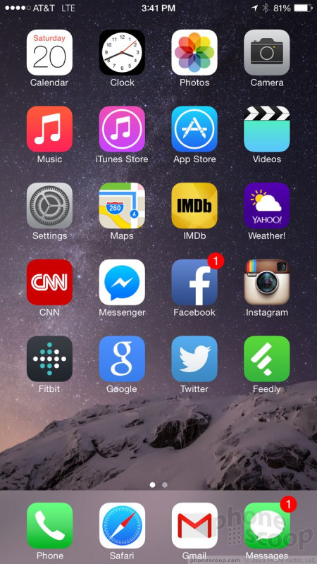
The iOS 8 home screens operate on the same principle they have since iOS 2 debuted back in 2008. This is somewhat disappointing.
The main home screen is also the left-most home screen. This is what you'll see most of the time when you unlock an iOS device. It's a grid of apps or folders. There's a persistent dock that sits along the bottom of the screen that holds four more apps. You can place any four apps in the dock.
The home screens are customizable to a point. If you start with a blank screen and add a single app, it will automatically jump to the upper left corner. You can't put it anywhere else. You can't stick an app in the lower left corner, for example, if there's nothing above it. This is something about iOS that I've long detested and iOS 8 doesn't fix it. You can, however, choose to put as many or as few apps on any given home screen, and then put more on additional screens.
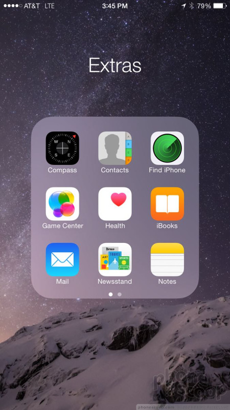
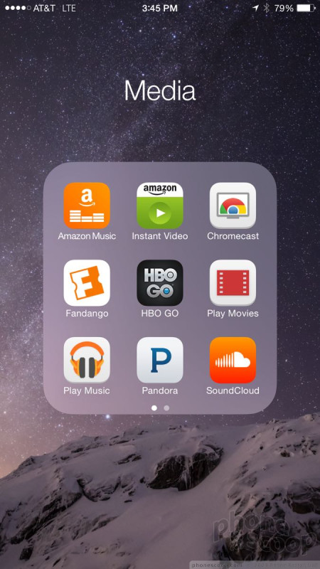
You can stuff apps into folders if you wish. Folders are automatically created when you drag one app on top of another. It'll suggest a name if the apps are similar, but you're free to pick whatever name you want. Folders can contain a seemingly unlimited number of apps, but you can only see 9 at a given time. Folders generate secondary pages when more than 9 apps are stored within. I wish Apple would make the folder window bigger so more of the apps are visible at a time (especially now that the iPhone 6 and 6 Plus have much larger screens).
iOS 8 still offers dynamic wallpapers that give the home screens a 3D look thanks to the slightly shifting background images. Last year, some people suffered from motion sickness thanks to this effect. It can be turned on or off at will, as well as minimized if you want. It's off by default.
Both Android and Windows Phone offer slightly more flexible home screens. For example, apps can be placed anywhere on an Android home screen, and Live Tiles can be expanded to three different sizes on Windows Phone. Further, both Android and Windows Phone allow the content on their home screens to change dynamically, be it in a widget or Live TIle. Some people may find iOS 8 inflexible in comparison. I know I do.
Control Center
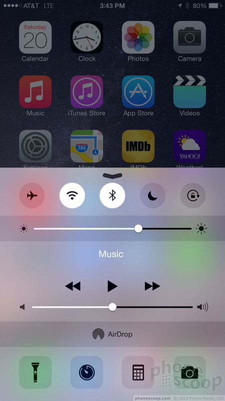
Apple added Control Center to iOS last year. The idea is to make it easier to adjust some of the iPhone's basic features without diving into the full settings menu. I think it's one of iOS's most underrated tools.
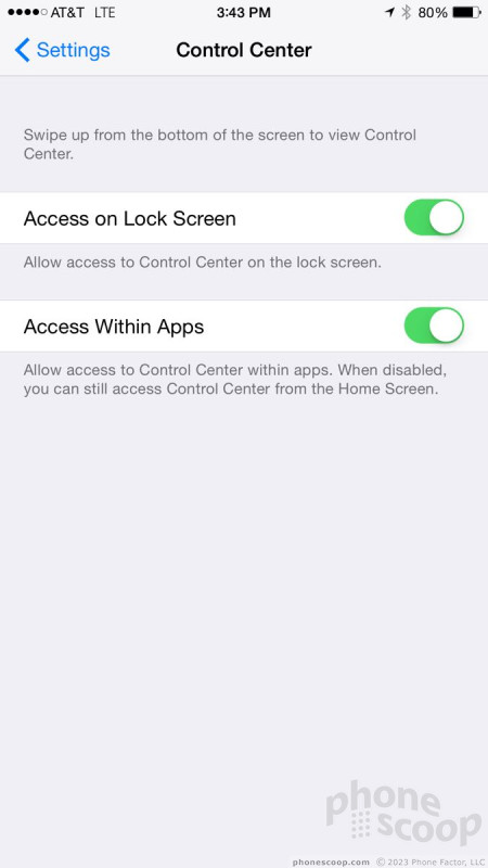
Control Center can be accessed from just about any screen within iOS. Swipe up from the bottom of the screen and there it is. You can disable Control Center access within apps, if you wish. It offers controls to the hardware and some software features. For example, you can toggle airplane mode, or the Wi-Fi or Bluetooth radios, as well as adjust brightness on the fly. Apple updated the UI for this. When you move the brightness slider back and forth, the rest of the screen adjusts the brightness level in real time so you can see just how bright it will be.
Basic controls for the music app show up in Control Center, too. You can play/pause, skip forward/backward, scrub through tracks, and adjust the volume. The Control Center makes it easier to share from the iPhone. You can turn on AirDrop and AirPlay, which let you send files to other devices and send media to the Apple TV, respectively.
Last, the Control Center gives you four shortcuts: flashlight, clock, calculator, and camera. These four functions (and all the controls) can be accessed and used from the lock screen when the device is locked.
Android and Windows Phone offer similar tools, but not quite as elegantly. For example, users of Android devices need to pull down the notification shade and then press another button to access toggles to the radios and brightness. The same goes for Windows Phones' Action Center. Some Android OEMs put toggles directly into the notification center, but in so doing reduce the amount of useful space for notifications.
Notifications
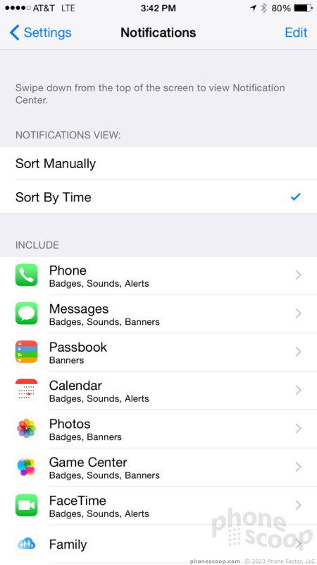
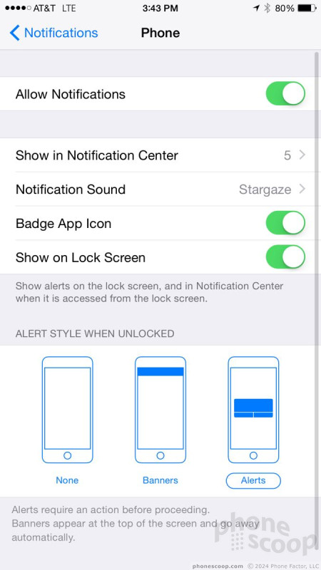
iOS 8 offers more control over notifications than any other mobile operating system. iPhone owners can manage notifications on an app-by-app basis, can choose from several different notification formats, and can prioritize them to appear in the order they prefer.
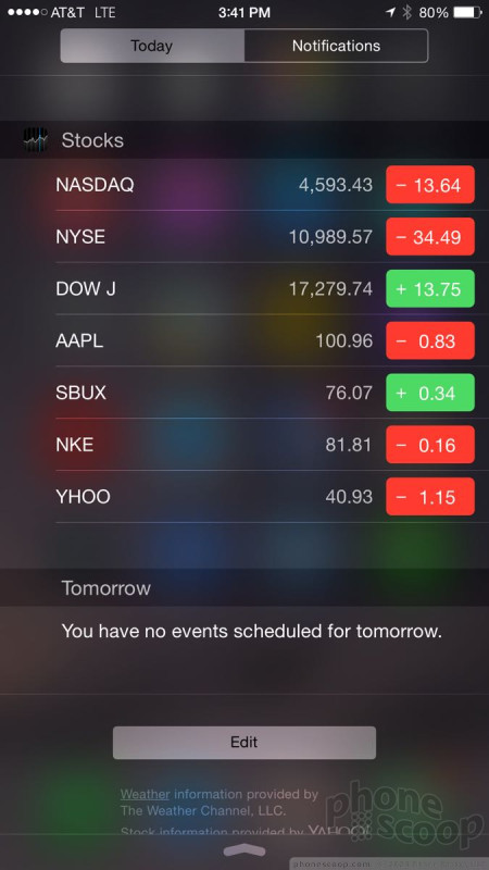
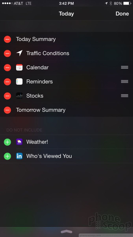
iOS 8 tweaked the notification shade so that it offers two tabs: Today and Notifications. The Today tab encompasses the calendar and your appointments. It will show you everything you have scheduled for the current and following days. iOS 8 lets you control what appears here, and in what order. The Today tab also displays the current weather conditions and a brief forecast for the rest of the day. iOS 8 lets developers create their own widgets, which can appear here. The widgets are dynamic and offer a quick peek at updated content that might otherwise remain hidden inside an app.
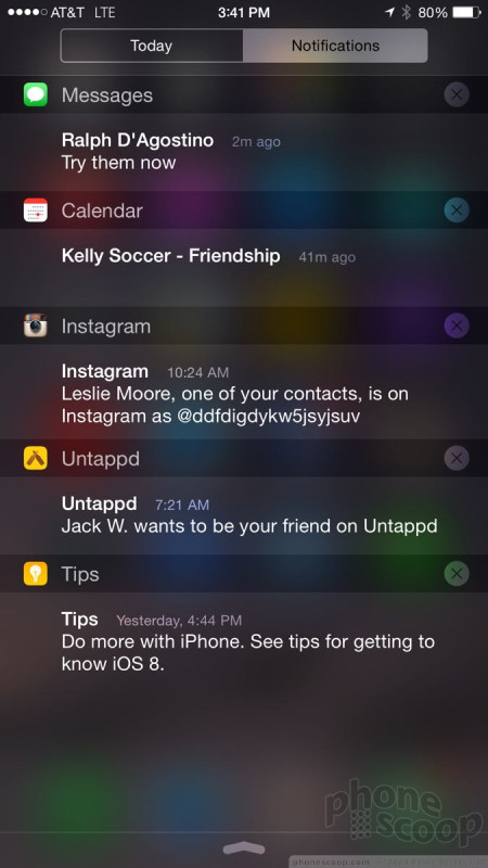
The Notifications tab is where all the alerts for incoming messages, calls, emails, and other apps land. You can sort them by message type, or in the order in which they were received. If you see a notification that you want to act on, press the notification and it will launch the associated app and conjure up a response. Notifications can also be dismissed en masse. You can even respond to text messages directly from the notification shade by swiping.
iOS 8 deletes the "Missed" tab that used to appear in the notification shade. It was reserved for phone calls. Notifications can be set individually to wake the screen for a minute, but doing so impacts battery life.
The Notification Center is extremely powerful, but also requires a lot of tweaking. The controls for each individual application are a headache to manage and need a bit of trial-and-error to get right.
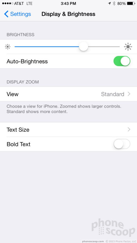
Settings
The settings menu is more or less carried over from iOS 7. Its appearance and functionality are essentially unchanged.
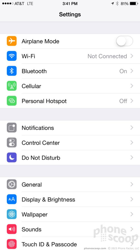
The settings are laid out in a single long page. Important hardware controls are positioned closest to the top even though they are duplicated in the Control Center. The top section also bundles in controls for the cellular data radio, personal hotspot, and VPN access.
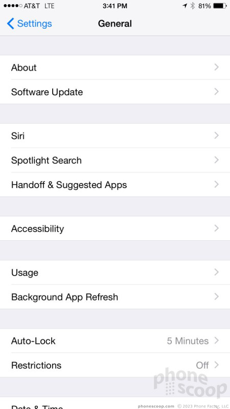
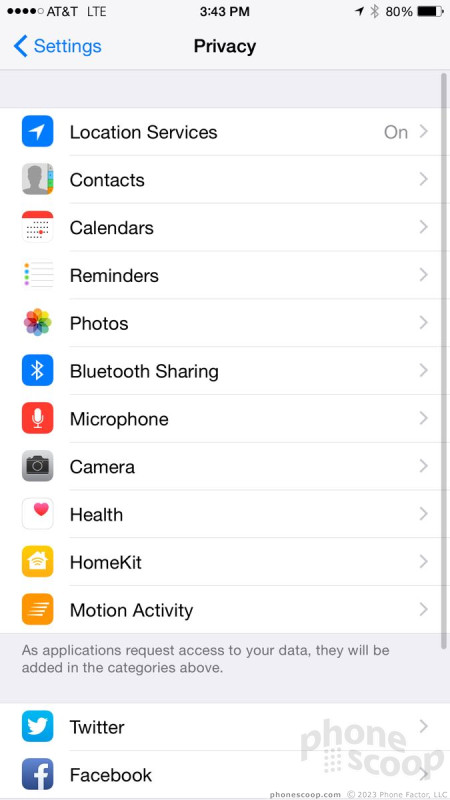
The next clump of controls lets you manage the Notification Center, Control Center, and Do Not Disturb functions. Each gives you pretty granular control over how these features behave, especially the Notification Center and Do Not Disturb tools. These are followed by access to controls for sounds, wallpapers, privacy, and general tools. The privacy controls let you choose what data apps can access. For example, this is where you can specify that Maps can access your location, but your whereabouts are off-limits to Facebook.
The settings menu is comprehensive and covers just about every single facet of the iPhone's behavior. The tools are laid out plainly and make sense to use. The settings menus of Android and Windows Phone may look different, but function in much the same way (long lists with nothing but text.)
Multitasking
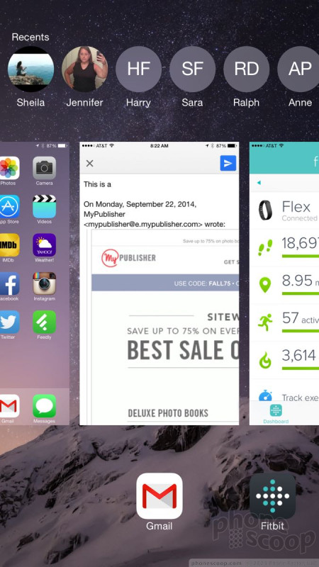
Most mobile platforms offer the same basic tools when it comes to multitasking. With iOS 8, a double-press of the home screen launches a carousel with all the recently used apps floating as cards on the screen. Each app card shows what the app was doing when last used. If you haven't fully closed any of your apps, the length of the carousel can stretch nearly into infinite. Swiping up on any of the cards closes the app.
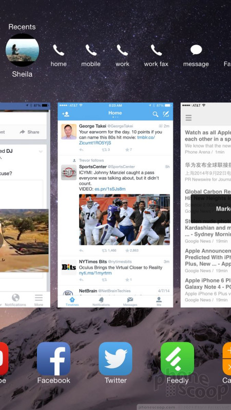
The one interesting new feature is the addition of contacts to the multitasking panel. The faces of the people you've contacted most recently, whether via email, phone, or message, now also float on the screen above the app cards. It also lists your favorites. Press the little circle and it will expand so you can call, message, email, or fax them. (Why fax and not FaceTime?). This is rather nifty, though it adds a bit of clutter.
In Android, a press of the multitasking key (on most devices) launches a vertical carousel of recently-used apps. In Windows Phone, a long press of the Back button has the same effect. All three platforms run about even with respect to this feature, though some Android OEMs have taken multitasking to the next level by allowing multiple apps to run side-by-side on the screen at the same time. iOS 8 doesn't go that far, at least not yet.
Spotlight
Spotlight is the built-in search function for iOS devices. The mechanics are the same in iOS 8 as they were in iOS 7, but Apple greatly expanded Spotlight's searching powers.
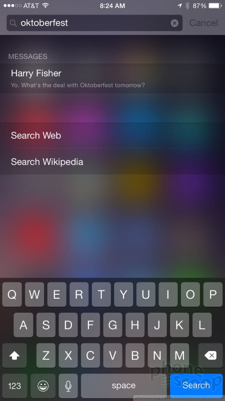
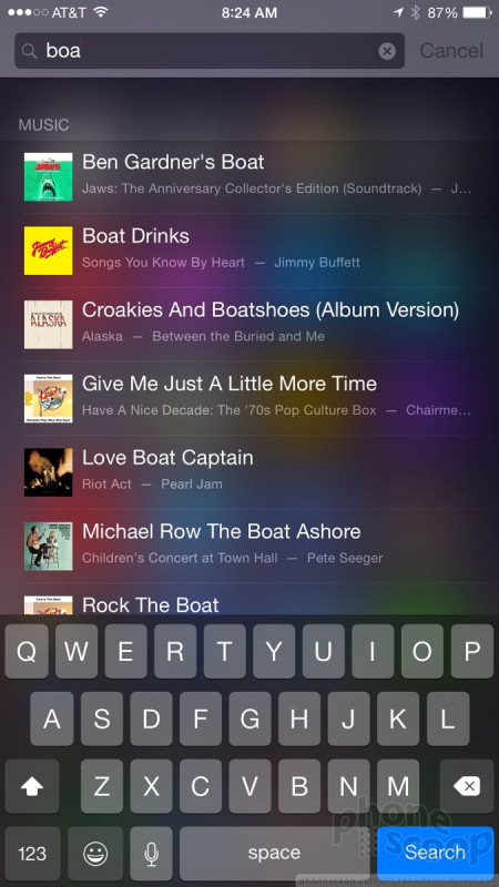
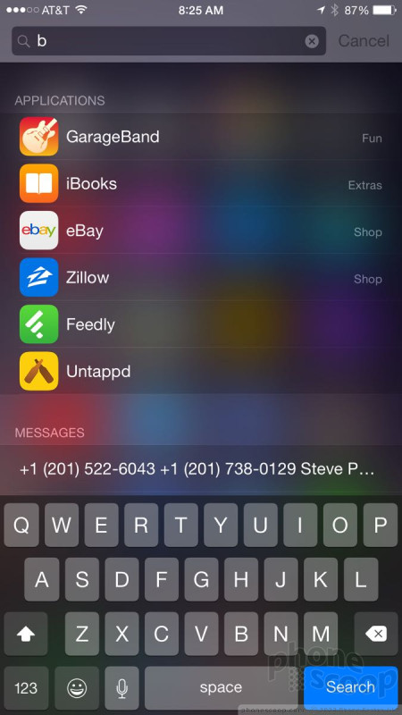
To launch Spotlight, place your thumb in the middle of the home screen and pull down. The search box will appear at the top of the screen. This isn't exactly an intuitive gesture. In fact, I only discovered it by accident. Apple could have done better. What's great about Spotlight is that it no longer searches just the content of the iPhone or iPad. Spotlight now also searches the internet, iTunes, app store, movie showtimes, nearby locations, and more.
For example, I performed a search for "Ozzy." Spotlight showed me all the Ozzy music and movies that are in my iTunes library, as well as provided links to Ozzy's Wikipedia page and general Google Search results. A search for "BMW M3" brought up the M3's Wikipedia page, but also provided links to BMW's web site. If you search for a particular contact, it will reveal that person's contact card as well as any other documents, files, or calendar items with their name.
Spotlight is more useful than ever, though Google and Microsoft have solid competitive features built into Android and Windows Phone, respectively. Google Search is, well, Google Search. Bing on Windows Phone is quite capable, too.
Performance
We tested iOS 8 on an iPhone 5, an iPad Air, and an iPad Mini. So far, so good. I didn't notice any problems running the new operating system on hardware that's as much as two years old. Everything about iOS was fast. Screen transitions were quick, animations were smooth, and applications opened in a blink.
A word of caution: New versions of Apple's mobile operating system are notorious for crummy performance on older iOS devices. If you're using an iPhone 4s (which is technically compatible with iOS 8), you might want to hold off on updating. Early adopters have already noted miserable performance on the 4s, though we can't corroborate this.
 Samsung Refreshes Galaxy S Series with S Pen, New Cameras
 Samsung Refines its Foldable Phones
 iPhone 14 Plus Offers a Big Screen For Less
 Snapdragon 8 Gen 2 Redefines AI in Flagship Phones
 Hands On with the Motorola edge+ (2023)