Review: Apple iOS 7 from A to Z
Apple has updated most of the applications that are native to iOS. Here are the changes specific to each app.
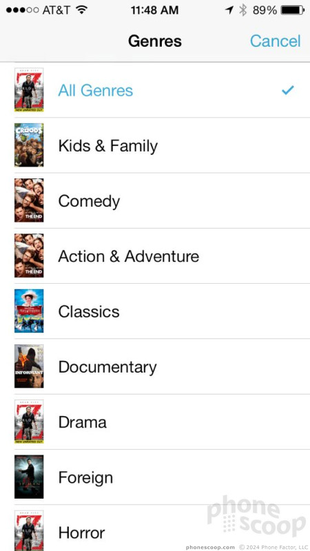
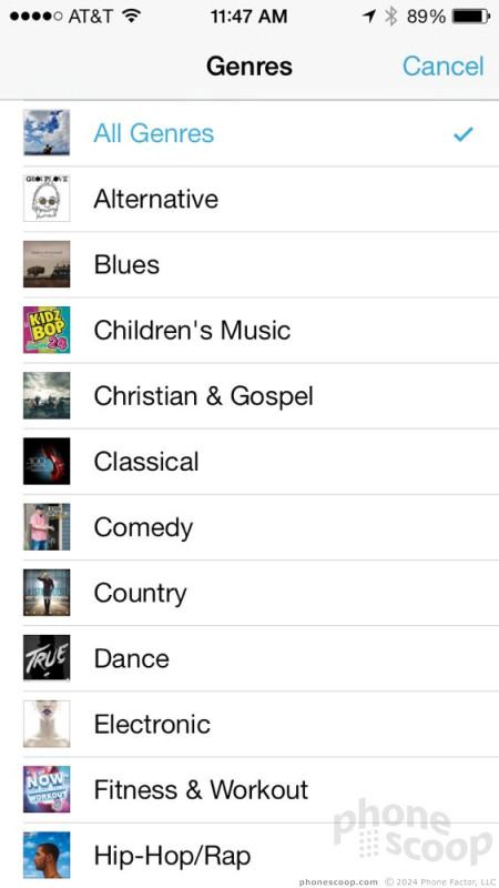
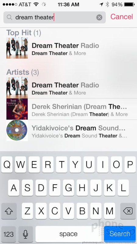
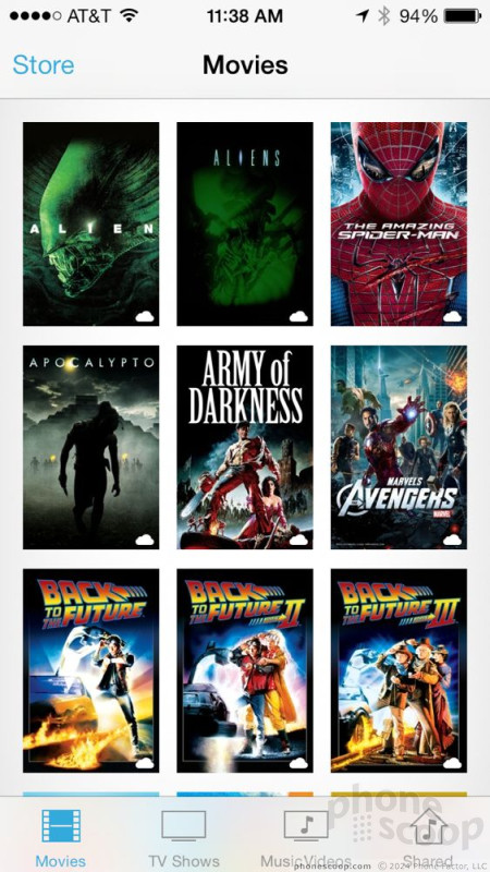
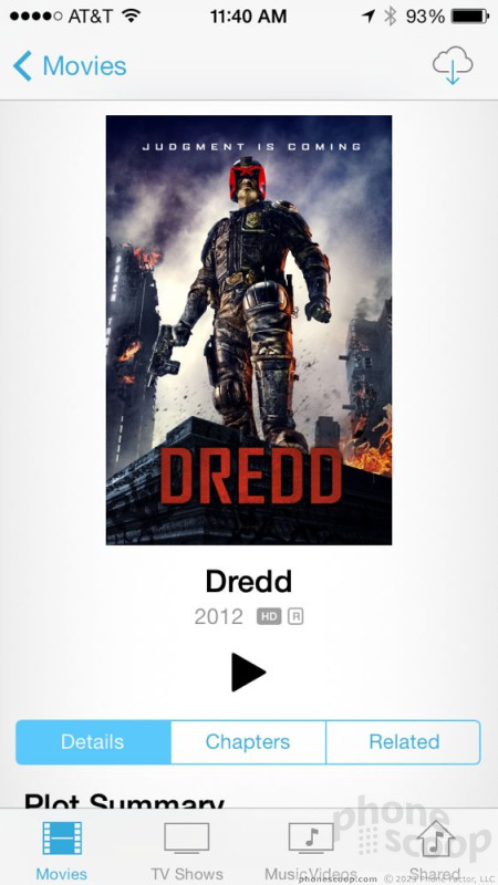
App Store / iTunes
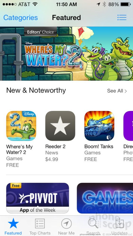
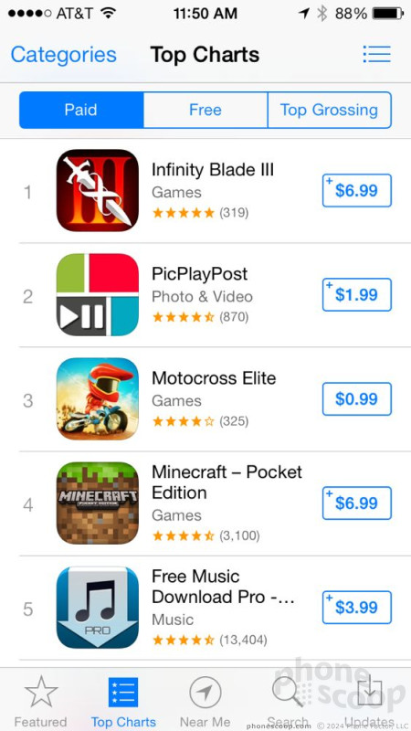
Both the App Store and iTunes have been retooled with a heavy dose of iOS 7's new design aesthetic. The App Store is cleaner, neater, and makes good use of white space to define its different sections. You're still able to easily browse through featured apps, the top charting apps, and perform quick searches for specific apps.
Among the new features is a browsing tool called Near Me. When you select this, the App Store will use your location to determine if there are any apps relevant to where you are. If you're standing in midtown Manhattan, for example, it might suggest an app that details how best to enjoy the Empire State Building. In my tests of the feature, I met with limited success. Out in the suburbs, it will show you what apps are popular where you live, but if there's nothing interesting nearby, the App Store will not show you interesting apps. If you're in a spot with a lot of touristy places, you'll have a better experience with this feature.
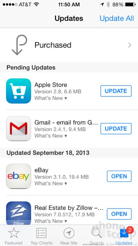
My favorite feature of the new App Store, though, is that it now updates applications automatically. In older versions of iOS, users had to confirm that they wanted to update apps. Now, apps are updated in background so you (almost) never have to worry about them. Large apps (>100MB) still require Wi-Fi to update. The "Updates" section of the App Store clearly tells you which apps were updated when, so you always know that you have the latest version available. Importantly, you can turn this feature off if you want to manage your apps manually.

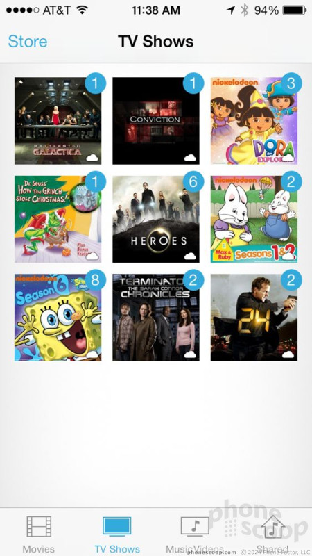
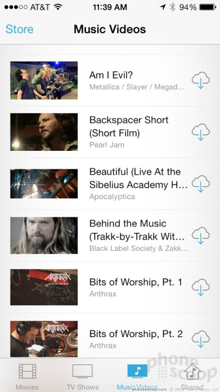
The iTunes Store in iOS 7 looks identical to the App Store. It's just as simple to browse for music, movies, and TV shows, or perform searches. The iTunes Store highlights featured content, but also makes it a breeze to view what's popular or what's on sale, etc. The store lets you check previous purchases and (if you're using iTunes Match) see what's installed on your device and what isn't. The store also lets you tweak Genius settings and so on.
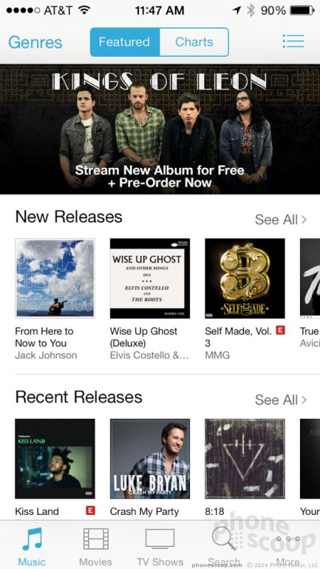

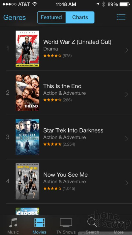
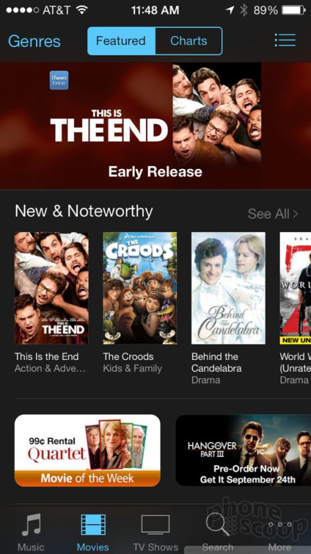
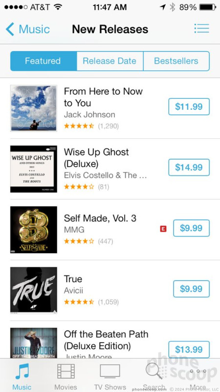
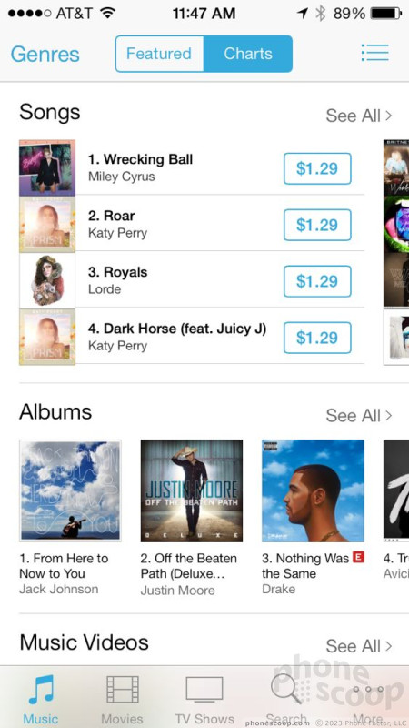
The App Store and iTunes Store are two places where iOS 7's redesign pay off. They really look much better than they did before. They also blow the Google Play Store out of the water. iTunes has always been a more powerful content store and that hasn't changed in iOS 7. Google could learn a thing or two from Apple in this respect.
AirDrop/AirPlay
There are two cool sharing features that more or less duplicate what DLNA and Android Beam do on Android devices.
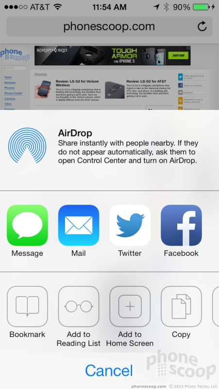
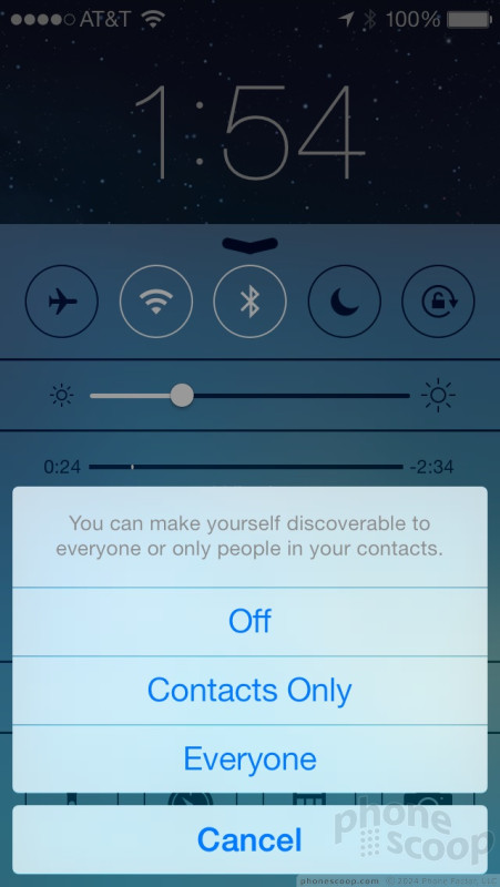
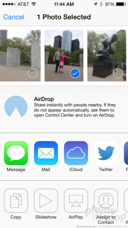
AirDrop uses Wi-Fi and Bluetooth to share files with other iOS devices. You can share photos, documents, contact data, and stuff like that. It's a bit like Android Beam except you don't need a phone with NFC and you don't even have to tap the two devices together. As long as you have AirDrop activated on your device, you can see other AirDrop phones/tablets in the area and push the content right over. It's dead-simple to use. After you've pushed the content, the other device will receive a notification. The owner of that device can choose to reject it or accept it. If it's a photo, it's added to their photo library, if it's contact data, it's added to their contact application, etc. It works between iPhones, iPods, iPads, and Mac computers. There's a little symbol that appears within content that can be shared via AirDrop. You'll know it when you see it. Other shareable files include notes, voice memos, Safari bookmarks, Passbook content, maps, and podcasts.
AirPlay lets you stream content from the iOS device to an Apple TV. This feature has been around awhile and is also very easy to use. There is a specific symbol in content that can be shared (movies, photos, music, etc.). Press the symbol and iOS will ask if you want to share that content with a nearby Apple TV. As long as the Apple TV is up and running, it's a breeze to share the content.
Camera
The iOS 7 camera application is brand new and reveals what features Apple thinks iPhone users really want from their smartphone's camera.
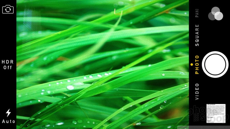
The camera can be launched from the lock screen, Control Center, or from the app on one of the home screens. iPhones don't have physical camera buttons, though the volume button doubles as a shutter release. The camera opens swiftly on an iPhone 5 and is even easier to use than before.
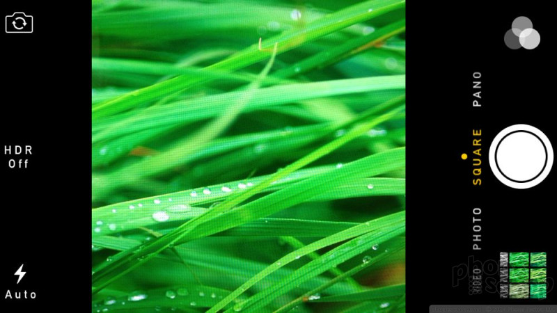
It presents a basic viewfinder in the center with a thin control strip running down the left edge and a thicker one along the right edge. The left one gives users quick access to the user-facing camera, HDR mode, and the flash. It's fantastic that Apple made the HDR mode accessible as an on/off switch in the main viewfinder. In iOS 6, you had to use a drop-down menu to find and turn on the HDR feature. Apple's HDR feature is among the best out there, and I use it constantly. Making HDR mode easier to turn on/off makes me very happy. Further, switching to HDR automatically turns off the flash. Smart. The user-facing camera switches much faster than it used to, and the flash toggle works well, too.
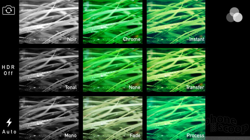
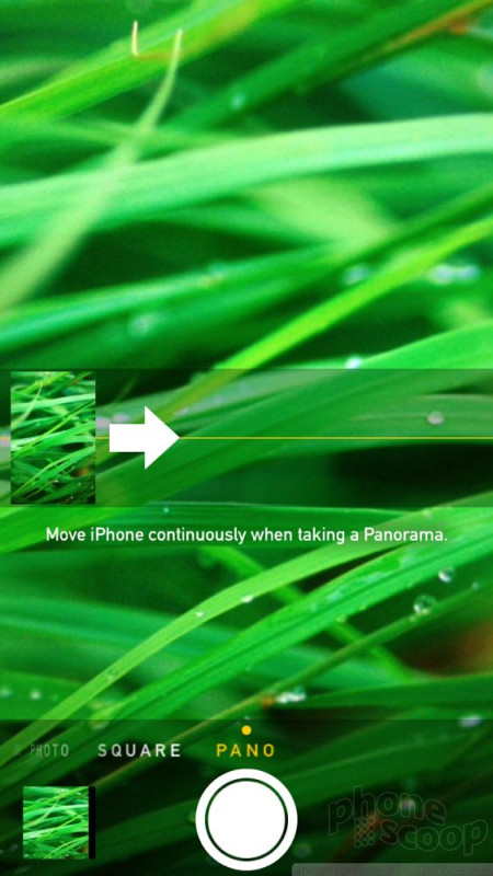
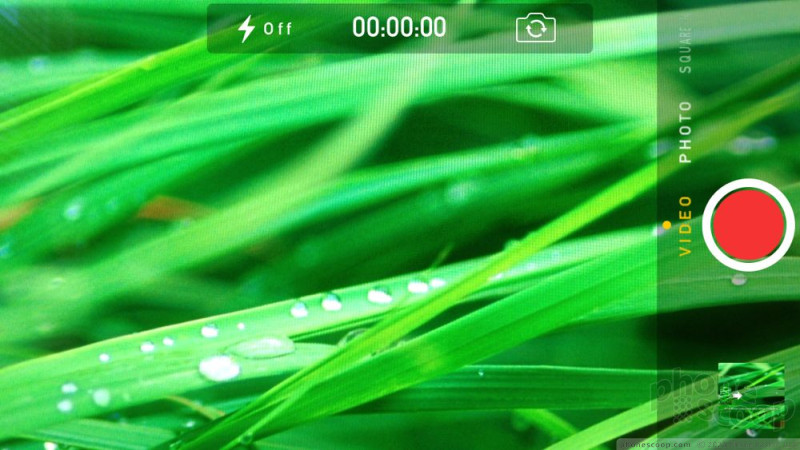
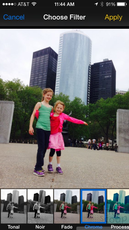
The control strip on the right includes the shutter button and lets you select from several different shooting modes: video, photo, square, and pano(rama). Rather than press a button or use a drop-down menu to change shooting modes, you swipe the screen from side-to-side. The default setting is of course a normal, 4:3 photo. If you want to shoot video instead, swipe sideways and you're now using the video camera. Ditto for the square and pano tools. When shooting in regular and square modes you can apply filters before you shoot. For example, I can put the iOS 7 camera into square mode, apply a sepia filter, and bingo I've replicated Instagram shots. There are nine filters altogether. It's a shame the filters aren't available when shooting video or panoramas.
I like that the shutter button is very responsive, how fool-proof the panorama shooting mode is, and the clean look of the camera. The touch-to-focus feature also works well.
The iOS 7 camera app is still missing a lot of features, though. With iOS, you do not have granular control over the bulk of the camera's functions, but this is the way Apple wants it (and the way Apple customers expect it). Apple favors simplicity over complexity and nowhere is it more evident than with the camera app. If you're bummed that the iOS camera doesn't offer features such as white balance or exposure control, take solace in the fact that its basic, automatic shooting mode is among the best in the business.
The video camera tools are even more stunted. You can choose the point of focus, and turn the video light on or off. Thankfully, you can also capture stills while shooting video.
It's nice to see that Apple advanced the usability of the camera, but I am still disappointed with the lack of features in the camera app.
Contacts/Phone
The phone and contact applications are among those least altered in iOS 7. They look different thanks to the radical new design, but the actual functionality and tools are almost unchanged.
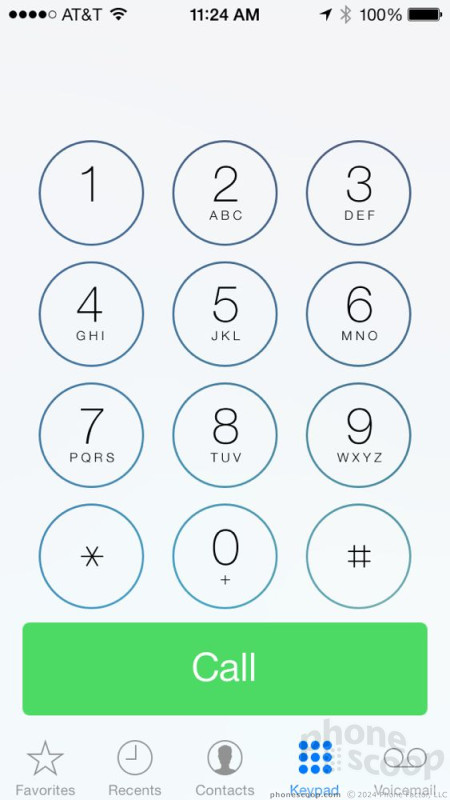
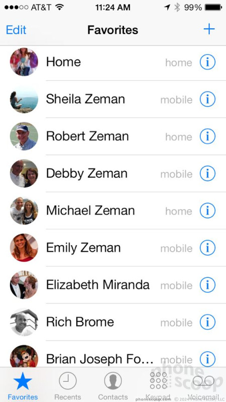
The phone app has five tabs that run across the bottom: favorites, recents, contacts, keypad, and voicemail. They are all pretty self explanatory. The favorites is a great place to create some calling shortcuts to those you call most frequently. You can create an innumerable set of shortcuts here. The software pulls over photos from your social networks so you can see a picture of the person you're about to call. The recent calls list can be sorted between all calls or just missed calls (why not dialed calls, too?). You can delete single call records.
The keypad uses the same circular buttons found throughout the operating system. One thing I dislike: In older versions of iOS, the phone app would show your wallpaper in the background with some controls floating above the wallpaper in a grid. Surprisingly, Apple decided to skip the transparent effect it uses elsewhere in the operating system. When a call is connected, the phone app has simple controls on a black screen. You can still see a thumbnail of the contact's picture, and you have access to functions such as mute, speakerphone, FaceTime, contacts, etc. The Send-to-Bluetooth feature is only visible when you've connected a Bluetooth headset. The phone is ridiculously easy to use, though it isn't as flexible as the phone app on Android handsets.


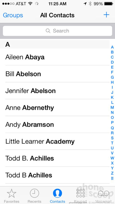
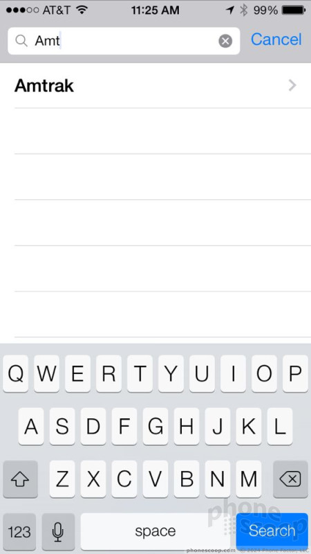
The contact application is kind of boring. This is one app that suffers from Apple's new design language. It's just all too white. The main view of your contacts is a long, alphabetical list. You can sort contacts into groups if you want. There's a search bar that's always visible so you can quickly find someone, and you can scrub quickly though the entire alphabet by dragging your finger along the right edge of the screen. It scrubs very, very quickly. I noticed no lag on the iPhone 5.
Individual contact listings are so spartan it's ridiculous. It's just pencil thin text on a white background. Apple's designers apparently ran out of ideas when they came to the contact app. Apple didn't do anything creative with the profile photos or anything else. BOH-rrinngg. There are no widgets for the contacts app, no Live Tiles, no recent social network updates, and none of the contacts' recent photos. Google and Microsoft both have much more interactive and connected contact applications in Android and Windows Phone, respectively.
The one thing I like about Apple's contact app is how easy it makes certain actions, such as sending a text message, or sending an email. It's certainly a breeze to use, even if that's because there's nothing to it.


Email/Messaging
The email and messaging apps take a page from the contact app. They are clean, white, and free of frilly design motifs.
iOS 7 supports a range of wireless syncing protocols, including POP3, IMAP4, Exchange, and CardDAV/CalDAV. This means you have a number of different ways in which to get your contacts, calendar, and email data to your phone. Most people use POP3 or IMAP4 because they are using internet-based email services. The others are meant for businesses or more advanced users. At the end of the day, you can rest easy in knowing that you'll be able to get your email and other data with no trouble.
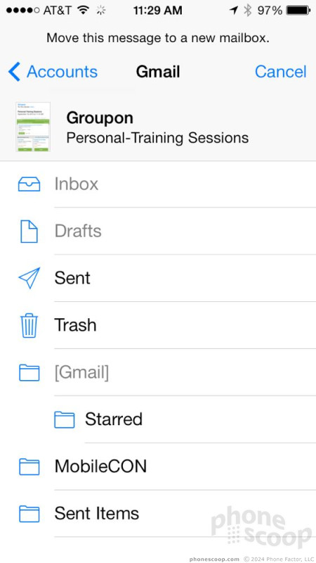
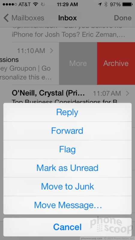
The stock email application is powerful enough for composing short messages and attaching photos/videos. The overall functionality of the app hasn't been updated much, but there is one pretty slick new feature. If you swipe from right to left on any given email, you'll see two options, Archive and More. If you hit the More selection, you can take a wide range of actions with that particular message. For example, you can flag or unflag it, mark it as spam, or move it to a different email folder. The mail app is also better at handling PDFs and any annotations therein, and the search function has been significantly improved. For example, you can use search modifiers. Type something like "from:Jane" into the search field, and the email app will pull up all the emails in your inbox that you received from Jane. The mail app can search the device, as well as the server for emails. It's also much faster than before.


The stock Gmail app for Android devices is still light years ahead, though. Even the Google-made Gmail app for iOS is better in some ways. For example, navigating through the inbox. The native iOS email app forces you to use these tiny little arrows to advance from one email to the next. With the iOS Gmail app, you can easily swipe from message to message.
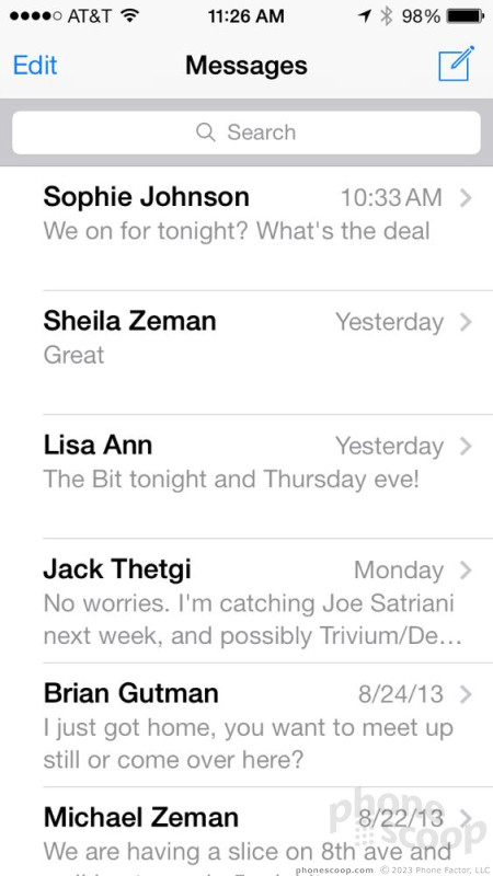
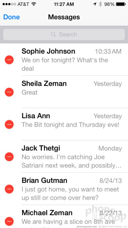
The text messaging app remains as bare-bones as ever. You can have conversations with one person, or a group. You can attach photos and other content, but there are no message templates to quickly drop in. Conversations are threaded, and photo/video content is put in line with the text. Individual text messages can be forwarded to others, though the process is a bit clunky (press-and-hold for a secondary menu).


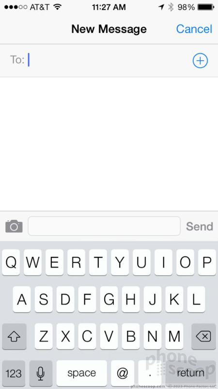
Both the email and messaging apps make use of the iOS 7 keyboard. If you were hoping for a vastly improved keyboard, you're going to be disappointed. I don't see any real difference in the size/shape of the software keyboard itself — meaning the buttons are just as hard (or easy) to press as they've always been. I feel comfortable saying that the word prediction and auto-correction is slightly better, but only slightly. When I look back at my words after finishing a long sentence I still see errors, just not as many of them.
What bugs me most about the keyboard is that there aren't many customization options. You can install some third-party keyboards, but they mostly offer symbols or emoji. You can't, for example, install something akin to Swype. That's annoying. Further, some third party keyboards for platforms such as Android are amazing at predicting what word might come next in a sentence. The iOS 7 keyboard doesn't offer any such advanced features.
Game Center
Thank goodness the Game Center has seen a visual overhaul. I hated the felt-covered gaming table of the old one. Game Center fully adopts the new design language in iOS 7 and that's a very good thing. It makes use of the color palette and white space, and has a much more modern and interactive appearance.
The central screen of the Game Center gives you an overview of your account. Your status is plainly visible at the top and there are easy-to-read notifications so you know if others want to play games with you. It is a cinch to see who else is online, see your own games and progress within each, as well as accept challenges or take turns.
The Game Center keeps track of your own downloads and games, and will also make recommendations for other games with links to the App Store.
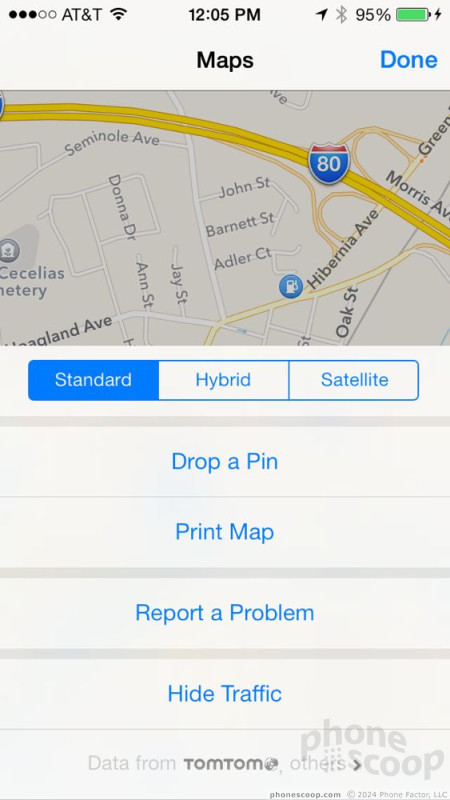
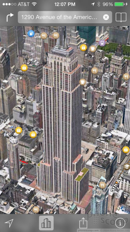
Maps
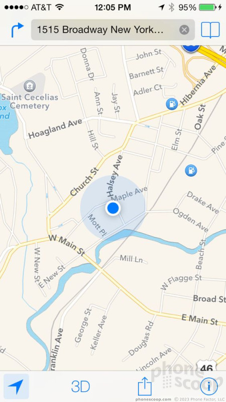
Apple's own Maps application was first released with iOS 6 in 2012. It was a disaster. Most of the problems stemmed from out-of-date or incorrect map data. Apple promised it would improve Maps, and it has.
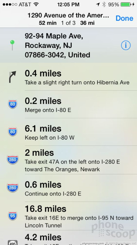
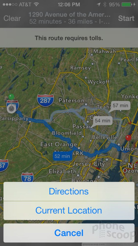
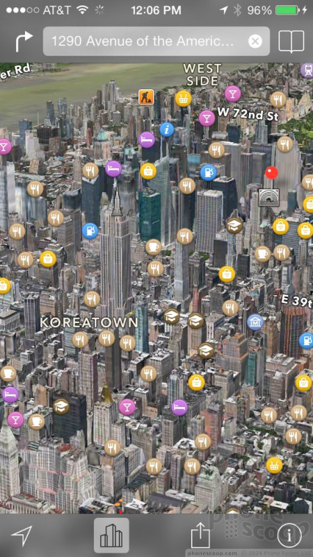
The newest iteration of Apple Maps pulls data from TomTom and several dozen other companies (some of which Apple acquired over the course of the last year). The result is far more accurate map data and navigation directions that won't accidentally send you out to the middle of the desert. Perhaps the biggest improvement I noticed in Apple Maps in iOS 7 was the speed (at least on iPads and the iPhone 5). The app is much faster at rendering maps, especially 2D maps. The 3D fly-overs are available to more cities, and they continue to look amazing. It's quite incredible the amount of detail Apple was able to apply to the 3D renderings of a city as dense and diverse as New York.
Apple Maps also works well when it comes to navigating between points. I was able to easily plot directions and follow them to my destination. You can also share directions, bookmarked locations, or your location details with others via AirDrop, SMS, email, Twitter, and Facebook.
Apple Maps still has limitations. For one, real-time traffic information is weak at best. The tool uses a series of dots to convey heavy and/or stopped traffic. These indicators are almost impossible to read when the device is held close to your eyes, let alone at arm length. Why Apple doesn't use the red, yellow, green system that other map apps use is beyond me. With Google Maps, for example, I know that a red road is a stopped road. Other advanced features, such as dynamic re-routing due to traffic problems ahead, mass transit or bicycling directions, and ETA notifications are all MIA in Apple Maps.
Suffice it to say, Google Maps for Android (and iOS) and Nokia HERE Maps for Windows Phone offer more features.


Music/Video, iTunes Radio
Apple gave the music and video player apps a modest refresh. The music player gains several notable new features, but the video player was somewhat neglected.
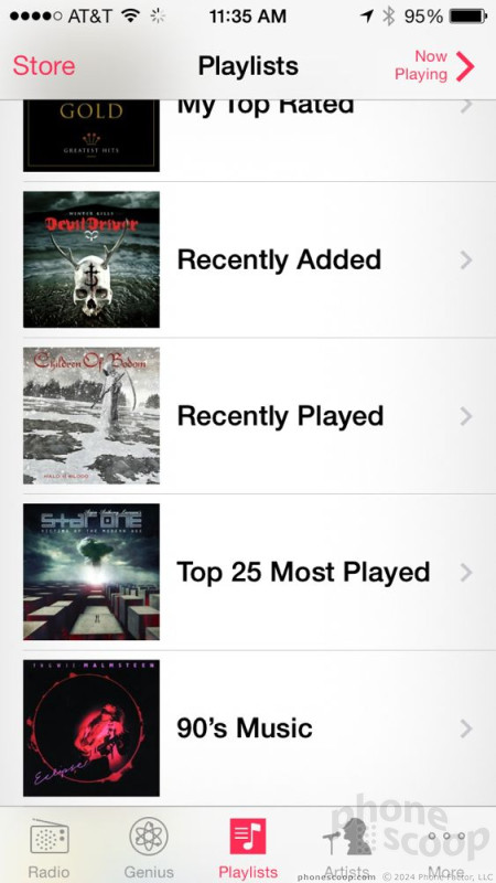
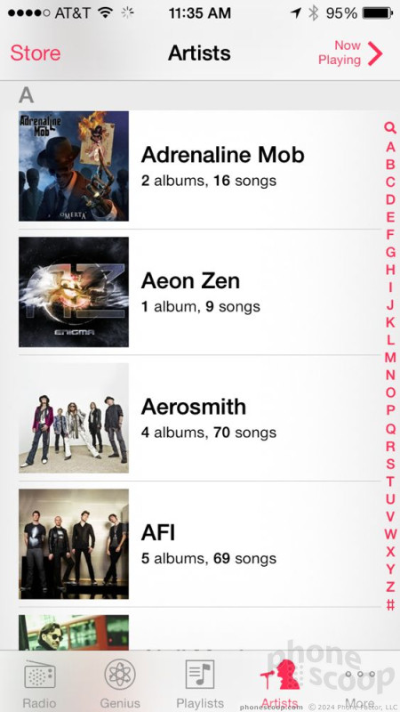
The music (or MP3) player has been visually overhauled to match the look and feel of the iTunes Store. It more closely resembles the store when you're sorting through songs, artists, playlists, and so on. I like the cleanliness of the design in this app. I find that the music experience is greatly enhanced on iOS devices with iTunes Match. The service, which costs $25 per year, lets you access your entire iTunes Music Library from pretty much anywhere. When first launched on your PC, Apple will scan your MP3 library for songs. It will upload any songs that it does not already own, and match the rest with its own selections. You can then turn on match on an iOS device and download any song from your library over the air if you want. In addition to the music files themselves, iTunes Match also carries over playlists from iTunes. You can download individual songs or entire playlists with just a few button presses.
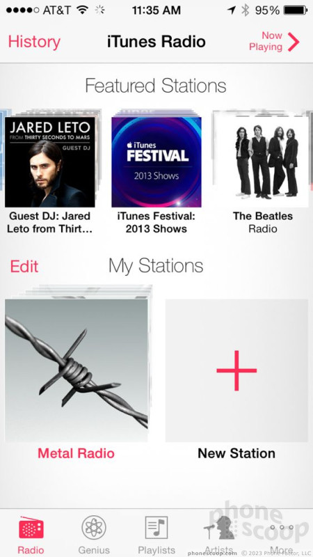
This is a great first step for the music fan. With iOS 7, however, there's a lot more. iOS 7 marks the introduction of iTunes Radio.
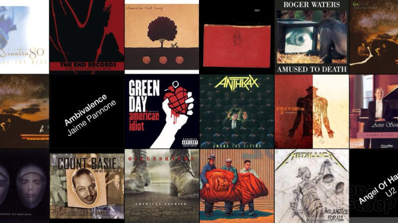
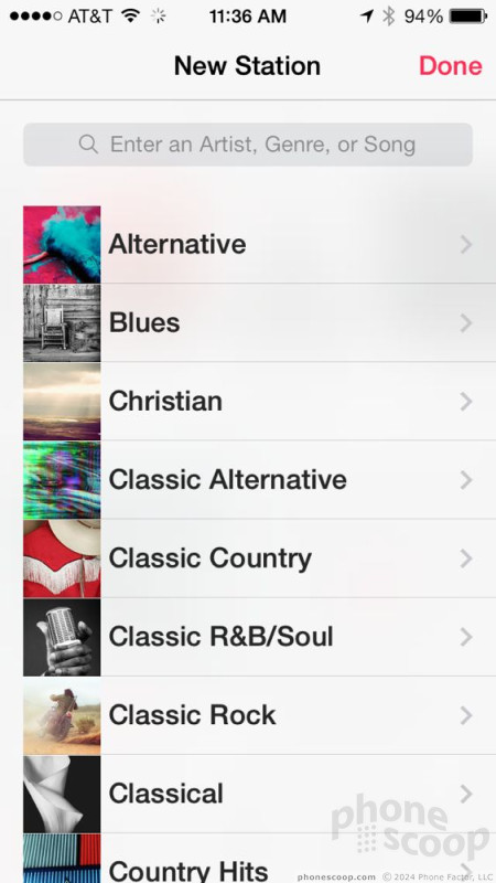
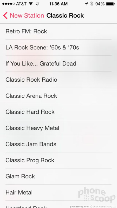
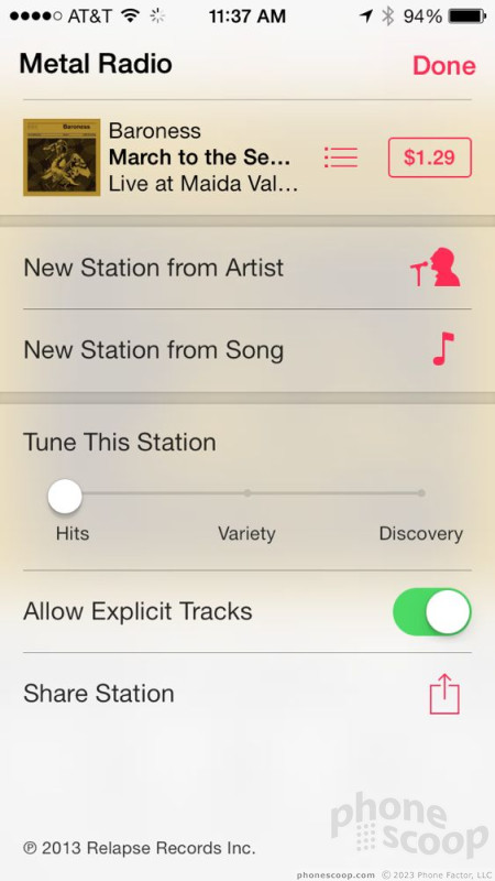
iTunes Radio is free and lets iOS device users stream curated radio stations over the network, as well as create their own radio stations. There are about 100 prefabbed stations that range from pop to country to R&B and rock. Many of the stations straddle mainstream selections, but more than few offer some off-the-beaten-path genres/artists, too. I was pretty happy listening to the various heavy metal radio stations over the period of a week. Of course, as you listen to each song you'll notice links that lead to the iTunes Store to buy the track (if you want). You can also view artist/album information, as well as favorite individual songs, stations, and so on. Basically, it's Pandora or Slacker for Apple devices.
iTunes Radio lets users customize radio stations as you go. The one pop channel I listened to, for example, had too much dance-oriented music in it. I skipped over those tracks and favorited some of the more singer-songwriter songs in the playlist and it eventually cut down on the dance-y songs and added more singer-songwriter tunes. Neat. There's also a history function that keeps track of every song you've listened to. This is really cool if you want to go back to get information about a particular song.
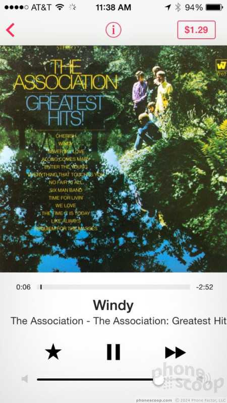
As for the quality, well, it's OK. I don't know what bit-rate Apple is streaming the tunes at, but it appeared to vary. I noticed a wide range in the quality from song to song, even when listening over Wi-Fi.


The rest of the music app in iOS 7 functions pretty much as it did before. My biggest disappointment? Still no user-adjustable equalizer to fine-tune the sound.
The video player is disappointingly feature-less. If you've loaded video content onto the device, it will show up in the device library. If not, you'll see your iTunes In the Cloud purchases, which are available for download if you're connected via Wi-Fi. Of course there is a link that takes you to the iTunes Store so you can peruse the collection of for-rent and for-purchase content, too. I was kind of hoping to see some tie-ins with third-party services, such as IMDb, or other similar sites that offer gobs of additional data on what you're watching. Oh well.
Video playback works fine with iTunes content. As long as you know how to rip iTunes-compatible files, you can sideload those, too. Playback controls are the simplest, including play/pause, skip forward/back, scrub through the video and so on.

YouTube is no longer part of iOS in that there's no preinstalled app. You can, however, still upload videos from the camera roll to YouTube directly. Google makes an separate iOS YouTube app, but you're on your own to download it.
Apple's music and video player are among the easiest to use and also among the best. Google's Play Music and Play Movies apps just don't compare yet, and I think they're more finnicky, too. Apple knows to make sure people can enjoy the content on their phones, and it shows.
Photo Gallery
Apple made some large and welcome changes to the photo gallery application. It is much better than before thanks to both the new design and new tools for controlling your pictures.
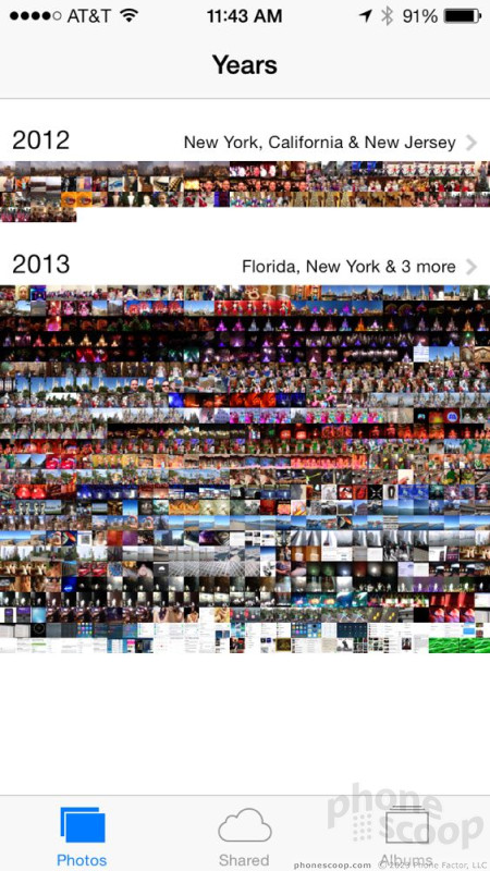
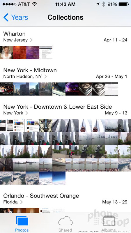
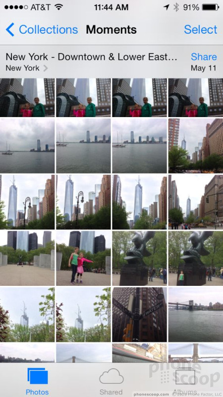
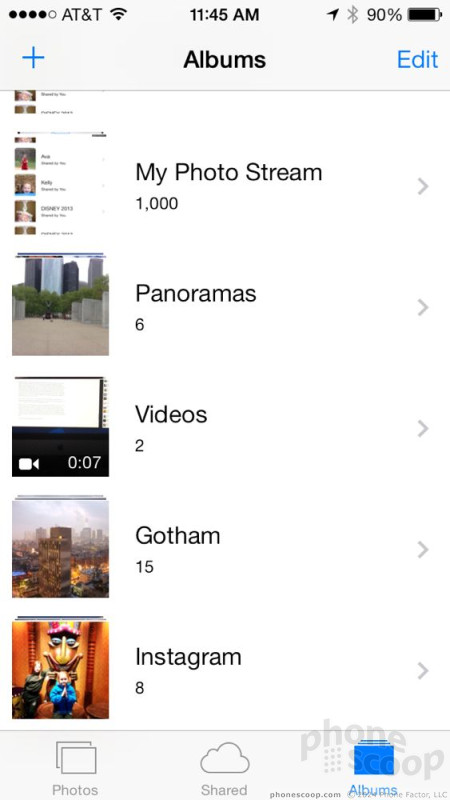
Photos are now automatically organized into new groups based on time, date, and location. For example, it will show you all the pictures you took in 2012, 2013 in one big massive collage. Select the collage, and you'll drill down into each individual year. Years are broken up into Collections (semi-large groups of shots all taken in a given location/time) and Moments (smaller groups taken at more specific locations.)
For example, a Collection will show me all the pictures I took over a one-week period in Las Vegas. A Moment will show me the pictures I took when visiting the MGM Grand one evening, complete with locations, dates, and so on. It's a neat way to view and browse through your photo collection. It's very immersive, and makes it easier for you to re-experience moments you had throughout the year.
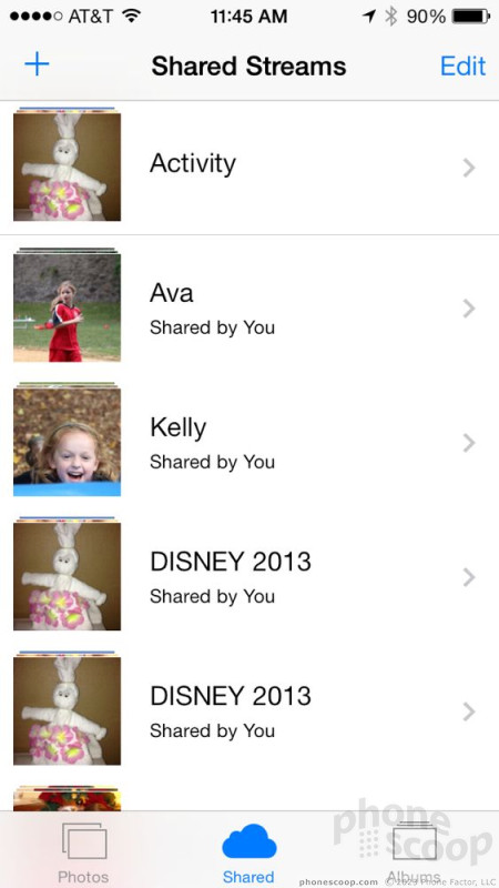
The photo gallery of course still supports shared photo streams. In the photo streams, you can see all your own photos, as well as the photos your friends and family have shared with you.
Last, the photo gallery still supports organized albums. For example, if you uploaded an album called "Kids Sports" to your device, that album will be visible in the album view of your photos. Perhaps my favorite new feature of the album view is that it creates a folder just for videos. You can now find all the videos you've taken in one spot. Thank goodness. iOS 7 also allows you to create your own albums on the device, though it is a bit unintuitive to use.


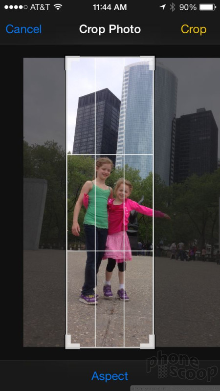
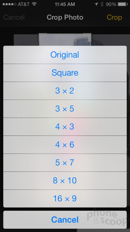
iOS 7's gallery app builds a bit on what was available in iOS 6 as far as editing features go. You can of course crop and rotate photos, use an "auto-enhance" tool that fixes exposure and color, as well as eliminate red-eye and apply different filters to create specific effects. If you're really interested in editing photos, you'll need to use Apple's iPhoto application, which is an extremely powerful app (that's now free!)
One thing that Apple's photo gallery is not good as is being social. Sure, it's easy enough to share photos with other iOS users, but there's no syncing with your various online accounts, such as Flickr or even Facebook. Android and Windows Phone both offer more socially-connected photo gallery applications. The saving grace in iOS is that it is the simplest to use.


Safari
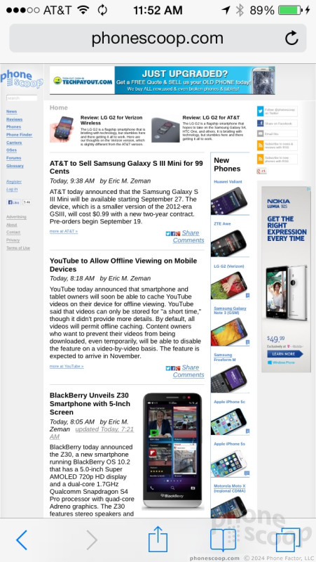
Safari is another app that received a major overhaul in iOS 7 and it's a much, much better browser as a result.
As with other apps, there's a lot more white space in the design and less "chrome" getting in the way of the content. The address bar takes up less space, for example, as do the navigation tools placed at the bottom of the screen (back, forward, share, bookmarks, tabs.)
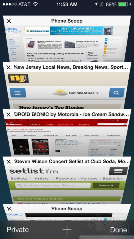
The new tabbed view is really neat. When you want to switch to another tab, press the button, and the browser will explode into a 3D carousel. You can see about 6 web pages at a time with previews of the content on each site. You can easily press one of the tabs to open it, or delete it. If you continue to scroll down, you'll eventually see a text list of all the Safari tabs you have open on other devices, such as your Mac or iPad. It's a pretty cool tool. The Chrome browser on Android devices does this, too.
Safari does a great job of rendering full HTML web pages, but there's a nifty tool to help reading web sites if you're not keen on pinching-and-zooming. Press a little button in the address bar, and Safari will filter out the headers, sidebars, and navigation tools, and show you just the main content on the page.
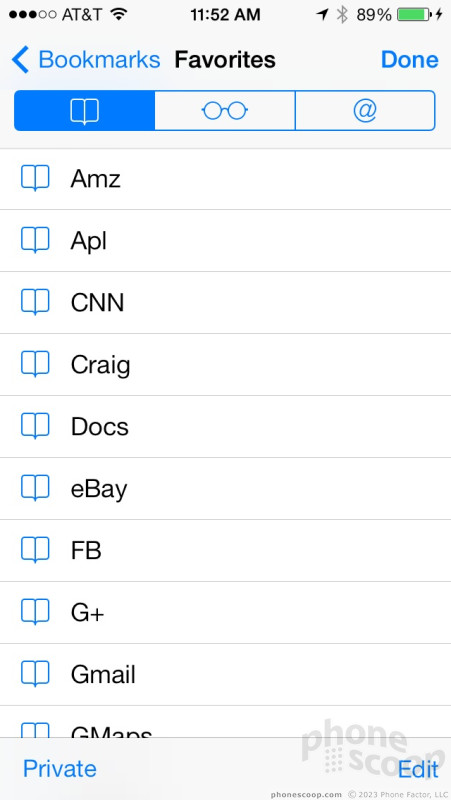
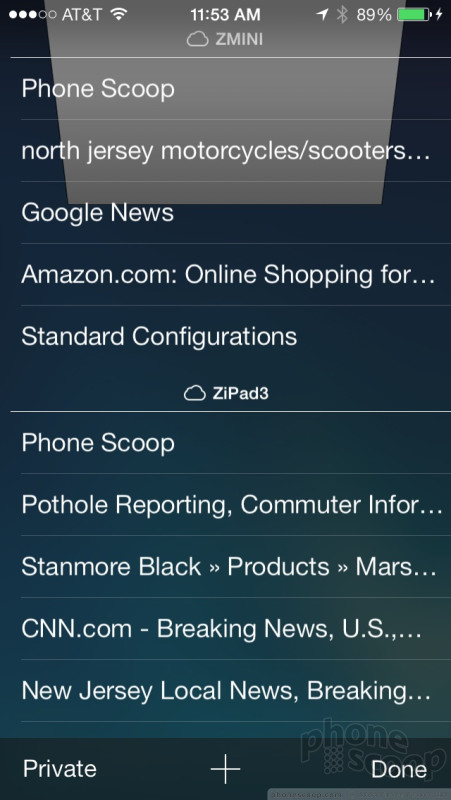
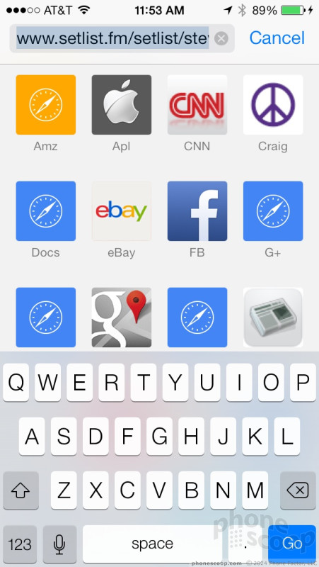
Any time you press the address bar, the keyboard will pop up, and so will your bookmarks. In fact, the bookmarks show up as little app icons, so you can easily press the one you want to jump to. For whatever reason, the dedicated tool for your bookmarks shows them in a text/list view and not the pleasant icon view. The bookmark tools also show you content you've saved for later viewing, as well as any web pages your social media contacts have shared. Huzzah for social networking in the browser!
Last, Safari is better at remembering passwords thanks to iCloud Keychain. As long as you trust Apple's servers to store your data, you can save account names, passwords, and even credit card numbers for use on web sites when signing into accounts or making purchases. Apple says it is all encrypted and secure.
Safari is among the best mobile browsers out there, though some of the changes make it a bit harder to use. The navigation tools at the bottom of the screen, for example, are harder to see from a distance. It's on par with Android's Chrome browser as far as syncing and sharing tools are concerned, and clearly surpasses IE10 on Windows Phone.
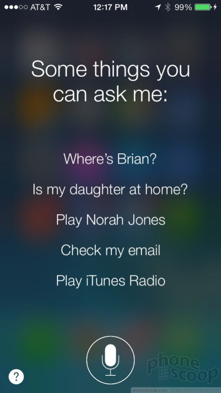
Siri
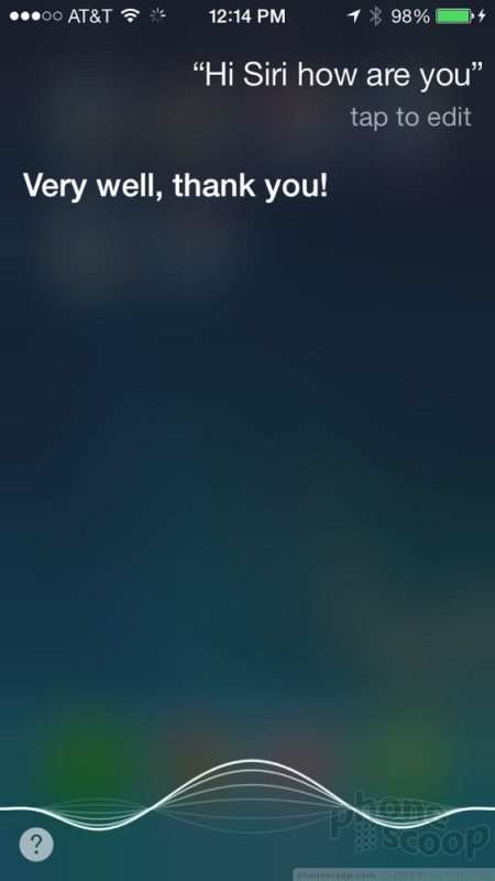
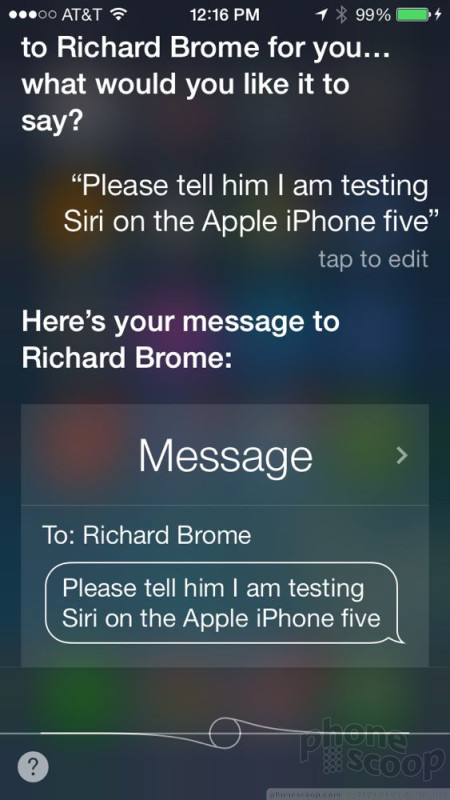
In iOS 7, Siri finally moves out of beta after two long years. Apple's voice-controlled assistant is much faster and much more helpful that before.
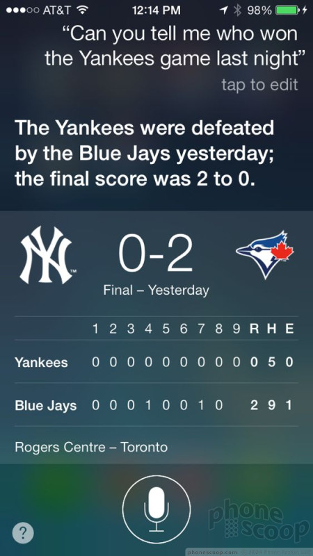
I think speed is the biggest improvement in Siri's behavior. In earlier renditions, Siri required a second or two or three to process voice commands. Now, Siri processes them in less than a second on the iPhone 5. That means faster responses and faster actions. Siri is also better at responding to more natural-language requests. You can speak more plainly when there's something you want Siri to do. Example: "Siri, who won the Yankees game last night?"
Siri lets you know when it is listening thanks to a new audio wave graphic that shows up at the bottom of the screen when you're speaking. Siri is also better at presenting information. For example, when you perform web searches, you're not pulled out of Siri (though you have that option). Instead, you see the search results listed within Siri. That means you can continue to use Siri if you don't like the results, rather than jump from Safari back to Siri.
Last, Siri is better at being social. Specifically, Siri can search Twitter for people, topics, and conversations. It's neat if you're looking for a specific thread to follow. Further, Siri has been programmed with more responses and is more interactive. You can, for better or worse, hold more of a conversation with Siri if you're into that sort of thing.
Example: "Siri, do you like me.?"
"Of course I do, Eric!"
"I like talking to you, Siri."
"I like talking to you, too, Eric!"

Utilities
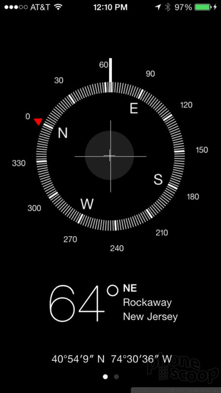
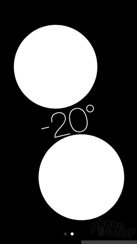
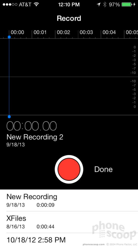
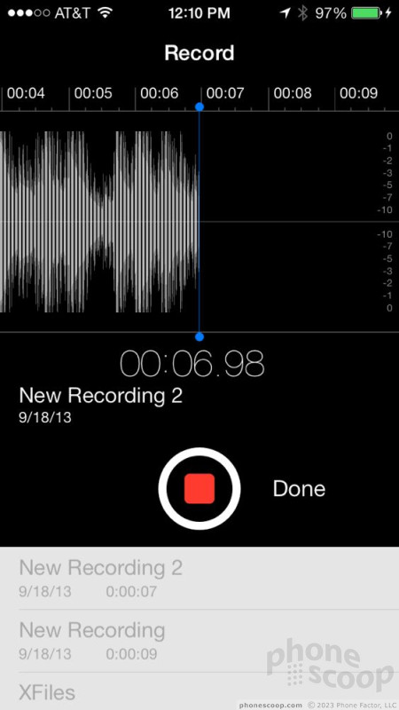
Most of the small apps in iOS were refreshed, too. I like how clean the Notes application looks now. The compass loses its old-timey look for a much more modern tool for determining your location and which way North is. The Voice Memo tool loses the analog microphone graphic for a much simpler and starker interface that shows an audio wave complete with highs and lows when you make a recording. Newsstand (which you can finally put in a folder!) has been retooled so that it no longer looks like you've walked into a 5 and Dime.
The weather app is much nicer to interact with. It shows the current conditions, as well as the hourly outlook and daily outlook. The app resembles the well-regarded Yahoo weather app for iOS devices. In fact, the iOS weather app still pulls its data from Yahoo. You can add a ton of your own locations and arrange them however you wish. I dislike that there's no active weather widget, but if you don't mind using the "Today" view in the notification panel, you can always see an up-to-the-minute basic forecast.
 ReSound Smart Hearing Aid Connects To Your Phone
 MetroPCS Opens Up iPhone Sales Nationwide
 Apple Makes iOS8 Available to the Masses
 Apple iPhone 4S
 Apple iPhone 5 (Americas GSM)
 Apple iPhone 5 (CDMA / global)