Review: Apple iOS 7 from A to Z
The underlying architecture of the user interface is mostly unchanged. iOS 7 still uses home screens, folders, jiggling apps, and swiping gestures to move from function to function. Here's a walk through of iOS 7's usability.
Lock Screen
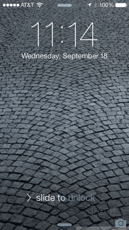
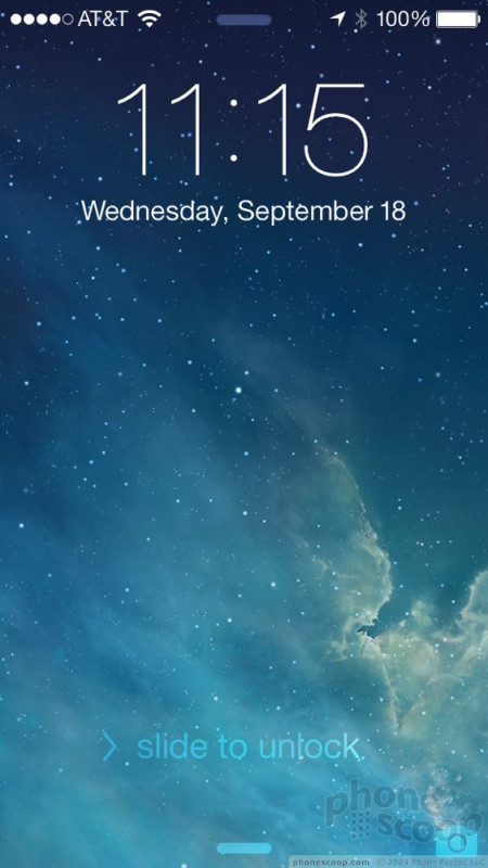
Apple made a few, minor changes to the lock screen's behavior, but the overall functionality of the screen is the same. Press either the Home button or the screen lock button, and iOS 7 will wake up. It displays a clock prominently in the uppermost 25% of the screen. The clock's appearance cannot be customized. You can't pick an analog clock or a different style digital clock. The status bar is also visible at the very top of the screen, giving you a glimpse of your signal strength and battery level. At the bottom of the screen, there's a the familiar "Slide to Unlock" text. It's no longer in a box with a distinct button. Instead, the text pulses and has an arrow telling you which way to swipe (from left to right) to unlock the device.
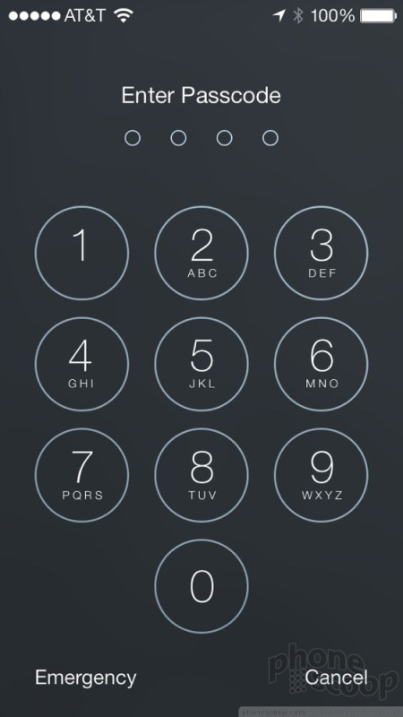
If you have enabled a pass code, you'll need to enter it before iOS 7 will unlock. This screen also has a transparent effect that lets you see a shadow of the wallpaper behind it. Before, it was just black. I like the new, round buttons and semi-see-through effect.
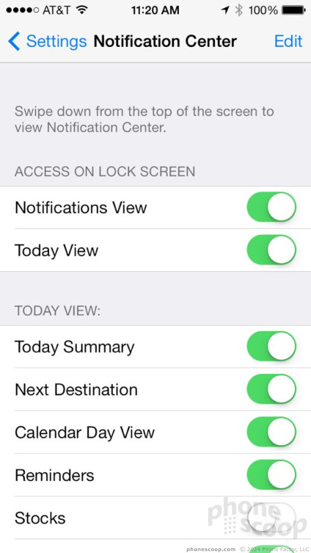
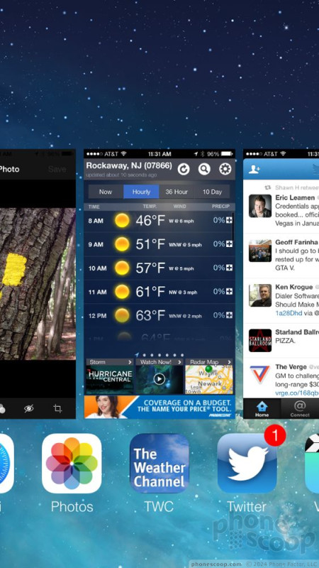
Several other tools are accessible from the lock screen. You can swipe down to view notifications (see how many emails or unread messages you have), or swipe up to interact with the Control Center (more on this later). There's also a shortcut to the camera from the lock screen. If you ask me, the camera shortcut button could be bigger and less cumbersome to use. It's tucked tightly into the lower right corner. You have to be careful to grab just the camera icon and slide it up. It is all too easy to accidentally grab the Control Center, instead. That can make it tricky to quickly snap spur-of-the-moment pics. If the phone is locked, the camera can be used without using your PIN. You can also use all the Control Center functions, such as toggle on/off Bluetooth, when the iPhone is locked. You cannot, however, go from the notification panel to any of the associated apps that deliver such notifications (email, messages, Twitter, phone, etc) without putting in your PIN.
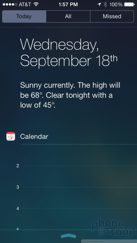
One thing I like about the notification panel is that it now includes a "Today" tab. Selecting the Today tab shows you your calendar and appointments for the day. It's handy for viewing your schedule without requiring you to fully unlock the phone first.
The lock screen is certainly more usable and useful. iOS 7 offers more information than ever before on this vital part of the operating system. Learning how to take control over the notifications, camera, and Control Center are all a snap.
Home Screens
The iOS 7 home screens operate on the same principle they have since iPhones have been able to download third-party apps.
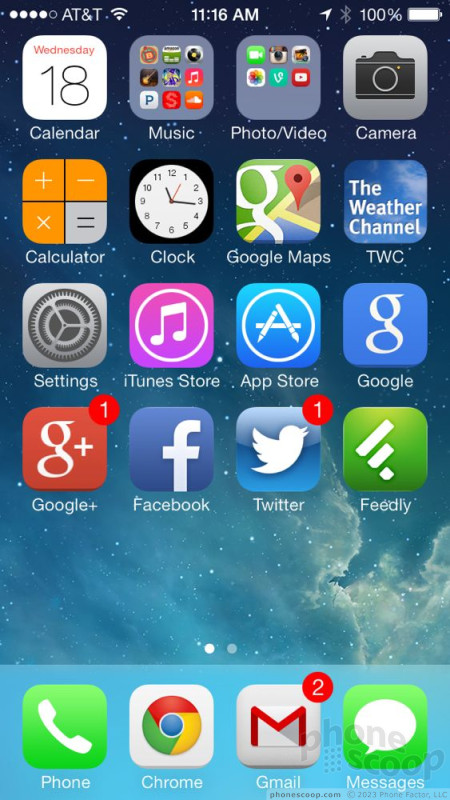
The main home screen is also the left-most home screen. This is what you'll see most of the time when you unlock an iOS device. It's a grid of up to 20 apps or folders. There's a persistent dock that sits along the bottom of the screen that holds four more apps, presumably the ones you'll use most often, such as the Phone, Email, Messaging, and Browser. You can put any four apps you want into the dock. As for the rest of the apps/folders, you can put them wherever you want … sort of.
If you start with a blank screen and add a single app, it will automatically jump to the upper left corner. You can't put it anywhere else. If you try, it'll just snap back to that spot. If you add a second app, it'll jump up next to the first and so on and so forth, filling in the grid as you go. You can't stick an app in the lower left corner or lower right corner, for example, if there's nothing above it. This is something about iOS that I've long detested and iOS 7 doesn't fix it. You can, however, choose to put as many or as few apps on any given home screen, and then put more on additional screens. For example, I have 16 apps on my main home screen, leaving a blank space where I could fit four more apps, and then I have additional apps and folders on a second home screen panel.
You can also put apps into folders if you wish. Folders are automatically created when you drag one app on top of another. It'll suggest a name if the apps are similar (games, music, etc.), but you're free to pick whatever name you want. Folders are now a blurred shade that reflects your wallpaper instead of black. Change your wallpaper and the color of the folders will change. In earlier versions of iOS, folders were limited to just 12 apps. This was a nuisance. In iOS 7, you can add innumerable apps to folders, but Apple introduced a new nuisance. Further, when you open a folder in iOS 7, you can only see the first 9 apps in there. If you have more than 9, the folder generates its own secondary pages and pushes the apps in there. Obviously, this means it takes more work to find your apps if you've buried a bunch of them in a folder. In iOS 6, though folders were limited to 12 apps, you could see all 12 when you opened the folder. The way folders work in iOS 7 is a backward step in my opinion. Why not make the on-screen window bigger to fit more of the apps?
The good news is you can have an unlimited number of home screen panels, as long as you stick at least one app on each page.
Despite the sameness in its architecture, Apple did add one new feature to the Home Screen: a three-dimensional look. The apps/folders on the home screens will float "above" the slightly shifting background wallpaper when the phone is tilted side-to-side. It's a minor detail, and hard to see, but still kinda neat.
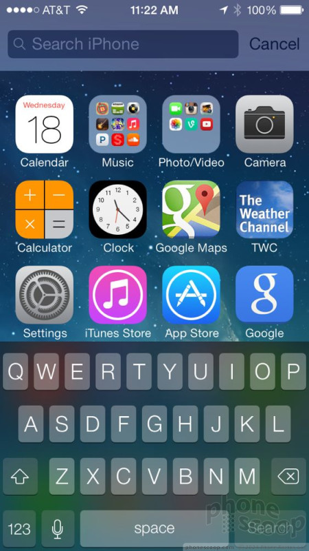
In older versions of iOS 6, there was also a built-in search function. In order to access it, you swiped the main home screen to the right. That separate search screen is now gone. In order to use the iOS 7 search tool you swipe down from within any of the home screen panels. But unlike the swipe-down gesture that summons the notification shade, you need to put your thumb in the middle of the screen and drag it down an inch or so to call up the search bar. Honestly, I discovered the feature quite by accident. How anyone would discover this (very important) feature on purpose is beyond us. It's not remotely intuitive.
In iOS 7, there are no real widgets, you can't resize app icons, and there is no live, updating content to see. The home screen in iOS 7 is a static, inflexible place.
Anyone even remotely familiar with how touch screen smartphones work will adapt to the iOS 7 home screens with ease. They may be a bit inflexible, but they are easy to master and control. In contrast, Android's home screen panels are far more flexible in that they permit widgets, shortcuts, apps, and resizable elements. You can do a lot more with Android's home screens, there's no doubt.

Control Center
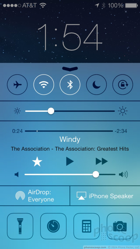
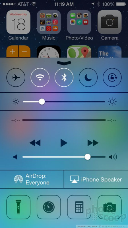
One of the genuinely new and exciting changes available in iOS 7 is the Control Center. The idea is to make it easier to adjust some of the iPhone's basic features without diving into the full settings menu.
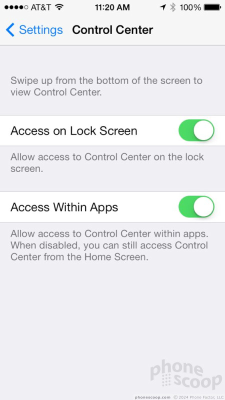
Control Center can be accessed from any screen, any app, any function within iOS. Simply swipe from the bottom of the screen up and it pops up. If you want, you can disable Control Center access within apps. It's a gray shade that fills about three-quarters of the screen. The shade is semi-transparent, and you can see what's behind it. It holds basic controls to the hardware and some software features. For example, you can toggle airplane mode, Wi-Fi or Bluetooth radios, as well as turn on night mode or lock screen rotation. The Control Center also lets you adjust brightness on the fly.
If you've used the music player recently, basic controls for the music app show up in Control Center, too. You can play/pause, skip forward/backward, scrub through tracks, and adjust the volume. The Control Center makes it easier to share from the iPhone. You can turn on AirDrop and AirPlay, which let you send files to other devices and send media to the Apple TV, respectively.
Last, the Control Center gives you four app shortcuts to the flashlight, clock, calculator, and camera. These four apps (and all the controls) can be accessed and used from the lock screen when the device is locked. The Control Center doesn't, however, let you jump into the full settings menu. A bit of a head scratcher, that. If you want, you can disable Control Center access when the device is locked, too.
After using iOS 7 for a while I found I really came to rely on Control Center to make quick adjustments to my iPhone when out and about. It's handy, for sure. After you master the nuances of swiping up to access Control Center (rather than swipe up in the app you're using) it makes a lot of sense. Android has somewhat similar controls, but they are buried a bit more in the upper notification shade.
Notifications
Speaking of notifications… Apple has updated the way the notification panel works a bit in iOS. Notifications themselves are controlled through the settings menu on an app-by-app basis. You can continue to select which apps can deliver push notifications, what style those notifications take, and which are prioritized in the notification center.
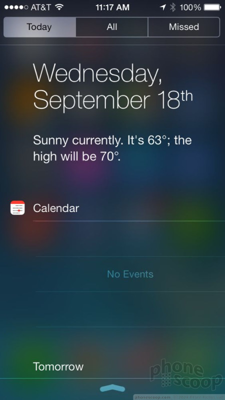
Notifications that make it to the notification panel fall into one of three tabs: Today, All, Missed. The Today tab basically encompasses the calendar and your appointments. That's all it does, but it will show you everything you have schedule for the current day and the following day. Further, the calendar will also show you the current weather conditions and a brief forecast for the rest of the day. It can also show you your stocks thanks to a ticker. The presence of the weather and the calendar in the notification shade are as close as iOS gets to widgets. It's a shame that third-party apps can't do this, too.
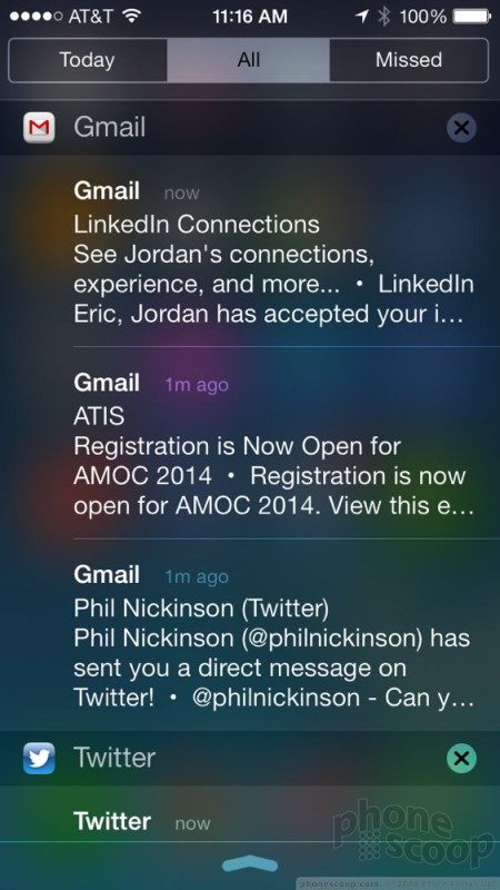
The bulk of notifications will fall into the All tab of the notification panel. This is where your emails, Twitter mentions, Facebook alerts, and text messages show up. You can sort them by message type, or in the order in which they were received. If you see a Twitter notification that you want to act on, press the notification and it will launch Twitter and take you right to the mention that triggered the notification. The same goes for other types of notifications. You can also dismiss notifications by group. For example, let's say the notification panel is telling me I have two unread emails, three Twitter mentions, a calendar appointment and a Facebook message. I can choose to dismiss just the Gmail notifications, and leave the rest, or vice versa.
The last tab in the notification panel is reserved for phone calls and things that may have gotten otherwise lost. I think it makes sense to call out just phone calls in a separate tab, because otherwise they might get buried in the avalanche of other notifications. And the way many people communicate these days, a missed call might indicate something much more urgent than a text message.
Like other elements of iOS 7, the notification panel has a translucent effect, but it's not as noticeable as the ones used on the lock screen and Control Center. Still, you can tell Apple paid attention to how it looks and feels to use, and I like that.
At the end of the day, it's worth pointing out, however, that iPhones have no blinking lights nor other visual indication to show you at a glance that there are messages waiting for you. Unless, of course, you randomly check the "accessibility" menu, wherein you'll find that the LED flash can be set to blink with incoming calls, etc. Notifications can be set individually to wake the screen for a minute, but doing so impacts battery life.
The Notification Center is extremely powerful, but also requires a lot of tweaking. The controls for each individual application are a headache to manage and need a bit of trial-and-error to get right. At this point, I'd put iOS notifications on par with those offered on Android devices. The fact that you can take action on them alone puts them neck-and-neck.
Settings
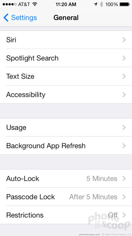
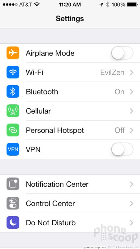
The settings menu has changed its look dramatically thanks to the new colors, icons, fonts, and use of white space, but it doesn't gain many new features.
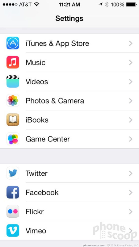
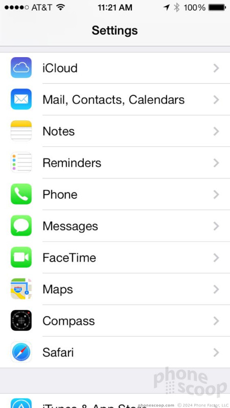
The settings are laid out in a single long page. Important hardware controls are positioned closest to the top (airplane mode, Wi-Fi, Bluetooth, etc.) even though they are duplicated in the Control Center. The top section also bundles in controls for the cellular data radio, personal hotspot, and VPN access (mostly for business users.)
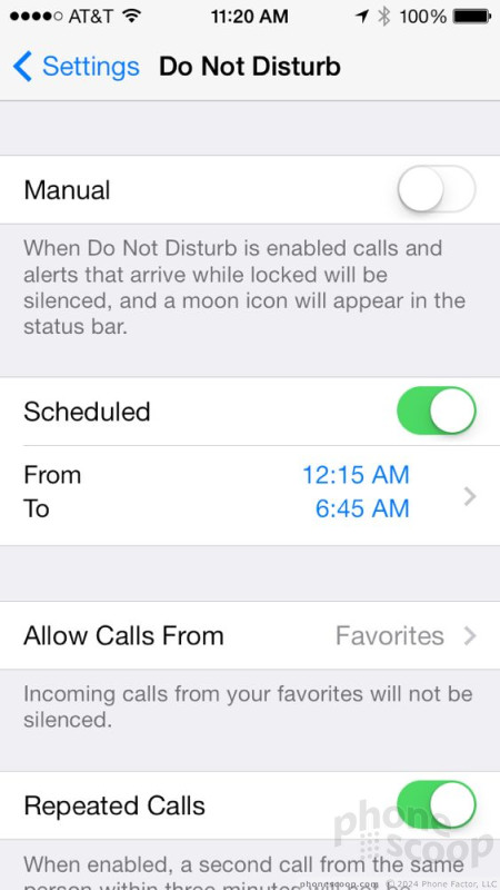
The next clump of controls lets you manage the Notification Center, Control Center, and Do Not Disturb functions. Each gives you pretty granular control over how these features behave, especially the Notification Center and Do Not Disturb tools.
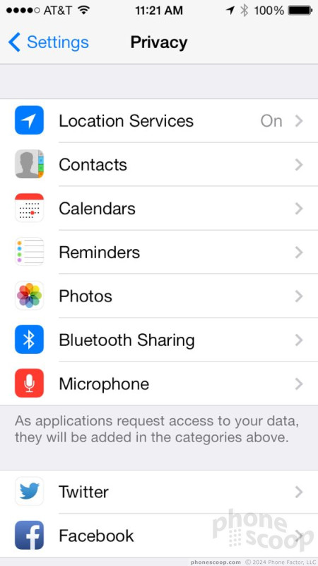
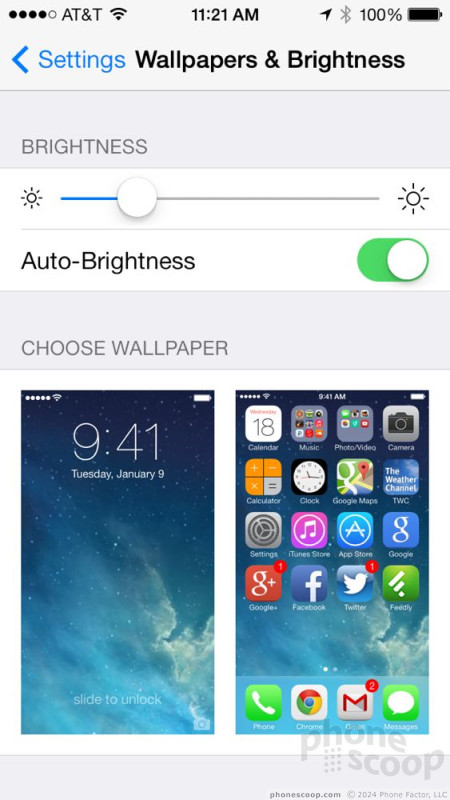
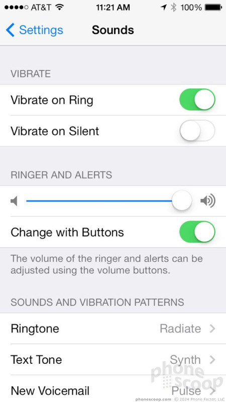
These are followed by access to controls for sounds, wallpapers, privacy, and general tools. You'll be happy to learn that iOS 7 adds a huge number of new alert sounds and ringtones. iOS was long, long overdue for some new sound effects, and I like the selections picked by Apple. The old alerts and ringtones are still available, but the new ones sound much more modern and, uh, alert-y. (Seriously, who is not sick to death of the ubiquitous old iPhone sounds?) There are also new wallpapers, including some dynamic wallpapers that move and change (similar to Android's Live Wallpapers). The privacy controls let you choose what data apps can access. For example, this is where you can specify that Maps can access your location, but your whereabouts are off-limits to Facebook and that third-party calendar app you may not fully trust.
The settings menu is comprehensive and covers just about every single facet of the iPhone's behavior. The tools are laid out plainly and make sense to use. Of course, it's also a bit overwhelming. The Settings menu is beginning to reach desktop-level lengths, though it is a bit easier to parse through than Android's settings menu, in my opinion.
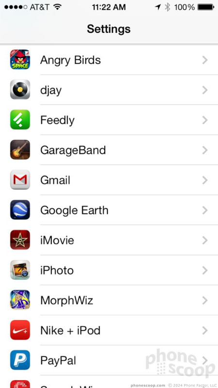
My big problem with the iOS Settings menu is that you have to remember which app-specific settings are controlled within that given app, and which are controlled via the Settings tool. Though most apps offer controls within the app itself, the Settings tool offers other choices for some apps. For example, I can't change the music equalizer from within the Music app itself. Instead, I have to exit the Music app and use the Settings tools to adjust the Music app. Sometimes this feels clumsy and unintuitive.


Multitasking
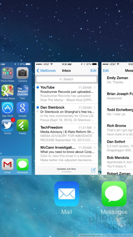
Apple updated the way iOS 7 handles multitasking, or fast-app switching. In older versions of iOS, you'd double-tap the Home button to bring up a small dock along the bottom of the screen. The dock would show you all the recently used apps. You could pick the one you wanted to jump to and away you went.
Now, a double press of the Home button calls up a more visually immersive multitasking tool. Instead of appearing as icons at the bottom of the screen, open apps float in the middle of the screen on cards, similar to webOS and Windows Phone. The apps show you a preview of what they were doing when you last visited them. It sure looks nice, but isn't quite as useful as far as I am concerned. In iOS 6, you could see the four most-recently used apps in the multitasking dock. In iOS 7, you can only see three open apps at a time. The result? It takes a bit longer to find the open app you want if its the fourth- or fifth-most recent app you used.
That said, the multitasking tool looks much more slick. There doesn't appear to be a limit to how far back you can jump. I stopped counting when I went back 50 apps in my multitasking history. Apps exist in a suspended state, so when you return to any given app, it should resume right where you left off without skipping a beat. To quit an app, just swipe it up and out of preview (again, just like webOS.)
Performance
We tested iOS 7 on an iPhone 5 and on an iPad Mini. In so doing, I didn't notice any problems running the new operating system on last year's hardware. Everything about iOS was fast. Screen transitions were quick, animations were smooth, and applications open in a blink.
A word of caution. New versions of Apple's mobile operating system are notorious for crummy performance on older iOS devices. If you're using an iPhone 4 or iPhone 4s (both of which are compatible with iOS 7), you might want to hold off on updating. Let early adopters jump into iOS 7 first and see if they start to complain about performance. If they do, perhaps it would be wise to stay away from iOS 7 if you value quick performance over the new features.
 ReSound Smart Hearing Aid Connects To Your Phone
 MetroPCS Opens Up iPhone Sales Nationwide
 Apple Makes iOS8 Available to the Masses
 Apple iPhone 4S
 Apple iPhone 5 (Americas GSM)
 Apple iPhone 5 (CDMA / global)