Review: Apple iOS 7 from A to Z
Sep 18, 2013, 4:30 PM by Eric M. Zeman
Apple's new operating system takes a major step forward in terms of design and functionality. It greatly improves usability, while also introducing some nifty new features. Here is Phone Scoop's comprehensive review of iOS 7.
Apple made iOS 7 available to iPhone owners on September 18. iOS 7 is a dramatic break from past versions of Apple's smartphone operating system. It includes a brand new design and hundreds of new features. Gone are the faux 3D textures used by Apple since iOS debuted in 2007. In their place are flatter icons, more white space, and a cleaner look. The general appearance of iOS had not changed since the very first version, so Apple was long due for an overhaul. iOS 7 may not be everyone's cup of tea, but it represents an important step for Apple in redefining its platform against competitors such as Google's Android and Microsoft's Windows Phone.
In this review, Phone Scoop will examine every aspect of the new operating system from start to finish. We've evaluated the new design as well as the many new features found in iOS 7. If you're looking for a real-world, comprehensive look at iOS 7, this is it.
Design
The primary thing most people will notice upon launching iOS 7 for the first time is that it looks significantly different from iOS 6 or any previous version of iOS.
Late in 2012, Apple ousted its long-time iOS manager, Scott Forstall, and put Jony Ive - the company's lead hardware designer - in charge of iOS. Ive has long been the guru behind Apple's iconic hardware. He was charged with overhauling iOS 7 and giving it a fresh look. If you're wondering why iOS 7 looks so different from iOS 6, that's the reason.
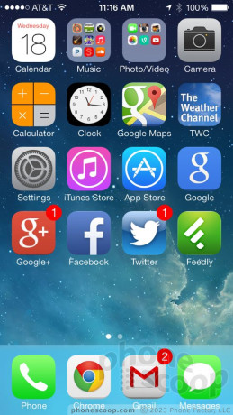
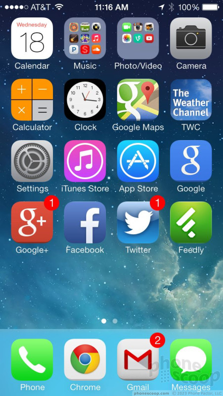
For starters, Apple has changed the textures used by the OS. Before, iOS was heavy-handed in its use of skeuomorphism, a design concept that employed the use of real-world objects in creating their virtual equivalents. This is why the old Game Center had felt textures, as if it were pulled from a Vegas casino gaming table. The calendar and contact apps used to have the look and feel of actual, leather-bound books. These textures gave apps a 3D look and feel and anchored them to our long-standing idea of what these types of things should look like. These are all now gone. In iOS 7, everything is flat. The whole OS has lost the three dimensional appeal it relied on for six years. That's not necessarily a bad thing.
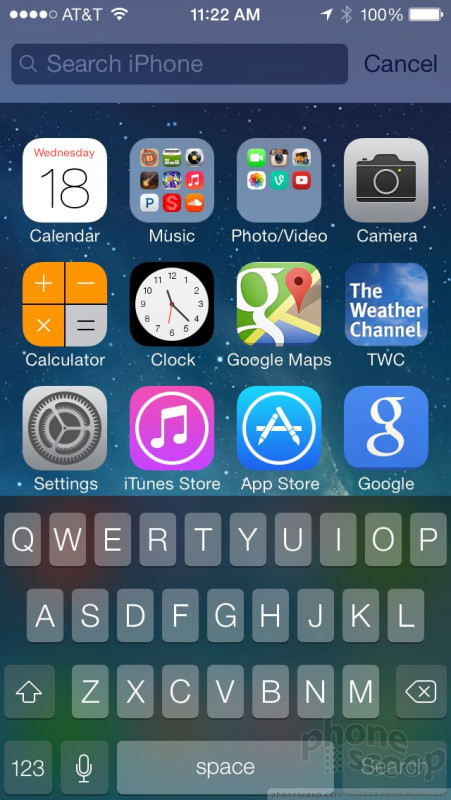
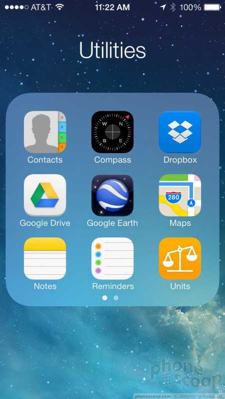
There's far more white space in iOS 7. In iOS 6 and earlier generations, apps and menu screens were packed tightly with content, shading, and colors. With iOS 7, icons and graphics in the apps and menus appear spaced further apart. Many of the gray backgrounds in the operating system have been replaced with white backgrounds. This is all amplified by the change in fonts. The new font is thinner and taller. These changes combine to create an entirely different appearance to most screens in the OS.
Then there's the color palette. iOS 7 introduces a range of new colors for apps and other screens. Many of them complement the white, green, pink, yellow, and blue colors picked by Apple for the iPhone 5c. Most of the earthy browns and medium grays used by iOS 6 are gone completely. If apps aren't using the new colors, they are white. The result is a brighter, cleaner, fresher looking operating system. It feels and looks more modern, there's no doubt of that.
Does the new appearance of iOS work? Well, design is design. Everyone will come to iOS 7 from their own perspective and react to it differently. There are many things about the new design that I like (use of white space, flatter icons, no fake-looking bookshelves). However, I strongly dislike the new colors. They strike a very "Easter-y" look thanks to the pastels. The greens used by vital apps such as the Phone and Messaging apps are absolutely grating to my eyeballs. I can't stand to look at them. Further, the thinner fonts play a role in usability here and there. In some apps, the thinner fonts and minimalistic icons are harder to read and/or decipher unless you're holding the iPhone close to your eyes.
I don't think there is any doubt that iOS was getting long in the tooth. Its look was largely unchanged for more than 6 years. I'm glad that Apple redesigned the operating system, and gave it a new look and feel. It was past time. I don't agree, however, with some of the design choices Apple made. That's how I feel about it. You may react to iOS 7's appearance in your own way.
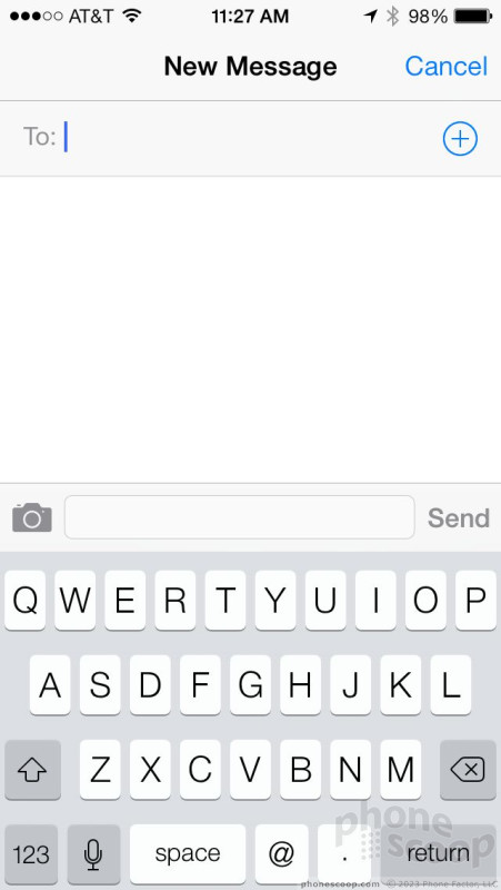
One last note. It will be important for third-party application designers to redesign their own apps using Apple's developer tools as soon as possible. The significant changes in iOS 7's design means that older apps look disjointed and out of place. For example, while testing iOS 7 during its beta period, most apps held off on updating. It created a schizophrenic experience that is unpleasant. The most jarring experience comes when using the native iOS 7 keyboard and then being thrust back into the old keyboard with an app that isn't up to date. Expect to see many of your favorite apps go through significant overhauls in the weeks just after iOS 7's release.
Eric has been covering the mobile telecommunications industry for 17 years at various print and online publications. He studied at Rutgers Newark and University of Kentucky, and has a degree in writing. He likes playing guitar, attending concerts, listening to music, and driving sports cars.
 ReSound Smart Hearing Aid Connects To Your Phone
 MetroPCS Opens Up iPhone Sales Nationwide
 Apple Makes iOS8 Available to the Masses
 Apple iPhone 4S
 Apple iPhone 5 (Americas GSM)
 Apple iPhone 5 (CDMA / global)


Comments

Glitches
Also - for the Manually turning on Privacy Mode, mine doesn't work, I still get full-volume notifications even with privacy mode turned on. I thought they fixed that in the previous iOS version ?

IOS 7 Notification Area
Notices for email, messages, news that showed up before no longer do. The Today Tab displays text based weather, stock information (absent the cool ticker), and a very basic calendar.
The other two Tabs, All and Missing, don't populate at all - totally blank.
A hard reset didn't help and the settings for apps within the notification center all appear to be correct.
Has anyone else experienced this sort of problem and, if so, any ideas for a fix?
Thanks
When I woke up this morning, both of them had things populated in them, so not 100% sure about that.
Also - I t...
(continues)

So...
Yup, still behind Android. No real change other than the graphics and name.

New IOS question

Great Review Eric!
While I am not an Apple camper, I forwarded your review to my Apple friends and they found your review very indepth and enlightening as they did not accept the new layout. They now have a better perspective on the new additions and advancements.
Well done!
John B.