Review: Android 4.2 Jelly Bean
Camera
Google updated the camera with a new control scheme. The basics are the same, but for those who like to adjust the controls, things are a wee bit different.
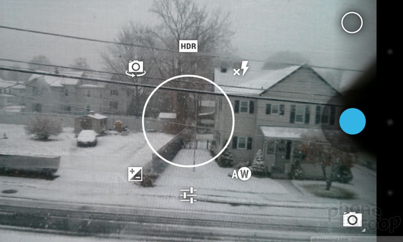
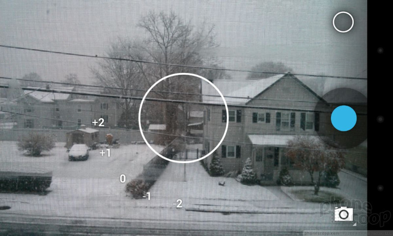
Rather than tapping a menu or settings button, the new camera controller in Android 4.2 appears as a circle in the middle of the screen. The easiest way to access it is to long-press anywhere on the screen. The circle appears around your finger, as do six options floating in a ring around the circle. The six options are: front camera, HDR, flash, brightness, full settings, and white balance. You slide your finger from the middle of the circle to one of the settings options floating around it and away you go.
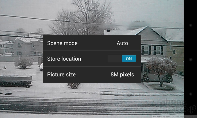
All of the options (with the exception of the full settings) are simple on/off-style adjustments. The full settings menu is a bit more involved and lets you turn on/off geolocation, set the megapixel size, and set the scene (day, night, party, etc.). This change is not obvious at first. I pressed the traditional menu buttons several times by mistake looking for the settings tools. It's also somewhat cumbersome to press-and-hold, and then slide your finger to the desired setting. Quite frankly, I don't see any improvement in usability here. In fact, I see quite the opposite.
But the camera itself remains as fast as ever at capturing photos, even in low lighting.
Notification Shade
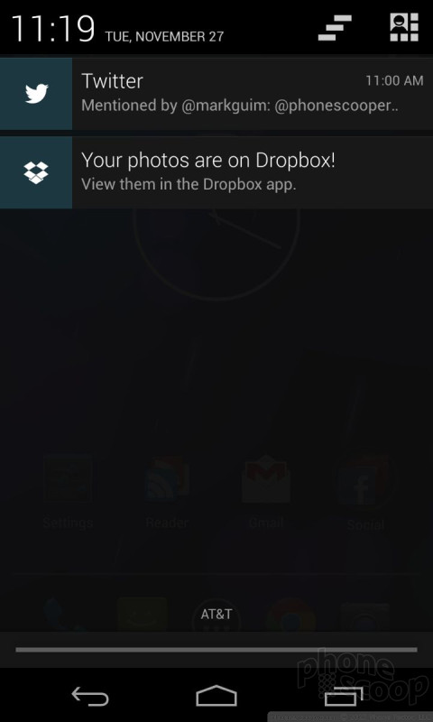
The changes Google made to the notification shade are another puzzler. In Android 4.0 ICS when you pulled down the shade it offered access to your messaging and other notifications in addition to some system tools, such as the main settings menu. This has been changed and adds an extra step that makes accessing some of these features more laborious.
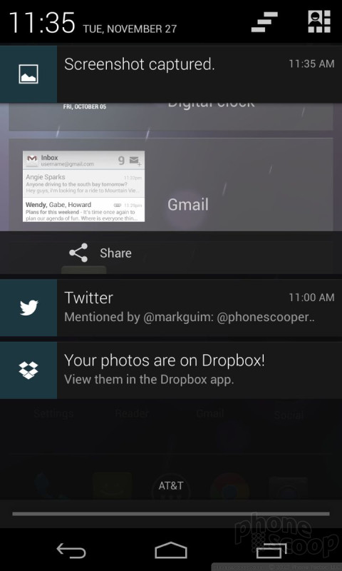
For example, the system settings. When you swipe down the notification shade, you'll see your emails, Facebook, Twitter, Google Play Store, and other notifications as you always have. As before, there is a symbol that appears at the top of the screen to make dismissing all the notifications at once a snap. (You can still choose to dismiss the notifications individually if you prefer. )
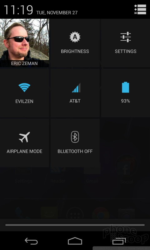
Easy access to the system settings, which previously appeared across the top of the notification shade with a simple button, has vanished. Instead, you'll see a second little symbol in the upper right corner. Touch that symbol, and a second shade drops down with the Wi-Fi, Bluetooth, GPS, Brightness, and Airplane Mode tools. I don't really see the need for two different drop-down shades. My guess is smartphone makers will customize the notification shade to suit their own tastes.
Project Butter Take 2
One of the best "features" of Android 4.1 Jelly Bean was “project butter”. Project Butter was an internal Google effort meant to speed up the performance and behavior of Android devices. Google's investment paid big dividends. Android 4.1 was noticeably quicker than Android 4.0 running on the same hardware. Android 4.2 takes it a step further.
Though we can't really say Project Butter is a feature that Android device owners can control, the real-world effect on the day-to-day performance of Android is real. Google made some improvements to the way Android 4.2 handles 2D/3D content with hardware acceleration. The result is smoother swiping gestures and faster web page rendering within the stock Android browser.
 Samsung Refines its Foldable Phones
 iPhone 14 Plus Offers a Big Screen For Less
 iPhone 15 Series Goes All-In on USB-C and Dynamic Island
 Samsung S24 Series Adds More AI, Updates the Hardware
 Hands On with the Motorola razr and razr+ (2024)