CES 2007 + iPhone
One company that's been very busy working on new products is Samsung, which introduced 6 new phones yesterday at CES. Including both clamshells and candy bars for CDMA and GSM networks alike, it's apparent that Samsung has serious image issues, as nearly all the phones are super slim. Cramming useful functions into drastically reduced form factors, however, did present some challenges for the Korean giant.
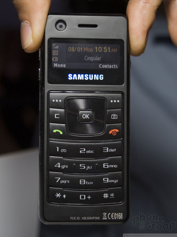
Before we dive into the phones, one surprising bit of information is that the i760, a bulky slider phone with full qwerty keyboard that slides a la HTC Wizard style, will ship with Windows Mobile Smartphone Edition 6, according a to Samsung rep who may have slipped up in telling us.
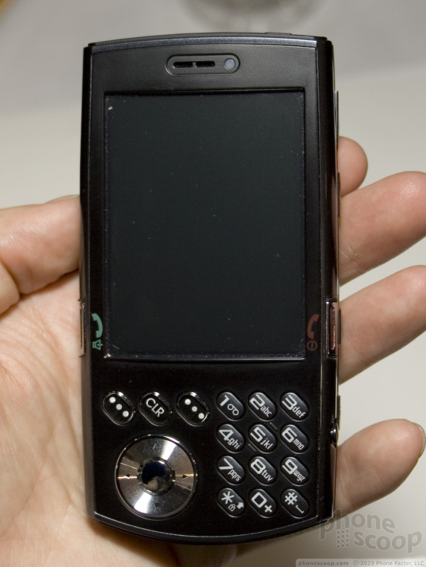
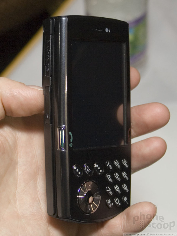
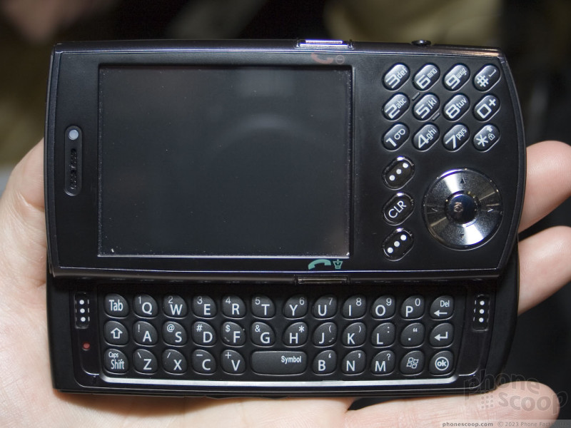
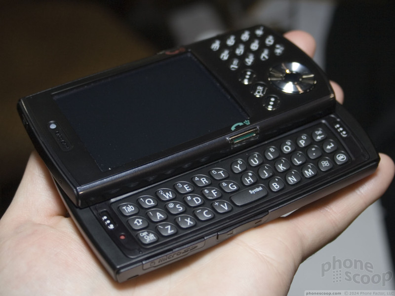
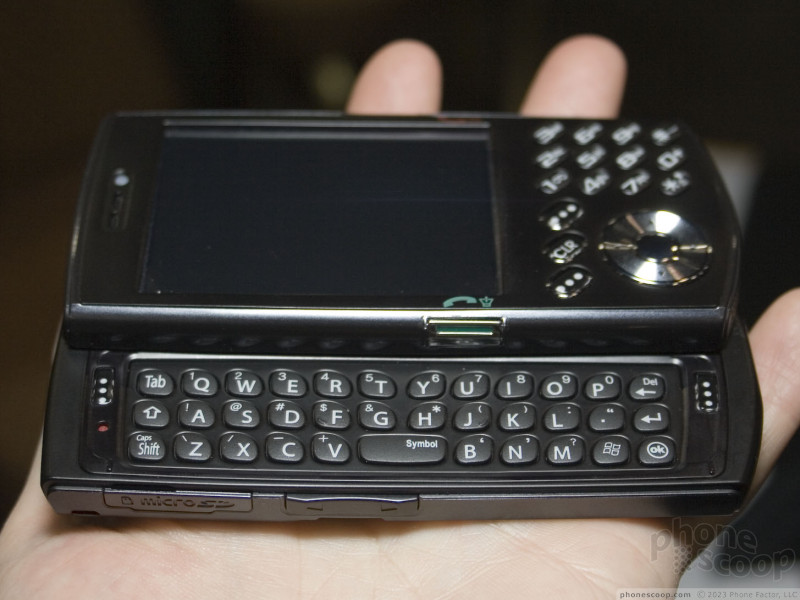
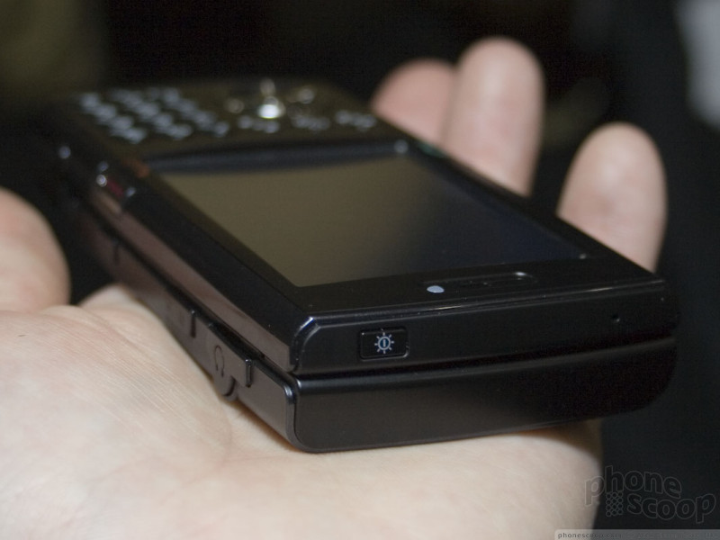
Samsung wasn't showing powered-on i760s, so we can't say much about how it works in practice.
It does seem like a good size and most of the keys seemed workable, although the send/end keys are very slim and awkwardly mounted on the side edges, making them uncomfortable to press to purpose, yet quite easy to press by accident. Both sets of soft keys are un-intuitively placed nowhere near the parts of the screen they are supposed to match up with. The design in general seems unrefined, like an early prototype or concept design.
These issues are mostly things that would be easy to adjust to, however, or things that are aesthetic and subjective. That's probably okay, since the i760 is expected to compete with the HTC Libra, another device that probably won't win any style awards. Only when we get our hands on working units could we say whether the i760 will be a good workhorse for the business users it's intended for.
Moving on, let's start with the handset that generated the most hype and buzz, the Ultra Music Phone. At first glance, it looks radically cool. Trim phone interface on one side, Zune-like MP3 player LCD and controls on the other. Oh, and of course it's darned near bulimic in thinness. One you pick it up and play with it for a while, though, the drawbacks of this design become quickly apparent.
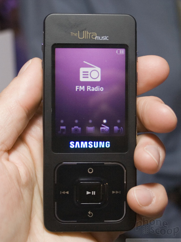
First things first: the phone side. Rather than having a standard 1.5-inch-square or bigger display on the phone side of the device, it has a full color 2-line screen positioned at the very top of the phone, measuring perhaps 1.25 inches by .75 inches. You may not think that would be a real issue given the much larger LCD on the back, but believe us when we say it is. Now that we're all used to using larger displays on phones, a 2-line display just isn't easy to work with.
Even though Samsung put some thought into the control panels accessible from the keypad, navigating between functions was not quickly accomplished. The icons were oriented in a horizontal fashion and you scroll through them sideways. Because the screen is so small, there were only a couple of icons visible on the screen at any one time, leaving you to wonder how far you have to scroll to get to the function you want.
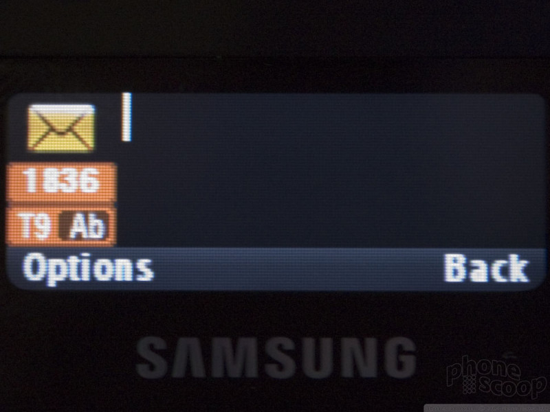
So, let's say you wanted to type a text message. Once the texting function is chosen, you only have two lines of visible text to input. It was very limiting to have such a narrow view of the message we were typing, especially when pecking out a full 160-character message. It was very frustrating not to be able to see the entire message at once as you can on most other phones. Now imagine these limitations spread out across all the different menus and functions of the phone and you probably get the point.
Dedicated music and camera buttons made accessing some of the features easier, but not overly so. As for the buttons themselves, there was very little interaction with them. It was difficult to tell if you had pressed them or not.
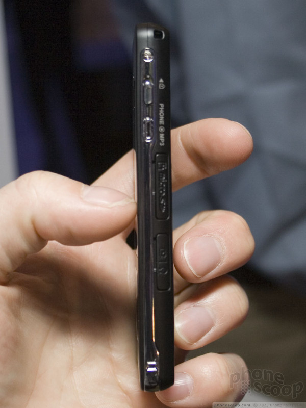
Okay, so you're done with your phone calls and you want to listen to MP3s. You have to press and hold the music button on the side of the phone to activate the other side of the phone. As it was demonstrated and explained to us in the limited time we had with the phone, only once side of the phone can be active at once.
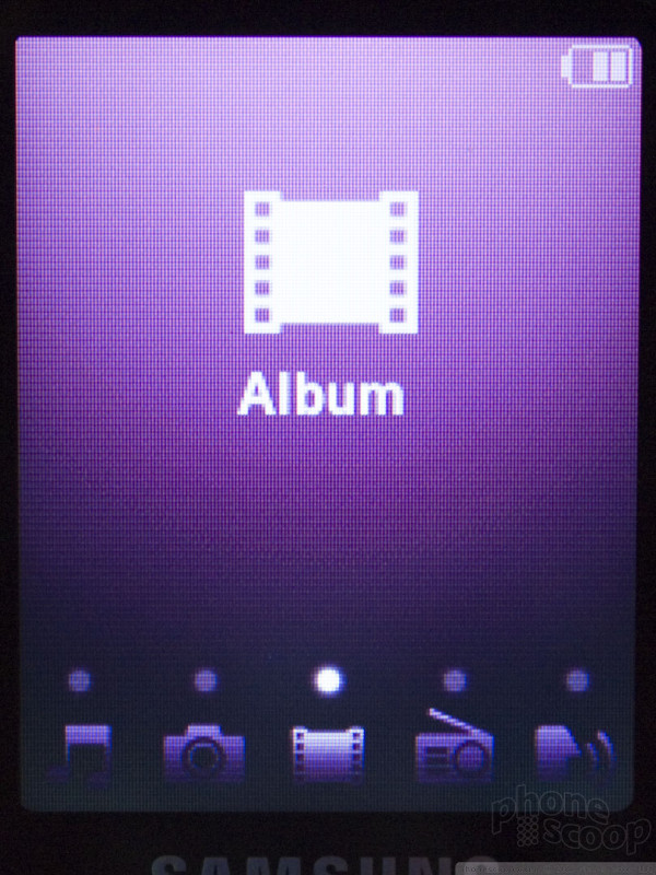
After the media player side is activated, the menu selection process was onerously slow. The navigation pad is touch sensitive, so you're not really pressing it as much as you are passing your finger over it. As with the front, the menu icons are presented horizontally at the very bottom of the screen even though there's a huge display to utilize. Why the rest of the screen is blank is a mystery to us. Unlike the front, where scrolling sideways was relatively quick, scrolling on the media player side took forever. There was an animated action to bring up each selection, and it just takes way too long.
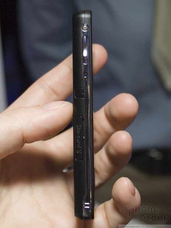
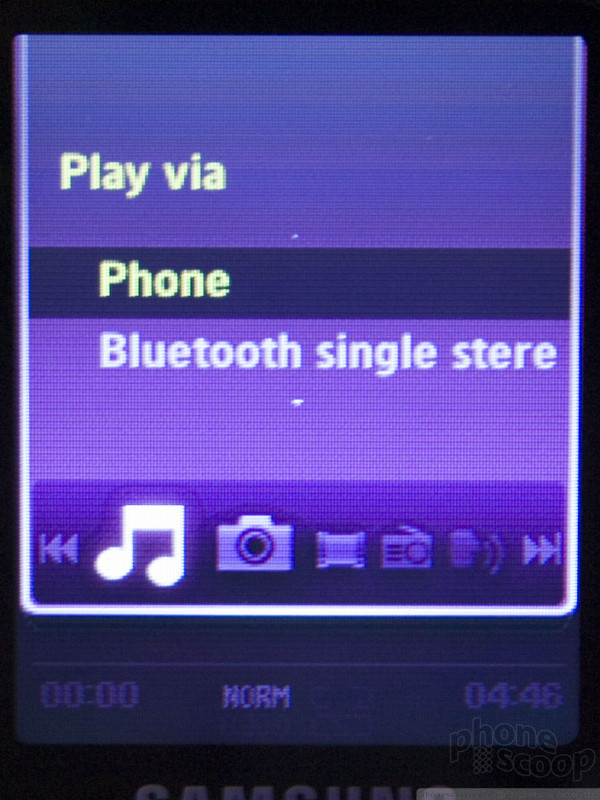
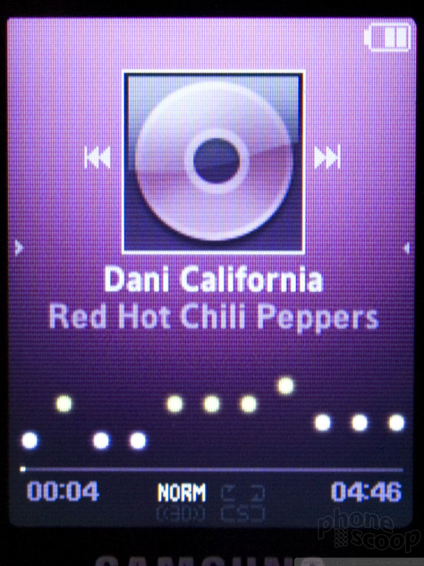
We didn't see any headphone jacks, but did spot what looked like a proprietary interface jack of some sort to attach headsets too. Why Samsung can't use standard jacks is beyond us at this point. The Ultra Music does support stereo Bluetooth, but the demo unit had headphones plugged directly into the proprietary jack. The Norah Jones they had pumping through the device sounded rich and warm, and the MP3 player features did let you manage play lists and more.
Composing pictures with the camera was pretty cool. Since the LCD on the media player side of the phone is so large, you really feel like you're using a full-fledged digital camera to take pictures. It tracked well when we panned the camera around and pressing the shutter button presented you with almost instantaneous results.
While we give Samsung credit for creating a very buzz-worthy device, in the end it was a disappointment to use and interact with. Whether or not some of the issues we encountered were pre-release bugs is hard to say, but let's hope that some of the not-so-easy-to-use functions have been streamlined come time that the phone is offered to the public.
Moving on, next we looked at the a727. Think of it as a faster, darker version of the Trace. Where the Trace is silver and EDGE-capable, the a727 is black and HSDPA-ready.
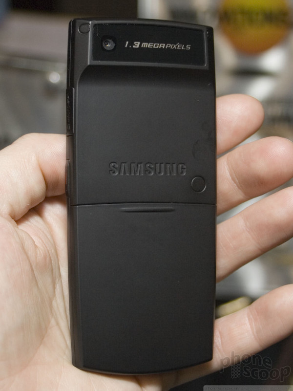
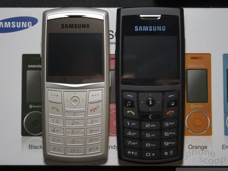
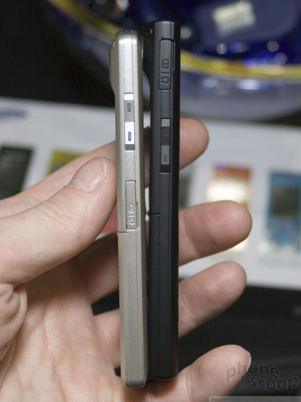
It sticks with the Trace's 1.3 megapixel camera, which was a bit of a disappointment. Like its older cousin, the a727 is impossibly thin. When you hold it, it barely feels like it has any weight at all. It might feel the same in your hand as an average deck of cards. To us, the thinness borders on scary. Sticking it in your back pocket could prove dangerous. Even though the casing felt solid and strong, the fear of snapping it in half is not unfounded. It also has the same texturized paint that Samsung has been putting on its latest models.
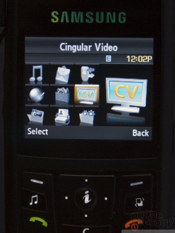
Compared to the T-Mobile software on the Trace, the Cingular interface on the a727 was pretty good. Sticking to a Halloween-esque theme with black and orange colors, the animated icons enlarged each time you scrolled over them and minimized when you moved on to the next icon. There was little to no lag when switching between icons and the screen allowed for enough icons to be seen at a time to allow you to find and select what you wanted quickly.
Dedicated feature buttons on the keypad for the camera and music player made for speedy access to those functions, though the interface with the applications themselves were at times cumbersome. The music player was similar to the one on the Ultra Music, but pared down for the smaller screen and simplified somewhat.
The keypad was not really satisfying. With the trend of creating completely flat keypads well entrenched, the action on the keys was minimal, given the super slimness of the phone. Though there was a bit of a click when each button was pressed, it didn't provide as much feedback as we would like. Holding the phone to type out text messages was interesting. It was like typing on a business card. With the phone being so thin, the distance between your forefingers and thumbs is fractional and typing messages just felt a little flimsy. There's no other way to say it.
Even though Samsung made some improvements over the Trace, it definitely could have done more to set this phone apart from the crowd. The HSDPA is a big step up, but limiting it with a 1.3 megapixel camera just doesn't make sense to us. Still, for image-conscious consumers, the a727 is definitely a sleek phone that ranks high in the cool factor.
Next up was the a717, another phone for Cingular. This phone is (yet another!) slim clamshell.
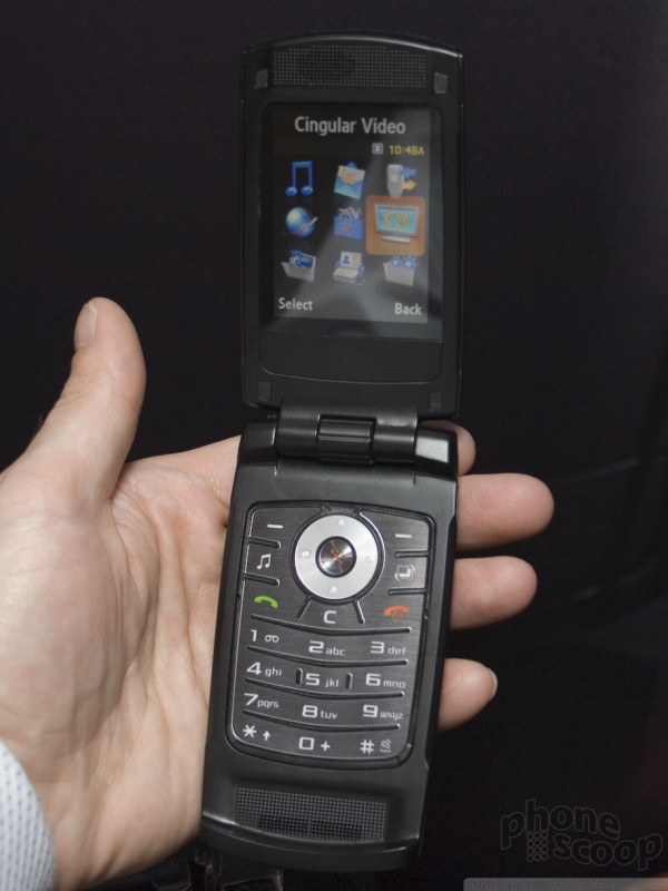
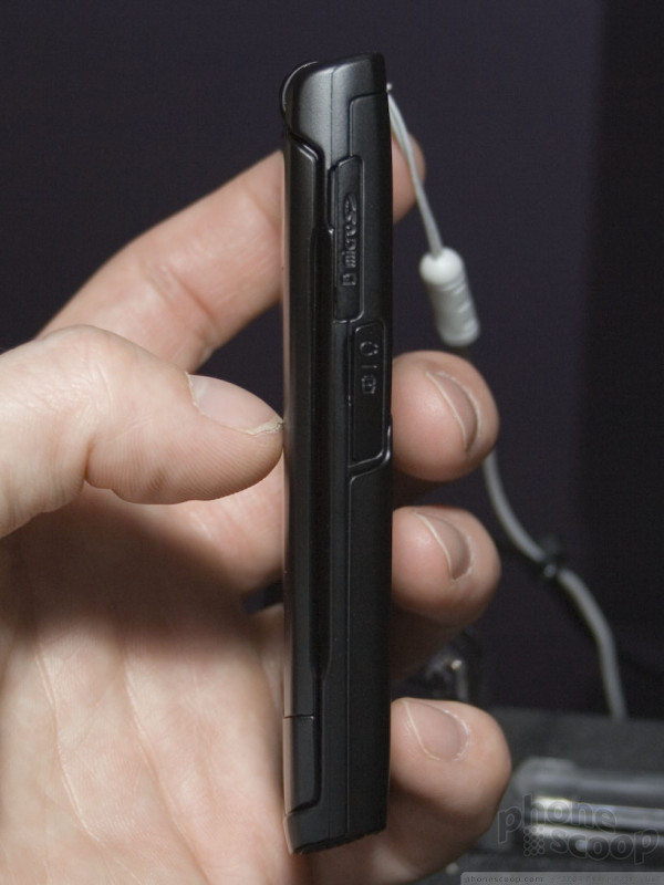
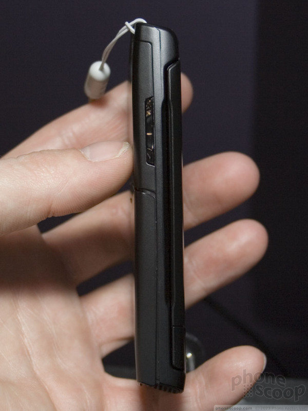
The overall design is similar to the m610, which is on the Sprint network. The phone feels solid in your hand, though the exterior front panel is very plain, and the exterior display is minimal. The back and front were both smooth and it easily slips into your pocket (even with the security tether attached to the display stand.)
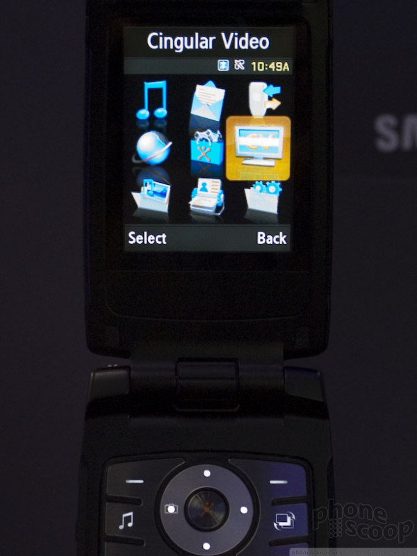
Since it is for Cingular, Samsung loaded it with an HSDPA radio and the revised UI, which matched the a727s in appearance and function exactly. It appears that Cingular is standardizing its UI (on Samsung phones, anyway), like Verizon Wireless has done with its standard feature phones. Response times with the UI were similar to the a727, as were the animations and menus.
The keypad is very flat. There's almost no contour or texture to it at all. Even though it appears as if there are two ridges separating some of the keys, it's hard to feel it when you swipe your thumb over the keypad. Of all the keypads at CES, this one provided the least feedback when the buttons are pressed. It was very easy to make mistakes typing phone numbers and text messages as sometimes the buttons didn't register your depressions. Many phones allow you to quickly and accurately type out messages when you are looking away from the phone because of the solid tactile response. Not so here. In the blindfolded typing test, the a717 was a disaster.
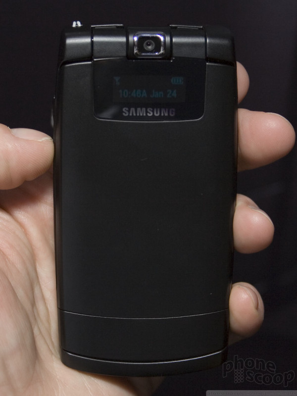
Along with the a727, Samsung added more dedicated function keys to the a717's keypad that take you to the camera and music player. Of all the Samsung models, this a717 presented the best screen viewing experience with the camera. The large screen helped here. The image was super sharp and tracked excellently as you moved the camera phone around. Switching between light and dark areas didn't stress the software at all, and it took pictures instantly when the shutter button was pushed. The rotating camera lens is unchanged from the m610, and swiveling it around gives the vain user plenty of options for taking self portraits.
As with it's other phones, the a717 offers Bluetooth stereo and the ability to put it in airplane mode. This was a trend we saw across other phone brands. As more and more people are using their phones as their primary mobile media players, you now have the option to turn just the radio part of the phone off, leaving the UI and media player sill accessible for listening to music and taking pictures. This is definitely a helpful feature for people who only want to carrier a single device and happen to travel on planes a lot. When compared to its Ultra edition cousins the a717s music player produce sound of about the same quality.
Even considering its shortcomings, the a717 serves as a solid mid-tier phone.
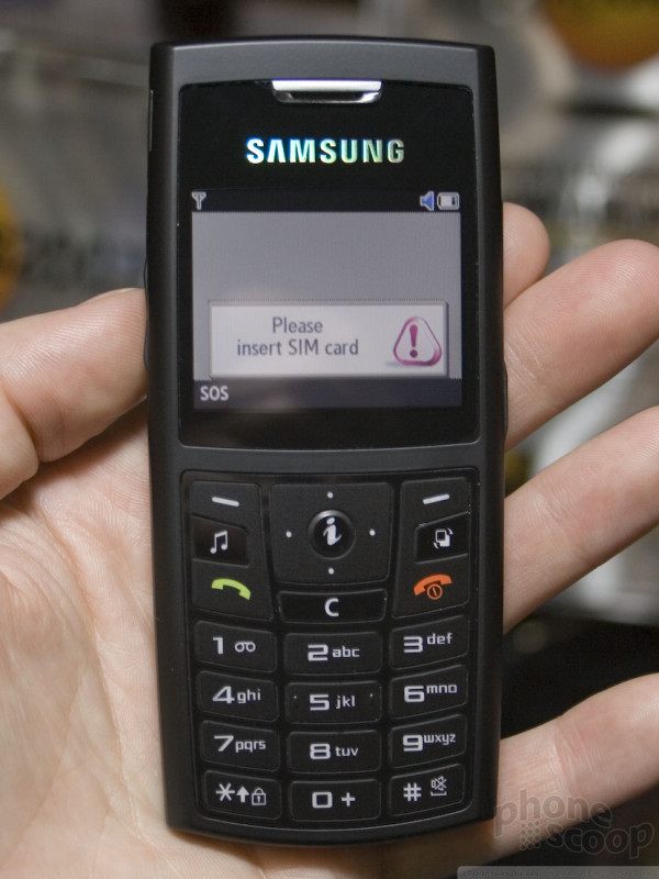
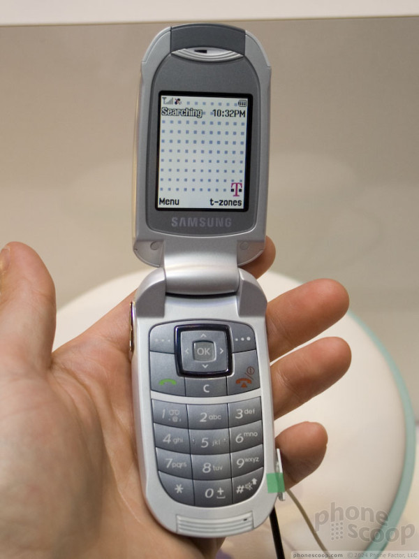
Moving on from Cingular phones, T-Mobile gets a new Samsung as well. The T329 is an entry level clamshell that has a trimmed down feature set.
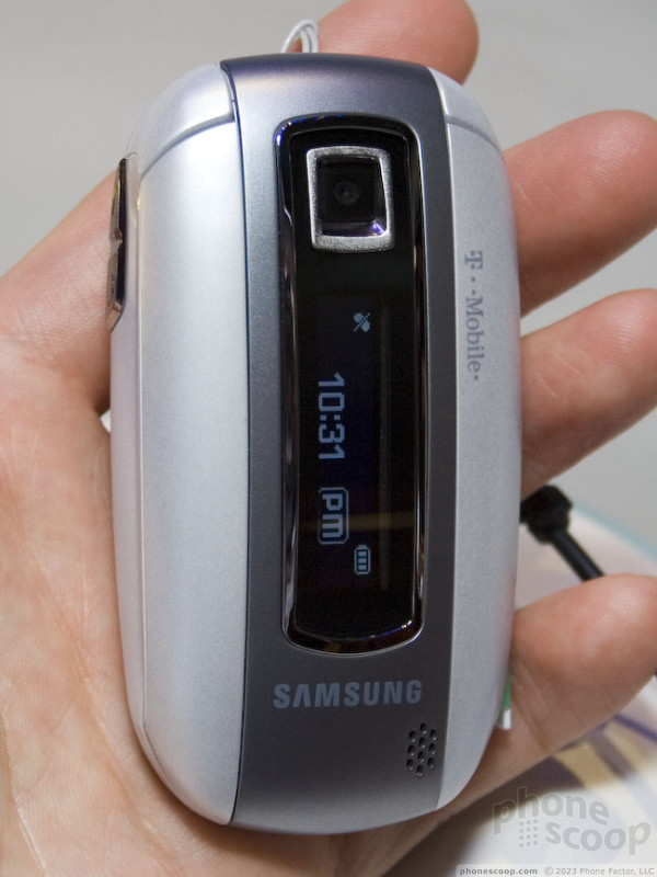
Holding it in your hand, it's light and smooth. The off-white coloring sets it apart from the silver and black colors that seem to dominate cellphone shadings these days. On the front is a vertically-oriented 1-line, 1-color display to indicate time, signal strength and caller. The display was very hard to read on the show floor.
Opening it up shows off the smallish screen and keypad, which are modestly sculpted and curved. The screen is rudimentary as would be expected on a phone at this level. The display shows clear pixelization, as do all the menus and animations. Bringing up the menus was quick and efficient, with only a handful of options to choose from. Each icon happily danced its dance when you scrolled over them. No complaints from the UI in terms of speed, but it was was somewhat frustrating if you made a mistake and choose the wrong icon. Hitting the back key sent you all the way back to a top-level menu rather than the previous screen.
Probably the best feature on the phone was the camera. Even though it's only a VGA camera, the UI for it was very intuitive. Zooming in and out and adjusting the exposure/brightness were all managed with the 5-way control pad. The quality of the pictures may not have been the best, but the experience of taking the pictures was as good as much pricier models. The zoom reacted quickly, as did the brightness control. Other functions were not as easily accessed form the main image viewing page. You had to go into other menus prior to taking the picture to access the more advanced features.
There was a media folder on the phone, but no ability to play music. It is strictly for downloaded apps from the T-Mobile services.
The browser functioned surprisingly well. Rather than some goofy homepage, an address bar popped up when you hit the browser key. Given its tri-band GSM/GPRS radio, though, this phone was not meant for serious web use.
One last Samsung phone that we were able to get our hands on was the u740 for the Verizon network. The demo unit did not have a battery installed, so we weren't able to interact with the UI, but the usability of the keypad alone is worth commenting on.
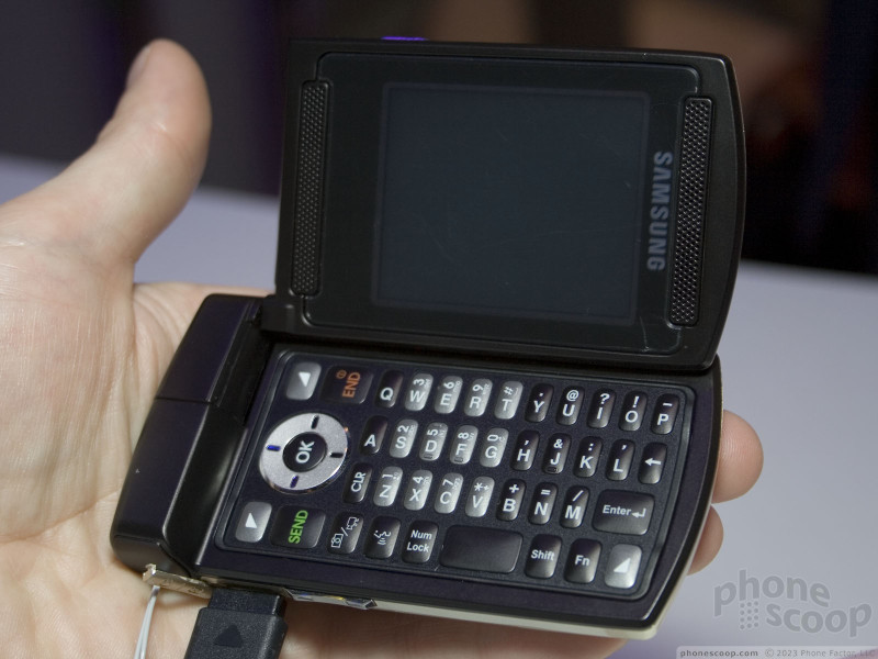
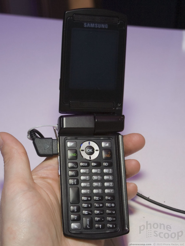
First, the u740 is a flip phone, with a dual-hinged screen that fold up like normal, or to the side to reveal a qwerty keyboard like the Motorola MPx. Perhaps it was because a million people handled it before we did, but the hinge quality was terrible. It was very loose, with a lot of play in every direction. It really should have been built much tighter. The UI will most likely be Verizon's standard interface. The u740 has a pretty weighty bulky feel to it and it's a medium-sized flip phone; definitely thick around the waist. While we were disappointed not to be able to use any of the actual features, we gave the keypad a test spin and came away sorely disappointed.
To start, the keys were very, very narrow. We're talking 3mm here, folks. This writer had a very difficult time typing on the thumb board. The layout of the keypad is just awkward. The hinge at the top of the phone almost prevents you from reaching the keys along the left edge of the keyboard and there's a small ridge on the bottom of the phone that makes typing the "p" key almost impossible. There were dedicated media keys, and the 5-way key had a fairly good feel to it. Overall, though, we agreed that this keyboard needs work.
That's about all we were able to ascertain without a working demo unit.
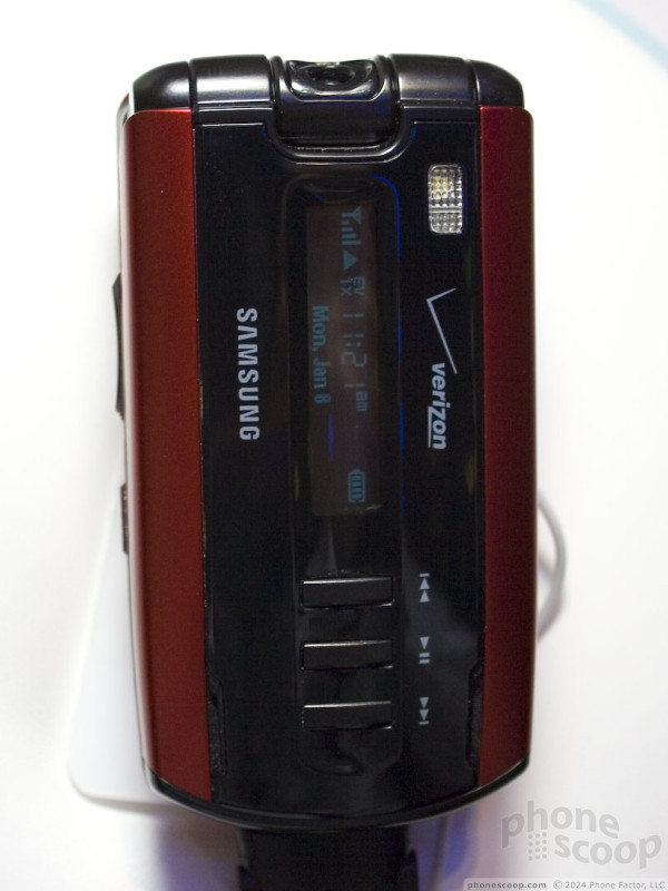
One final nugget of Samsung news. As you an see in the pictures, we spotted an a930 with red bars on the front panel. If you remember when the a930 was first seen, it had silver bars straddling the front display. When the phone was actually launched, however, it was all black. This appears to be an updated color scheme for the phone, cause, hey, red and black are just cool.
 Video Tour: Samsung A717 & A727
 Review: MOTOROKR Z6
 Review: iPhone
 Review: Motorola ic402
 Samsung U740 Video Tour
 Motorola ic502 Buzz