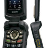
Review: Kyocera DuraXT for Sprint
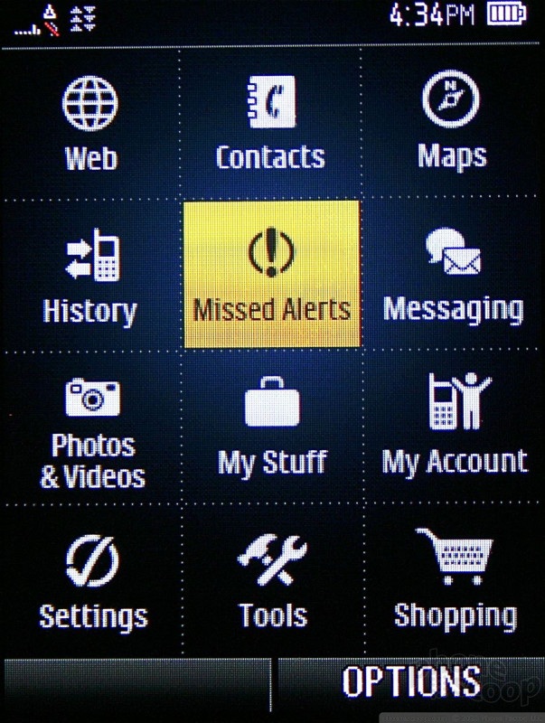
Sprint hasn't invested in its Java-based feature phone platform in years, and it shows. As someone who's used touch screen devices for more than five years, remembering how painful it is to scroll through menu after menu after menu with a d-pad is an unwelcome experience. What probably bugs me the most is the yellow-on-black appearance of the main menu (a color combination I detest) and the inability to change it. There are no themes, no profiles, and no options to change the background and menu colors.
On the flip side, for the fine field folk who've remained Nextel subscribers for years, it'll be old hat.
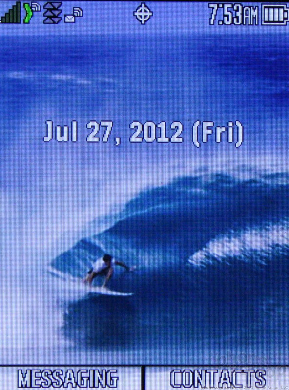
The home screen provides access to the messaging and contacts apps via the soft keys. If you want to get at the main menu, press the center of the d-pad. The main menu is a 12-icon grid that can also be viewed in list form. Rather than make you jump through hoops to change the way the main menu looks, the right soft key does the trick. For my money, the grid view is easier to use on a day-to-day basis.
The 12 icons don't offer any surprises and are composed of the requisite mixture of phone tools and Sprint service offerings. Similar to other Sprint phones, it uses the My Stuff folder to centralize all your media and apps and games. The "Shopping" icon doesn't take you to an on-board app store. Instead, it fires up the browser and loads Sprint's painfully bad content portal.
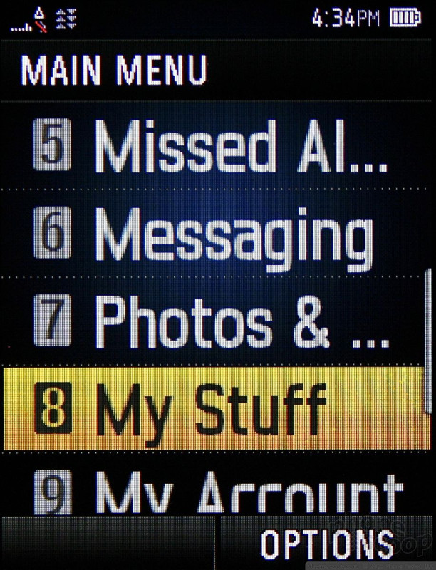
Once you move deeper into the menu system, the default view of the menus switches to an endless array of lists.
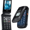
 Kyocera DuraXT Arrives at Sprint as Rugged Direct Connect Clamshell
 Hands On with the CAT S22 Flip
 Kyocera Brings a Rugged Flip Phone to FirstNet
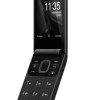 Verizon Picks up Nokia's New Flip Phone
 Kyocera DuraXT / DuraPro